

Food illustrations have a special way of making us hungry before we even taste the dish. From colorful fruits to beautifully plated meals, illustrated food captures textures, flavors, and emotions in a way that feels both artistic and inviting. In this blog, we’ll explore the world of food illustration with artist Gloria Vanessa Nicoli.
 Gloria Vanessa Nicoli is an artist inspired by the magic of everyday moments. Her journey began in Italy and continued in Shanghai, blending diverse cultures into her life and art. During studies at Accademia di Belle Arti di Brera in Milan, Gloria fell in love with printmaking. Today, she focuses on watercolor paintings, capturing the essence of food, animals, and flowers. Storytelling, novels, and fan fiction deeply influence her work, while hobbies like stamp engraving and origami fuel her creativity.
"I thought I could just draw the desserts I wanted to try, as a way to satisfy my cravings on paper instead of in the kitchen."
What's your first step when starting a food illustration? Do you sketch, plan colors, or something else?
Before I start drawing, I first decide on a clear food theme in my mind and what I want the illustration to express. Then I start collecting lots of different references based on that idea, not only photos of real food but also anything that inspires the shape, texture, or color mood I'm going for. I try not to rely on just one or two literal food photos, so my imagination can stay open, and I don't feel locked into a single real-life example. During this stage, I keep brainstorming, adjusting the picture in my head again and again until I have a blurry but solid direction. Once that direction feels stable enough, I start sketching.
How do you choose which food or dish to illustrate?
For a long time, I mainly chose desserts. The original reason was honestly a bit lazy: making desserts at home by following tutorials was a lot of work and might still fail, and buying them outside was too expensive. So I suddenly thought I could just draw the desserts I wanted to try, as a way to satisfy my cravings on paper instead of in the kitchen. While I was drawing, I could almost imagine the taste, which made the process feel a bit like actually eating them. After a few pieces, I started to add more playful and imaginative ideas on top of the food, without worrying whether such dishes exist in real life. After finishing three dessert series, I moved on to savory dishes, and now I also like to paint foods related to different holidays.
Do you use reference photos, real food, or rely on imagination?
I use a mix of reference photos, real food, and my own imagination, depending on the piece. For my early dessert series, I mainly relied on photos of actual food to study different textures, shapes, and moods. I would gather lots of references, not just food photos but anything that sparked ideas, to keep my creativity wide open instead of sticking to just a few images. Later on, I started creating fantasy-style foods from scratch, imagining magical recipes and drawing them with no real-world limits. In more recent food illustrations, I also add little scenes around them to give the picture some story and keep it from feeling too plain.
Do you have favorite brushes, textures, or techniques that work especially well for food?
I mainly use brushes from the Watercolor brush library in Rebelle, as the default presets that come with it are already super versatile for food. I may tweak the opacity to 100% on a few of them, so when I save the illustration as a PNG, there are no strange transparency issues. For line work, I stick to two liner brushes; for coloring, I use four Round brushes most of the time; and for special textures, I go with Splat, Flat Dry, and other dry brushes, plus I make good use of the quick-dry shortcut to keep those textures crisp without water bleed messing them up.
Watch on YouTube: youtu.be/yptY8kwWwZM
What's your approach for rendering textures like glossy fruits, creamy sauces, or flaky pastry?
Because I use watercolor brushes, which can easily bleed and blur together, rendering textures requires extra care with canvas wetness and dryness. When using dry brushes for rough textures like bread crumbs, powder, or flaky pastry, I hit the quick-dry shortcut and Dry button in the Layers panel right away to make sure the paint doesn't smear. For glossy surfaces like syrup or soup that need clean, sharp highlights, I keep those edges crisp with dry layers too. For matte surfaces, I let the layer stay wet so the colors blend naturally, then use the Blend tool to smooth out anything that looks off.
How do you make food look appetizing and realistic without overworking it?
I learned the hard way after a few pieces that you shouldn't obsess over every tiny detail. Instead of zooming in with a small brush and painstakingly copying the reference, I now zoom out the canvas often to check the big picture, like overall light and shadow, and use bigger brushes for a more natural flow, which actually makes the illustration look real and lively. Early on, I would spend days perfecting complex details, but the results weren't as good as I hoped, and it killed the fun. Now, I save time with texture brushes like Spatter or Splat, pencil, and patterns for details, so the piece stays fresh and inviting. Comparison of Gloria's early food illustration vs. now
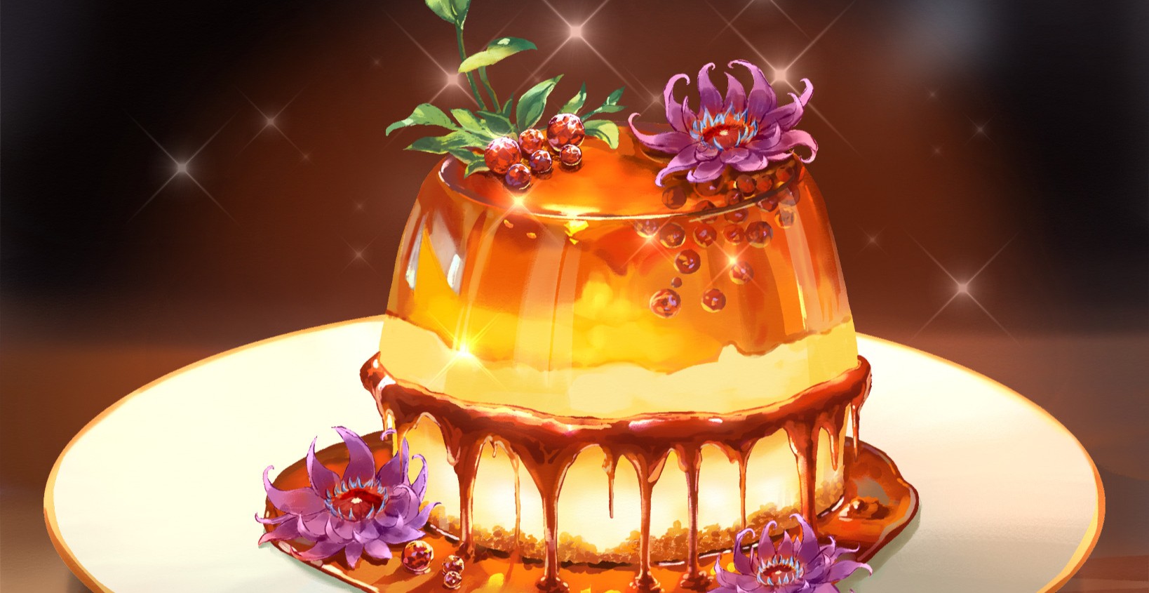
"Most of my food illustrations include some kind of slightly translucent syrup. To make it look appetizing, I always add bright highlights that catch the light."
Do you have tips for arranging food elements in a composition?
I haven't done too much formal study on food composition myself, but for arranging food elements, a great tip is to check out professional food photography or gourmet magazines for inspiration. You'll often spot fresh, clever layouts that really make everything look mouthwatering and give you new ideas.
How do you decide on perspective or camera angle?
It depends on which part of the food I want to highlight. If the focus is on showing what's on top, I go with a higher angle. For instance, my Dutch pancake piece has a thick, round pancake topped with bacon and a sunny-side-up egg in the center. For something like a layered cake where I want to show the colorful cross-section inside, a 45-degree angle works best, as it reveals the cutaway while still showing some exterior and top. For burgers and layered foods like that, a full side view is perfect to display all the stacked layers clearly.
Do you use special effects, like reflections, highlights, or wet edges, to make food look more realistic?
Yes, I love drawing syrup. Most of my food illustrations include some kind of slightly translucent syrup. To make it look appetizing, I always add bright highlights that catch the light. For illustrations where the food is the main subject, I also apply a Gaussian blur to the background, which helps the food pop out more and grab attention.
Are there common mistakes beginners make when illustrating food, and how can they avoid them?
One common mistake beginners make when illustrating food, and one I fell for myself, is obsessing over unnecessary details and sticking too closely to the reference photo's colors, which often makes the whole image look muddy or dirty. Another is getting the big light and shadow relationships wrong at first, leaving the main subject flat and unappealing. To avoid this, regularly switch your canvas to black and white to check if the lighting feels right overall. For colors, limit how much you pull directly from the reference. Once you set the base hues, experiment with mixing your own shades.
Do you have any tips for preparing food illustrations for print versus digital display?
For print-quality food illustrations, aim for at least 300 DPI resolution. I always start new canvases at that setting. The key difference is color modes: digital displays use RGB, which has a wider gamut and makes colors pop brighter on screens, while print uses CMYK, so printed results often look a bit duller or grayer. If you know it'll be printed, avoid super-saturated colors from the start to prevent big color shifts, or after finishing, use the proof color feature in Rebelle or Photoshop to tweak until it matches the intended look.
What's one tip that dramatically improves a food illustration?
Ambient lighting and a simple, non-distracting background. Early on, I drew food without any background. Pure white made the food stand out, but it felt boring and flat. Now I add subtle backgrounds that match the mood, nothing detailed: just some decorative elements with a Gaussian blur. This instantly boosts the overall polish. Or add a light source, like morning warm light coming through a window, casting a rectangular glow on the table, partly hitting the food, darkening and cooling the unlit areas to create an instant atmosphere.
Apart from the food illustration, what is your favorite subject to draw?
Apart from food illustration, I've done the most work in children's book illustrations, but personally, I prefer a young adult anime style. I'm also gradually practicing human figures and scenes so I can draw the original characters I imagine in my head.
Thank you, Gloria, for opening your studio and sharing with us how you approach food illustrations. We hope to see more of your mouth-watering food projects made with Rebelle in the future.
Happy Painting,
Escape Motions Team
-----
Learn more about Gloria Vanessa Nicoli: escapemotions.com/featured-artists/gloria-vanessa-nicoli
What do you think?
0 Responses
0
Upvote
0
Funny
0
Love
0
Surprised
0
Angry
0
Sad
Sign in to comment!