

Great ads rarely begin with a camera rolling, they begin with a sketch. In this behind-the-scenes guide, Rebelle Featured Artist Jeremy S. Thompson shares his process for creating presentation storyboards, from rough concepts to polished client-ready frames. Along the way, he explores visual storytelling, creative problem-solving, and the fast-paced realities of commercial work.
Born in Scotland but raised on the east coast of Canada, Jeremy S. Thompson grew up drawing and consuming all things pop culture. Eventually, somehow, he stumbled into the advertising industry, which took him to Toronto, where he provided storyboards, photography, cinematography, and motion design for a variety of clients. This ultimately led to a career as a freelance commercial illustrator and director.
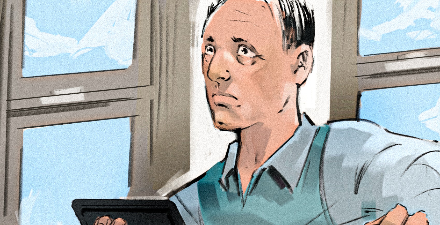
Variety of Storyboards
This demonstration falls into the category of presentation storyboards. The big difference between these and other forms of storyboarding is the level of detail and communication packed into each panel.
A shooting board, for instance, tends to be much faster, looser, and quicker to produce. It’s primarily there to inform camera movement and general staging, and as a result, there are usually a lot more of them produced for a client.
Presentation boards, on the other hand, tend to do a lot of heavy lifting per frame. Not only do they suggest camera angle and motion, but they also communicate background details, location, casting, wardrobe, and even performance through expression and body language. In commercial work, these boards often become the visual backbone for the project. From the initial client pre-production meetings all the way through wardrobe, art direction, staging, location scouting, filming, and finishing.
Watch on YouTube: youtu.be/Nwl8PaLMoI8
Step 1: Understand Who Your Client Is
At the very start, it’s important to get off on the right foot. One of the best things to do is get a sense of who you’re drawing for. When working with a new client, it is crucial not to assume their level of experience. One of the biggest dangers is poor communication and not setting expectations. A client may make assumptions as the work progresses, and by the end, they may be unhappy with the final result. That’s a particularly dangerous situation when deadlines are looming, and everyone is already moving at a full clip.
That said, having a strong brief or detailed correspondence is a great roadmap. Refer back to it throughout the process, collaborate with producers or other decision-making departments, and ask any important questions early on, rather than later, when “righting the ship” becomes a much bigger task.
Once the communication foundation is set, the next step is producing the rough story map. This is arguably the most important stage, because most of the information should already be present and understandable here.
Step 2: Produce a Story Map
This stage is all about exploration. Be rough, messy, throw notes into headers, or place a "TBD" over areas that aren’t solved yet. But the key is making sure the audience still understands what they’re looking at. Sometimes, very sketchy blocking is enough. Other times, it is necessary to push much further toward polish before the idea clicks.
Tip: For the actual drawing, I love using a pastel oil brush with a thick square head shape. I love the way the brush skips along the canvas surface and leaves behind textured marks. I can erase or smudge easily as I work, and the canvas itself dictates half of the texture, not entirely on the brush. That’s one of the foundational things I love about Rebelle. Many drawing applications fake canvas texture through the brush engine itself, which is a completely understandable approach once you know how those engines work, but to me, it always felt a little backwards.
Step 3: Clean-Up Paths
Once the roughs are approved, it’s off to polish. In some cases, the roughs are already so close to final that the client only wants cleanup work and a fast tone, which is fantastic when the deadline sits overhead. Otherwise, redraw the clean image over the roughs using the same brush. Sometimes all that is needed is to shift the line temperature if the color palette is agreed on.
At this point, focus on shadows, silhouette clarity, and overall appeal. This is also where some of Rebelle’s additional tools really shine. The Perspective tool is simple and intuitive, and you can lock the horizon line. The flip canvas tool is also incredibly powerful. It feels like Rebelle is projecting a flipped view of the canvas rather than actually processing and flipping every layer and pixel. The result is extremely fast and hugely helpful for spotting proportion issues while drawing.
The vector paths are another standout feature. Using externally provided vector shapes or custom paths, they essentially become customizable rulers. Create complex French curves or common primitives and draw directly along the edge while the brush naturally follows the guide. Being able to scale and rotate those guides quickly makes them incredibly useful. Even the default shapes, especially with proportion constraints turned off, can produce fantastic results. For anyone drawing architecture or vehicles, it’s absolutely worth exploring.
Tip: I’ll usually create a new layer underneath and use a custom flat-head cover brush from the airbrush engine. It behaves a bit like a digital Copic marker, but covers with a precise pixel-perfect instead of a buildup digital effect. This is the only brush I use to do this, and it is interestingly the opposite of Rebelle’s analogue design philosophy.
"Rebelle really is one of my favourite things to draw in. I get a wee little endorphin hit every time I see the title screen load up on my computer." - Jeremy S. Thompson
Step 4: Highlight Focus Areas
This is one of the stages storyboard artists struggle with the most. The idea is simple: work from the middle outward. Highlight the one or two key reads you want the eye to land on first. Increase contrast and detail there. Then gradually taper that detail and contrast outward so the viewer absorbs the whole image while still understanding exactly what matters.
In black and white, this is relatively straightforward because you’re mainly dealing with tonal contrast. Color, however, is an absolute beast. Now you’re balancing color contrast and tonal contrast simultaneously, while also wrestling with the human brain’s completely unhinged interpretation of color. A color can appear totally different depending on what surrounds it. Other oddities a brain does, it's forced to interpret colors. Take magenta, for example. It’s basically an impossible color, because it relies on the low frequencies of red and the high frequencies of blue meeting to create something that technically shouldn’t exist as a unique wavelength. Physics says, no, that’s not really possible, and your brain says, yes, it is.
At the end of the process, merge all visible layers into a new layer above and paint directly onto that. This is the “wild west” stage.
Tip: I use pencils, airbrushes, or a filbert express oil brush to finish the piece. I’ll do things like adding highlights, softening areas that have become too contrast-heavy, blending edges, and generally wrestling the drawing toward final appeal.
Step 5: Fight the Frustration, Meet the Deadline
We’ve hit the 90% mark. Most artists know this spot well. You’ve stared at the same image for quite some time, and suddenly it's terrible, and nothing works anymore. Every decision feels wrong. Clearly, you're terrible at everything, you’ll never be as good as your peers, or get close to the artists you love and admire, and you really should quit and never draw again. Do you recognize yourself here?
Fortunately, Jeremy has managed to soften that a bit as he’s gotten older. But the imposter syndrome is real. But that is part of what pushes us to improve. One quote that I've had rattling around in my head over the years, that I consider a truth that's helped me over the years, is: "Art is never finished, only abandoned."
Eventually, the deadline arrives, you’ve only budgeted so much time for each drawing, and you have to decide when to abandon the piece and move on. That’s usually when the artist glances at the clock, calculates how long it’ll take to package the boards into a presentation, label everything properly, and ship it off.
“I'm sure I'll be fired this time, the jig has to be up.” Then another friendly email comes asking for more boards. A warm, fuzzy feeling appears, excitement to draw all over again arises, and the cycle repeats. It’s a very strange career.
Stay Creative,
Escape Motions Team
-----
Learn more about Jeremy S. Thompson: escapemotions.com/featured-artists/jeremy-thompson
Get in touch with Jeremy: rustedpig.com/contact
What do you think?
0 Responses
0
Upvote
0
Funny
0
Love
0
Surprised
0
Angry
0
Sad
Sign in to comment!
Be the first to comment.