

Let’s look at the depth and color vibrancy with Ivan Seelnon, motion designer and Rebelle Featured Artist. Even though this topic can be quite challenging to tackle, tips on rendering, shading, colors, and expressionism will help you develop a great technique and habits. Follow Ivan's tips and make your next painting pop.
DISCLAIMER: All images were created in a short amount of time and were made to showcase the application of the mentioned ideas and fundamentals. They were not made to represent final products, but progress, to give some under-the-hood ideas. If a picture looks good at that stage, usually it ends up looking good at the end as well.
Depth
Before we dive into colors, shading, or rendering, we must establish the depth of the painting first. Depth determines how close your colors are to full black and full white. This gives your artwork that energy boost or keeps it chill – it's all about riding that value range wave. To establish depth, we have some choices to make:
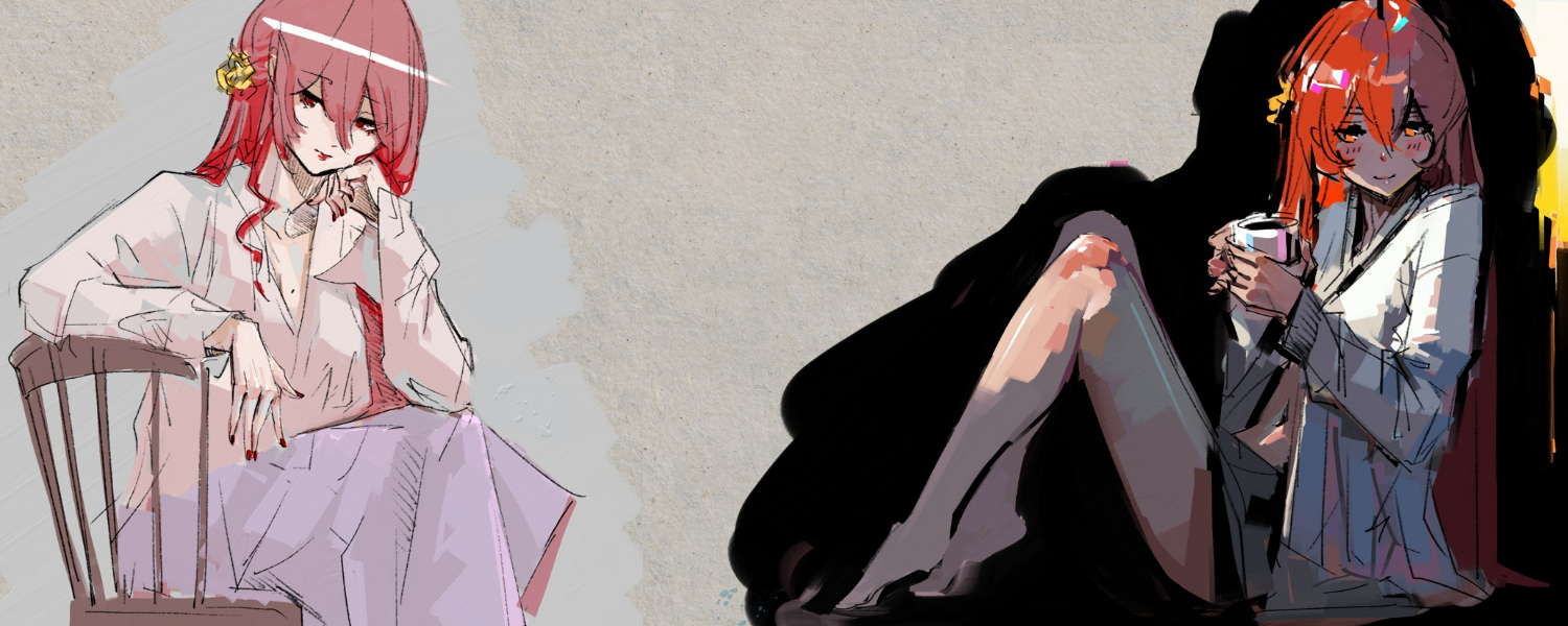
High contrast contains a very dark background with intense light hitting the subject. This artwork will have a lot of energy, can use lots of colors, and usually doesn’t need much to look good.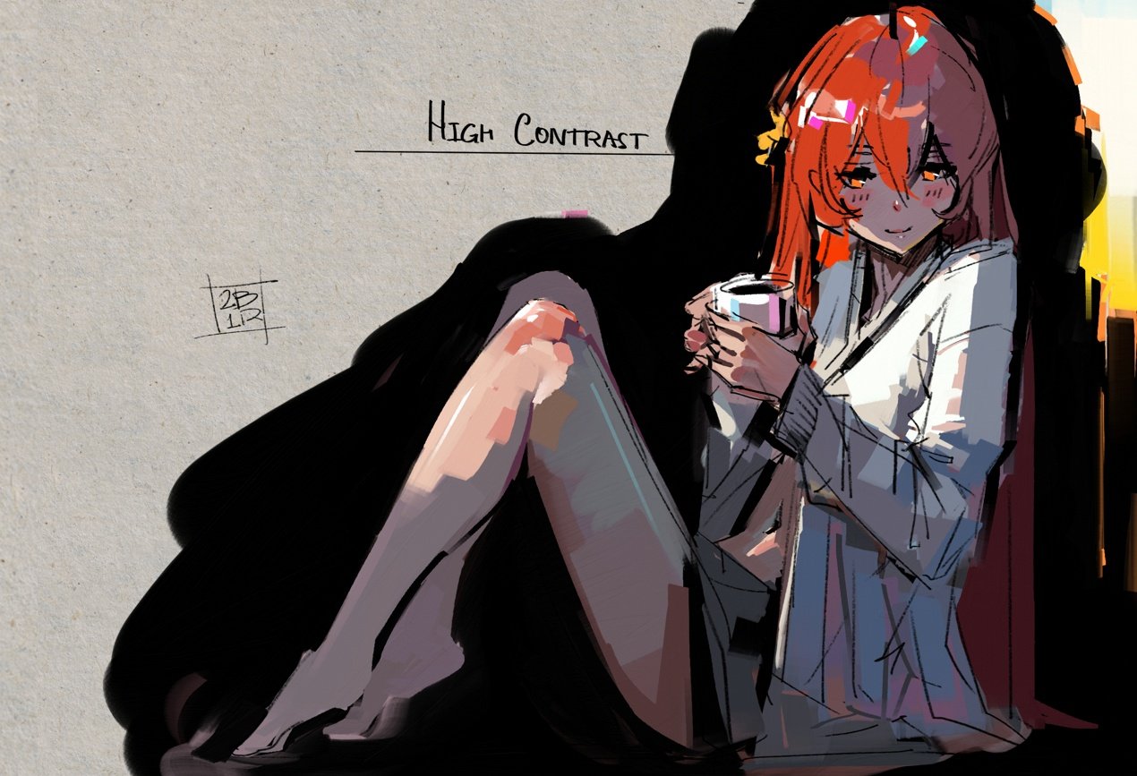 Medium values are good for everyday-type paintings with the ability to do dramatic light as well as smooth, overcast-type light scattering.
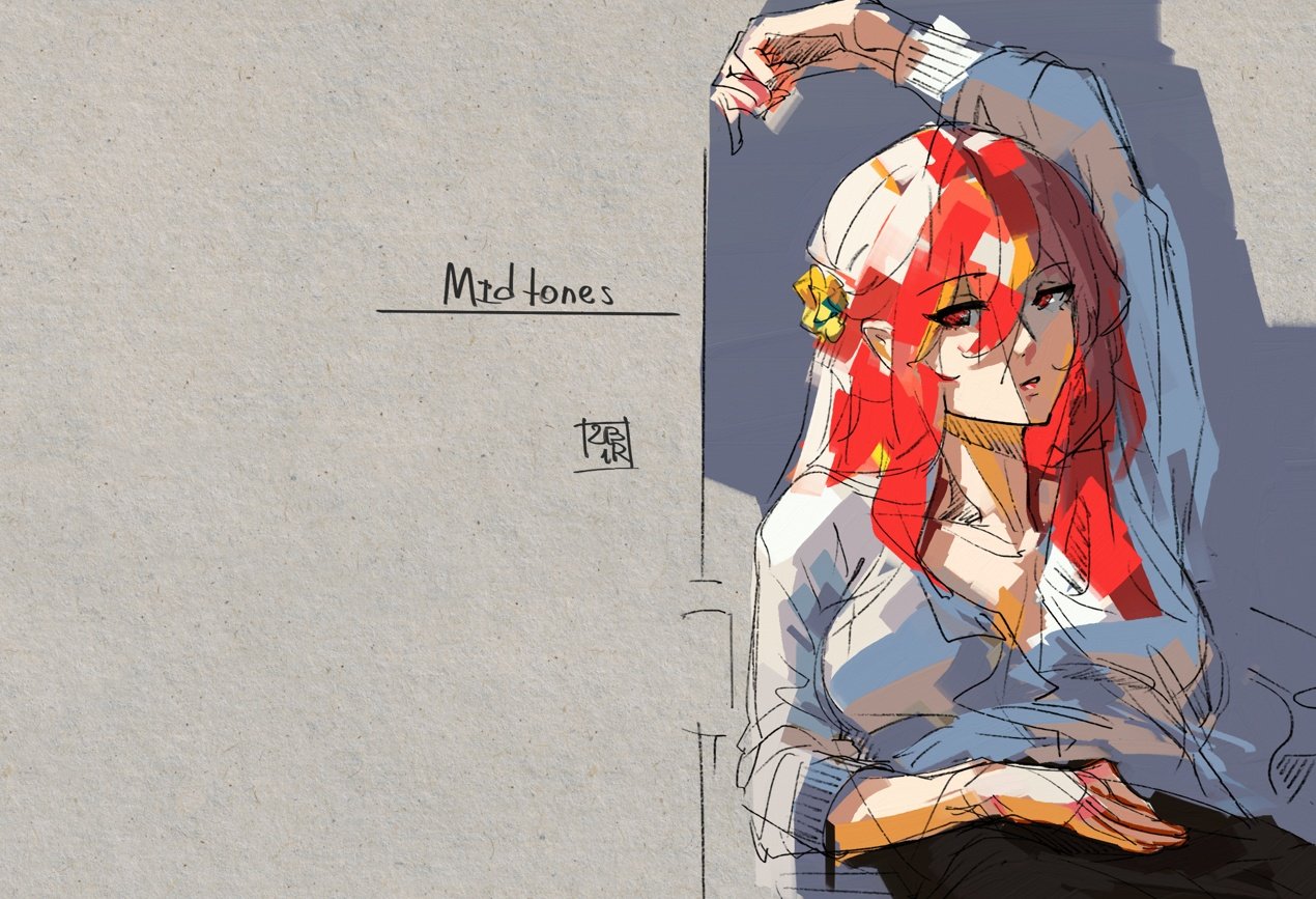 A low range of values provides great pastel feel, mostly for chill and quiet pieces.
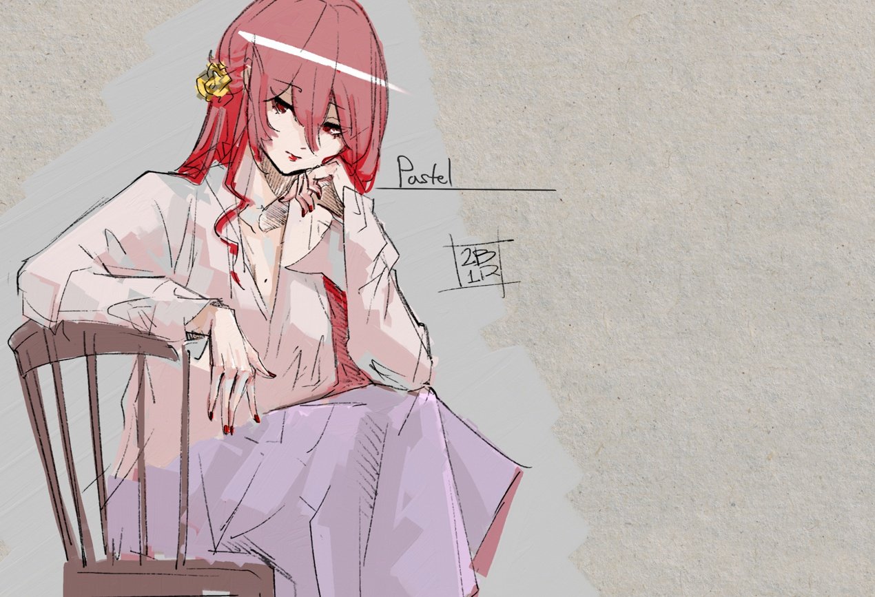
Further, I will be explaining the High Contrast setup. Other ideas work similarly, just with different value ranges. Feel free to try these on your own in your practice time.
Set-Up
Make your canvas as close to black as possible, to a point where any other lighter value will feel like light. Pick some values to describe bounced light and some values to describe direct light. The main idea is to start feeling the light itself, temperature, mood, and environment. It can be cold to cold, warm to warm, warm to cold, or cold to warm.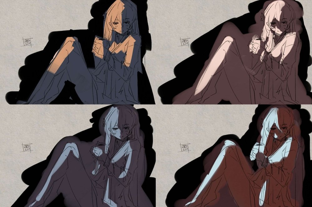
The idea of warm shadows in cold light is experimental and not true to real life. But it’s the art and we are allowed to experiment. For any different depth, use less contrast between dark and light, while following the same idea. Suppose you want to use overcast with scattered light. In that case, it’s about creating a gradient of light transitioning into shadows, but mostly just trying to understand that relationship while looking at a reference.
Grey Reactions
The next important step is to see how grey colors react to the set environment. If everything is cold, grey will become warm, and if everything is warm, grey will become cold. Blue-ish grey may become green, yellow grey might become red-ish, and so on.
Grey usually acts complimentary to the temperature and colors of the environment. Here, I made an example of warm shadows in cold light and warm light in cold shadows. The same grey value is acting differently.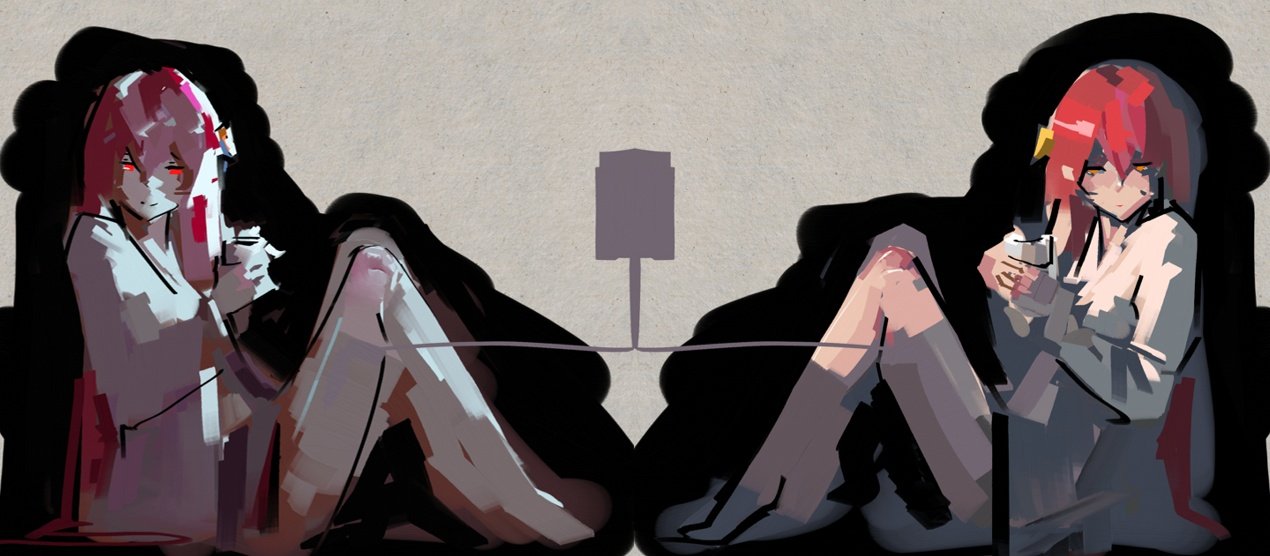 If some colors feel off, try mixing them with grey and with the original set-up color. Still, you will have to know how to mix specific colors to set global illuminations and have the instinct where and when to add a specific color to the scene, which is only possible by painting from references and studying how different artists approach different situations.
The main thing to remember is that grey is the bridge between colors. Therefore, any transition or communication of two colors is made when using low-saturated versions of said colors, which are close to grey. Grey in general is a conflict solver.
Depth Construction
Next, we will look at darker and lighter approaches. The main idea is that the deeper you want something to go, the darker the value you should pick. The more extruded you want to go, the lighter the value to pick. The neck goes in darker. The nose goes out lighter.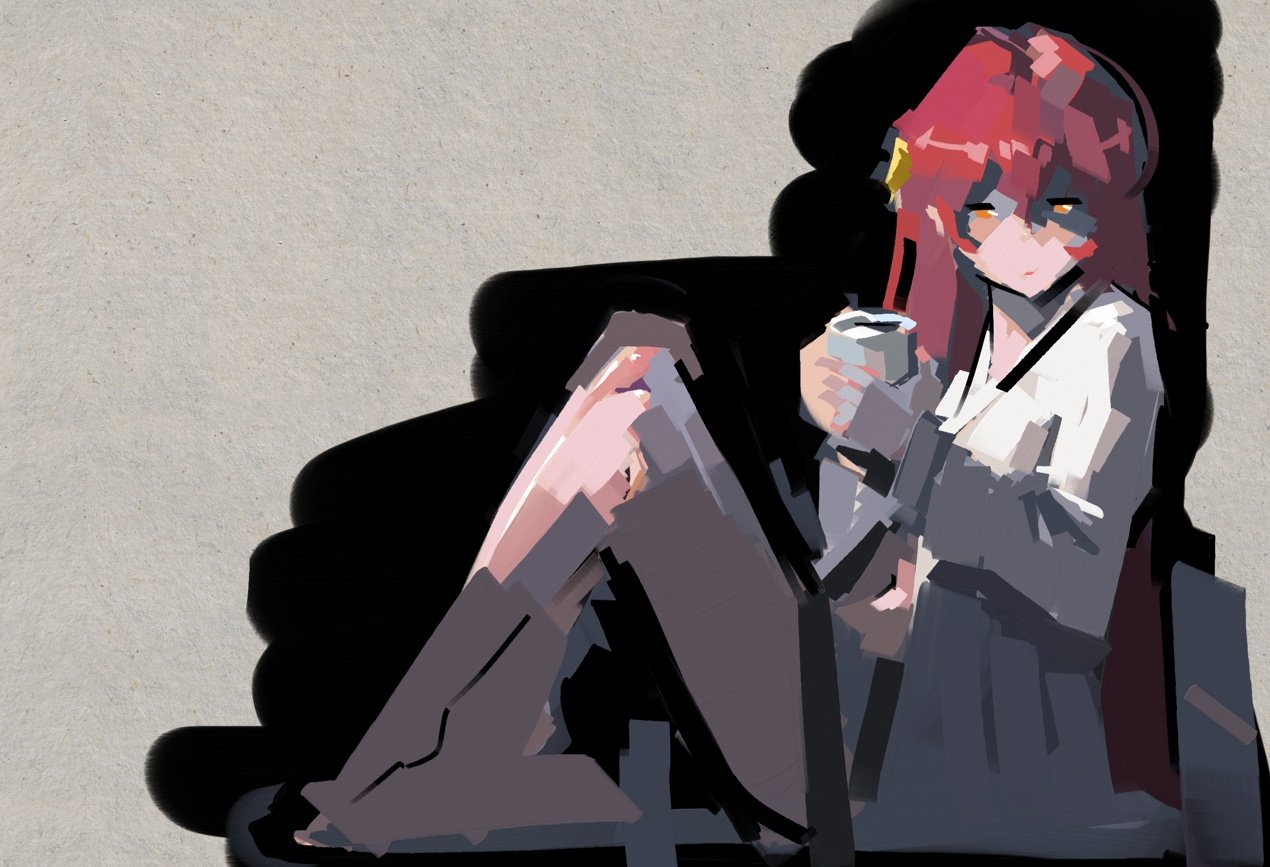 Those two options help a picture to be more three-dimensional and less flat in general. These ideas could be described as Ambient Occlusion and Specular Light, but I found it’s easier to deal with as an “in and out” concept. When I paint a fold and think about how deep I want to push it, naturally, I pick darker values. The same goes for extruding something out, this helps with specular lines, shoulders, folds, skin, trees, flowers, and so on.
At this point, a picture should have understandable qualities for any viewer, and in some cases, it’s fine to stop at this stage while keeping line art. Using colors is optional, everything could be done with black and white only.
The Most Important Concept for Painting
Defining a meeting place of dark and light gradients is the most important to create visually appealing artwork. It’s a way to create very expressive lines. It also works like an attention grabber, works as details, as complexity, as pretty much anything descriptive.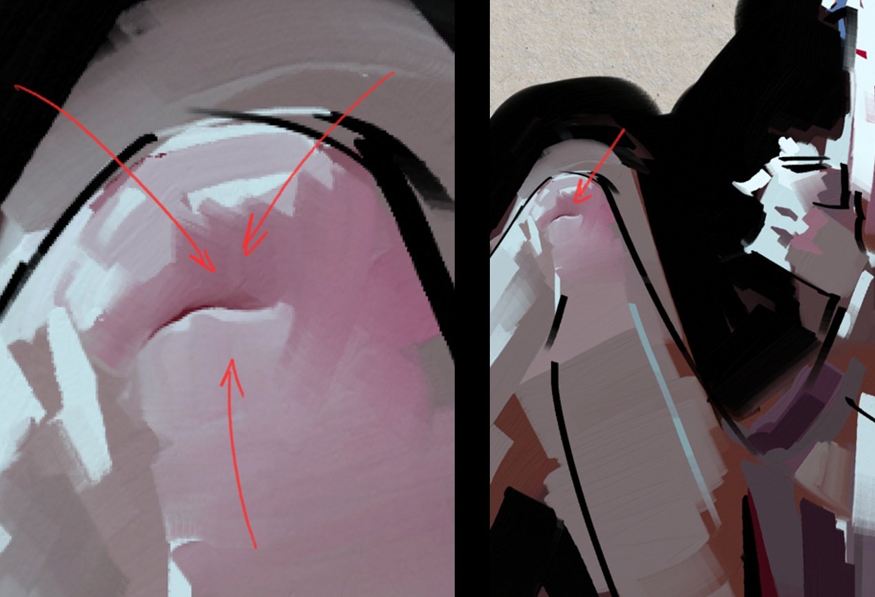 90% of everything painted is dancing around this concept. It’s present at every edge and pretty much everywhere, but it’s not that visible in 89% of the cases. But the best way to think of it is as it’s very extreme and very pronounced, then it’s easier to execute in timid situations.
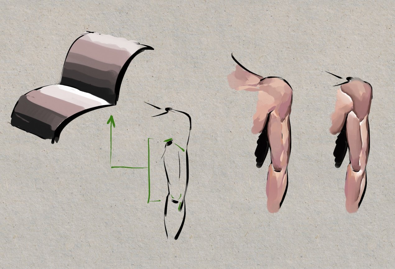 This is a concept for rendering and painting, which requires techniques of how to combine soft edges with hard edges and might be difficult to execute or to find the right balance for inexperienced artists. Don’t be discouraged though, just keep practicing.
Colour Vibrancy
For colors to pop, we need to achieve a good balance between chill and wild. It’s a subject of feel on what to add and when, but usually, it has to do with light-to-shadow transitions, like glowing effects, sub-scattering, light bleed, and so on. The general vibrancy of hues is good to use in shadows and semi-boring places. Overall, a picture can use any and every color in the world if it follows physically correct values.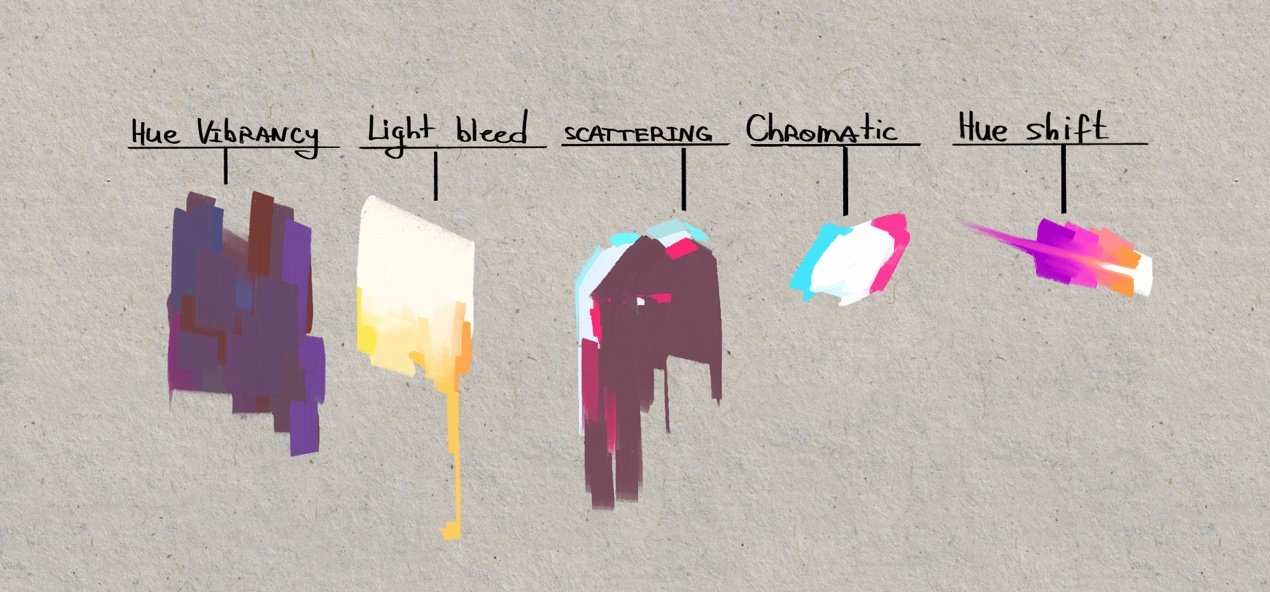 There are some options for our color vibrancy scenario:
1. Everything is timid, so it is easy to set attention-grabbing parts.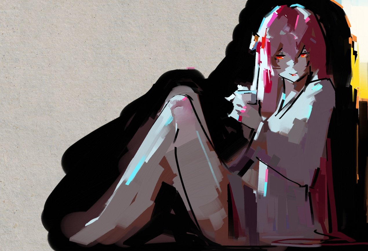 2. Everything is intense, so it needs timid shadows to hold it together.
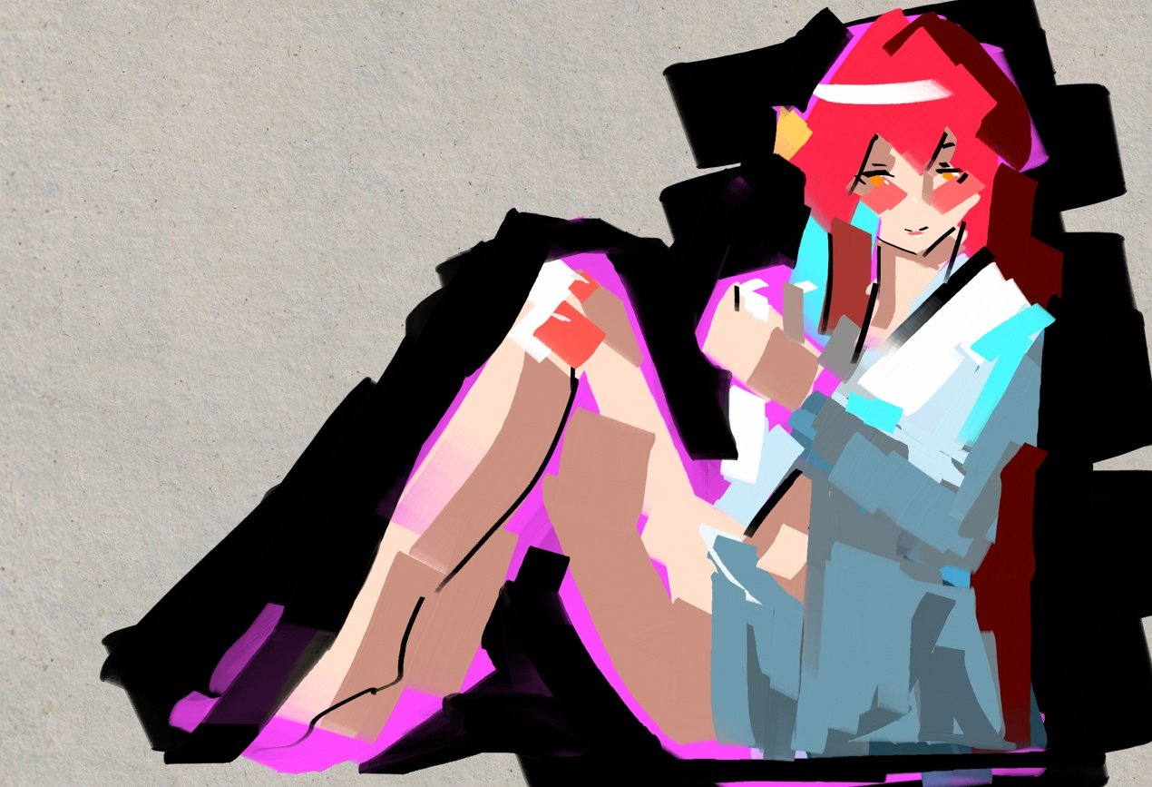 3. Everything is timid, so saturated highlights stand out.
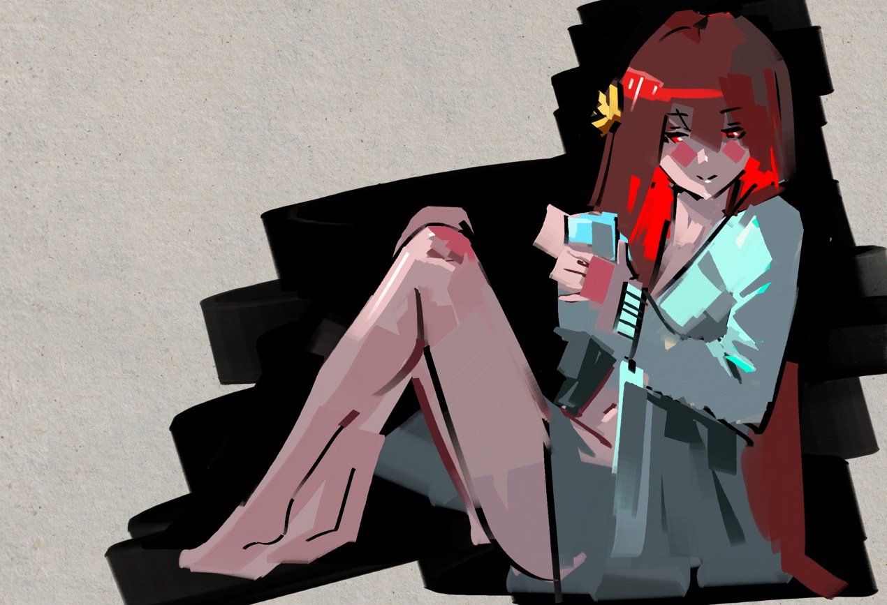
Some problems that can interfere with establishing the correct color vibrancy for our painting are the inability to understand 3D forms of objects, global illumination, rendering, color balance, design, techniques, or fundamentals. While these need to be learned, another problem can arise, which is a lack of experience. In this case, just be sure to dedicate the necessary time to practice.
Summary
There are two big separations between light and dark. Both light and dark have their small amount of deviations of values to make descriptions of 3D forms. There is a communication between light and dark at places where the two meet. Here are some examples of the results you can get:
Overexposed - describing the subject in shadows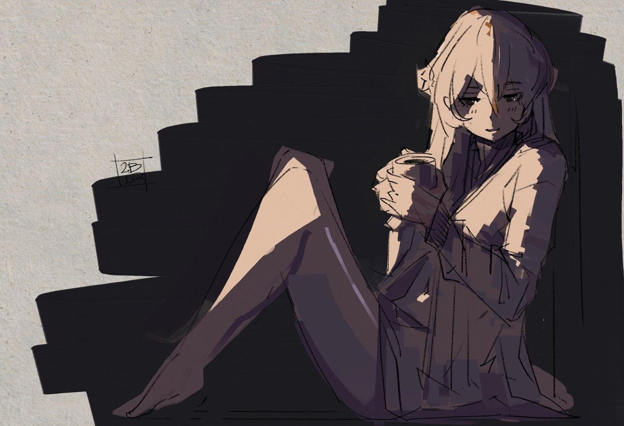
Underexposed - describing the subject in light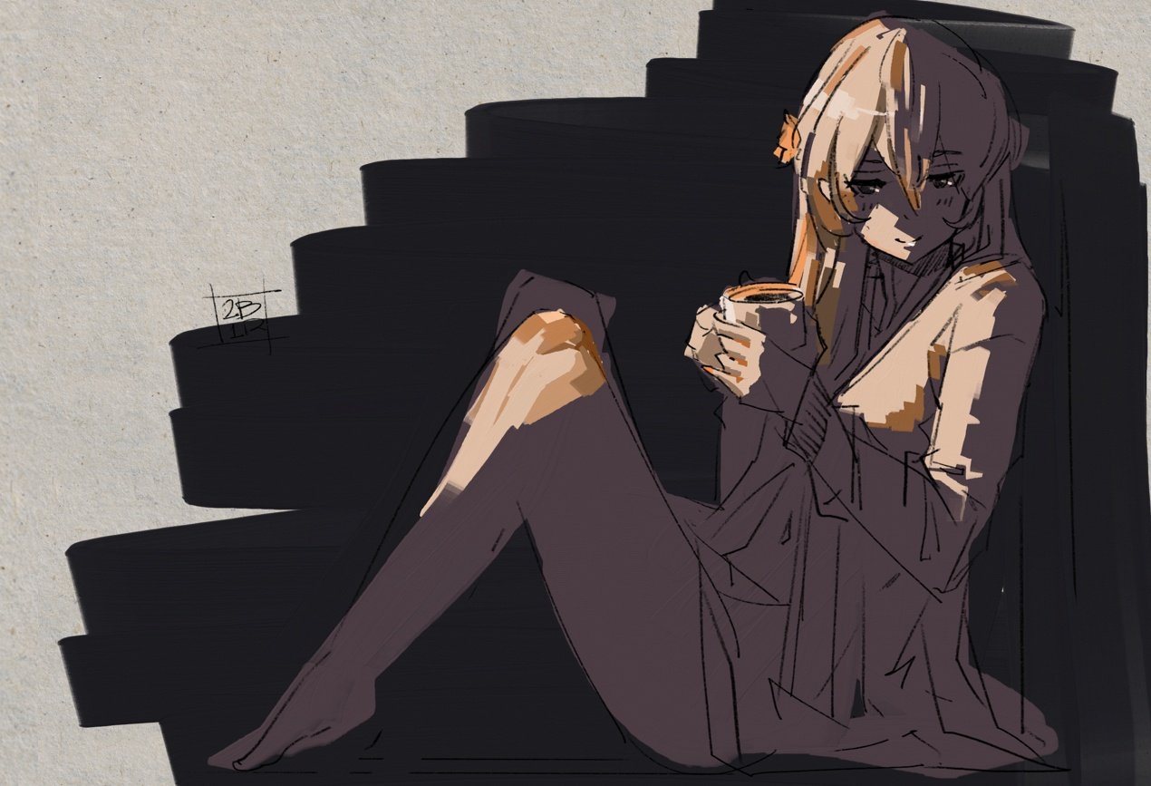 Combined
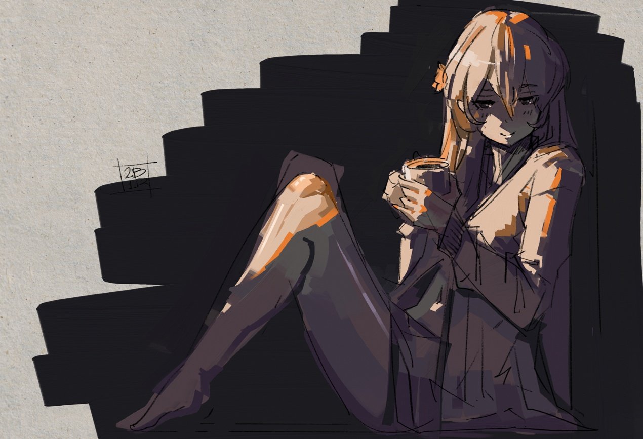 The main goal is “understandable” quality. If removing line art still creates a recognizable picture, you are doing great.
Adding more elements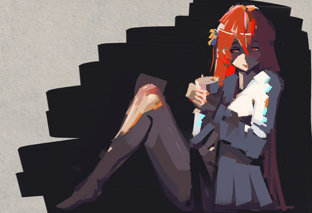
Here is my thinking behind adding more stuff to the image. When looking at a robe, that is white, it will reflect more light, meaning values need to be lighter. Because blue light is easier to scatter, the shadow part of the robe will have a blue bias.
Hair is red, but it is inside of a warm environment, so when it’s lit, it will have an orange bias. To showcase blue light scatter: in the shadows, hair will be more purple as its red natural and blue bounced light meet.
Skin needs to be warmer, so the introduction of purple-grey, orange, and grey-ish red will create a feeling of blood, which creates a feeling of being alive.
I am finishing with fun fully saturated colors to give overall playfulness and vibrancy of the color spectrum. But here comes the main catch of doing this without a reference. The amount of blue mixed into the hair should be the same amount of blue mixed into the coat… It’s almost impossible to get this right. With reference, the subject matter is inside said illumination, so it already has the right amount of light scatter applied to every color. To get these colors right without using a reference, you will have to have a well-trained mind-eye, memory, and instincts or use digital tricks of color correction. But well-placed color by an experienced artist is always better than applying color dodges, multipliers, and RGB curves.
Set Yourself for Success
As you can see below, start with a light setup. Introduce greys of different kinds, warm shadows for contrast, building depth, meeting lighter and darker values to create “lines”, adding flavor with a glow for white and red with some full saturated red. The rest will be pure detailing and fixing, moving stuff around, and adjusting proportions.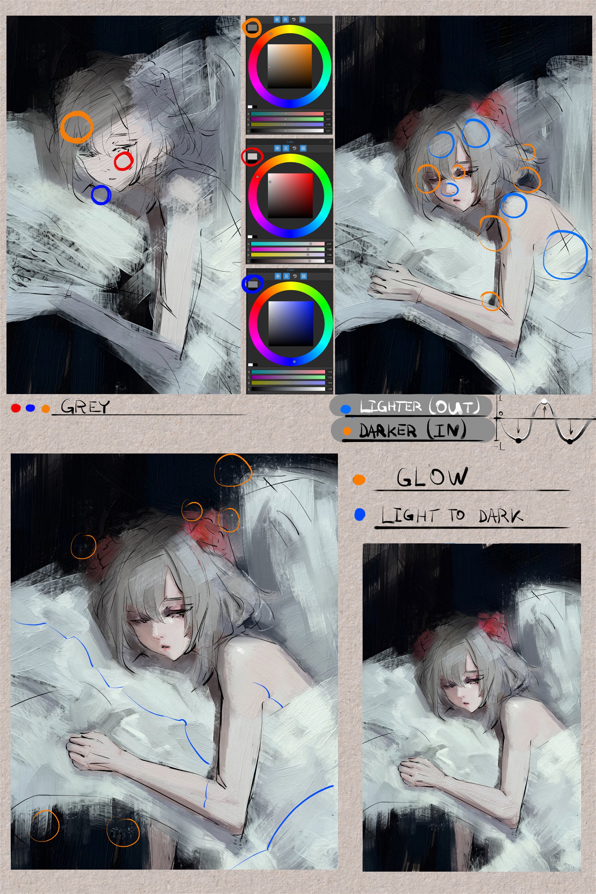
_____________________________________________________________________________________________________
Thank you, Ivan, for these tips on how to work with depth and color vibrancy. We believe your tips and examples will be helpful to those who are just starting with drawing or find themselves in need of more practice.
Happy Painting,
Escape Motions Team
----
Visit Ivan's portfolio: escapemotions.com/featured-artists/ivan-seelnon
What do you think?
0 Responses
0
Upvote
0
Funny
0
Love
0
Surprised
0
Angry
0
Sad
Sign in to comment!
Be the first to comment.