

Welcome to the Rebelle Master Series! Daniel Ibanez, an American painter and educator takes you on a journey of discovering the unique style and techniques of different traditional artists while trying to recreate it on digital canvas in Rebelle. This time, we will look at J.C. Leyendecker and the illustrations that changed commercial art in the early 20th century. How can we apply this unique approach to our paintings today?
After a successful Rebelle Master Series by Daniel Ibanez from last year, which discussed John Singer Sargent’s legacy, we are back with the series. We hope that the exploration of J.C. Leyendecker’s illustrations and the following application to your projects will help you enhance your work with stylish sharp lines. This series contains four parts, which will premiere on our YouTube channel in the following weeks. Subscribe to our channel and do not miss any new tutorials.
Elegant Artworks for Mass Publication
Joseph Christian Leyendecker was a prolific American illustrator known for his distinctive style and iconic advertisements. Born in Germany in 1874, Leyendecker immigrated to the United States with his family at a young age. He studied at the Académie Julian in Paris before returning to America to begin his career. Leyendecker's work graced the covers of popular magazines like The Saturday Evening Post, where his illustrations became synonymous with the American way of life in the early 20th century. He is perhaps best remembered for his creation of the Arrow Collar Man, an advertising campaign that helped define the idealized image of masculinity during his time. Leyendecker's influence on American illustration and advertising continues to be felt to this day.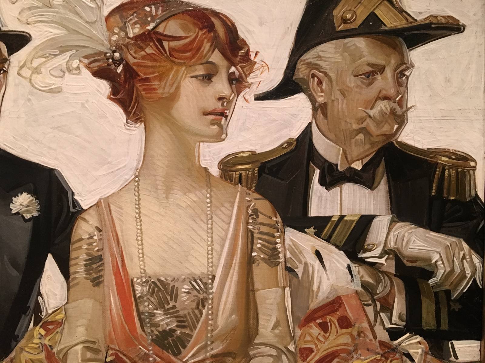
In the Stands 2, Oil on canvas, 21x37 1/2 in, Arrow Collar Advertising, 1913.
Master Study
When examining J.C. Leyendecker’s brushwork and design trends, we are looking at the golden age of illustration from 1880 to around 1930. To start the master study, we need to pay attention to the lines and shapes as these simple building blocks of art are crucial for almost any style. They are very important for the art persuasion of Leyendecker. In his illustrations, you can see very attractive contours in the silhouettes or the profiles of the figures and a lot of design sensibility that goes into the linework.
Let’s take one of Leyendecker’s paintings as a reference and focus on the linework of the sketch. If needed, use a Transform tool to adjust those lines quickly. Once happy with the sketch, we can start blocking colors. Think of dropping a Color Picker into a general area, what would be the average tone temperature and value of the area? In this case, reddish Auburn tones for the hair, tan beige cream colors for the skin, and pinky white color for the background. We are just creating something like a tile mosaic of the image and this is really strong commonality between the work of Leyendecker and the traditional artists like John Singer Sergeant.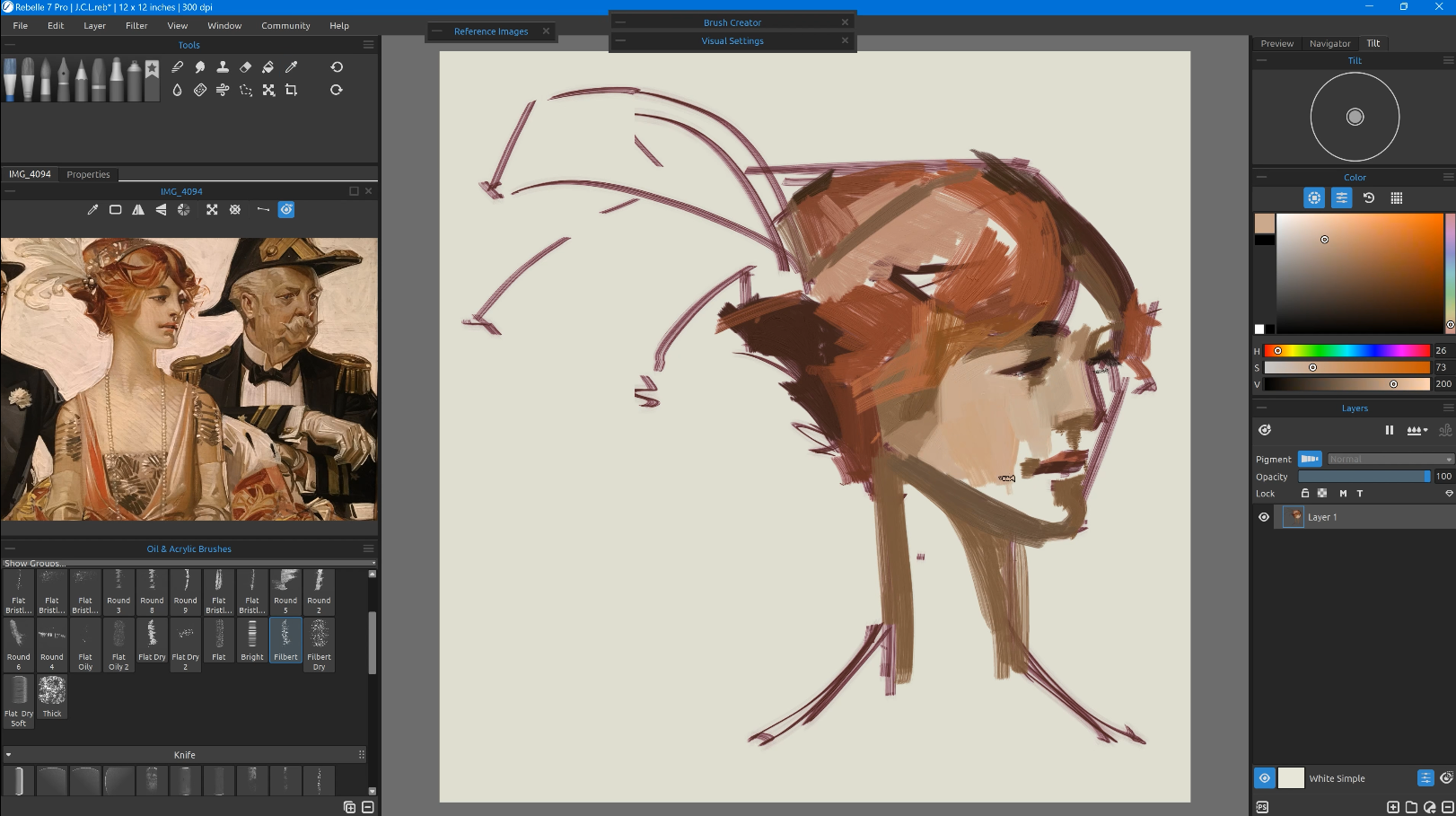 Even though the beginning process was similar for Leyendecker and Sargent, the treatment of the brush and the brushwork differentiates them. Leyendecker’s stylization of the figures is much stronger. We can notice strong linear elements, sometimes sepia or burning-toned lines will enter into the figure but a lot of times they just define the outer contour.
There is also sort of a light quality that activates angular marks that show up on the nose, the lips, the cheek, and the chin. You can see Leyendecker paints features realistically or naturalistically but with an angular unblended dynamic finishing mark.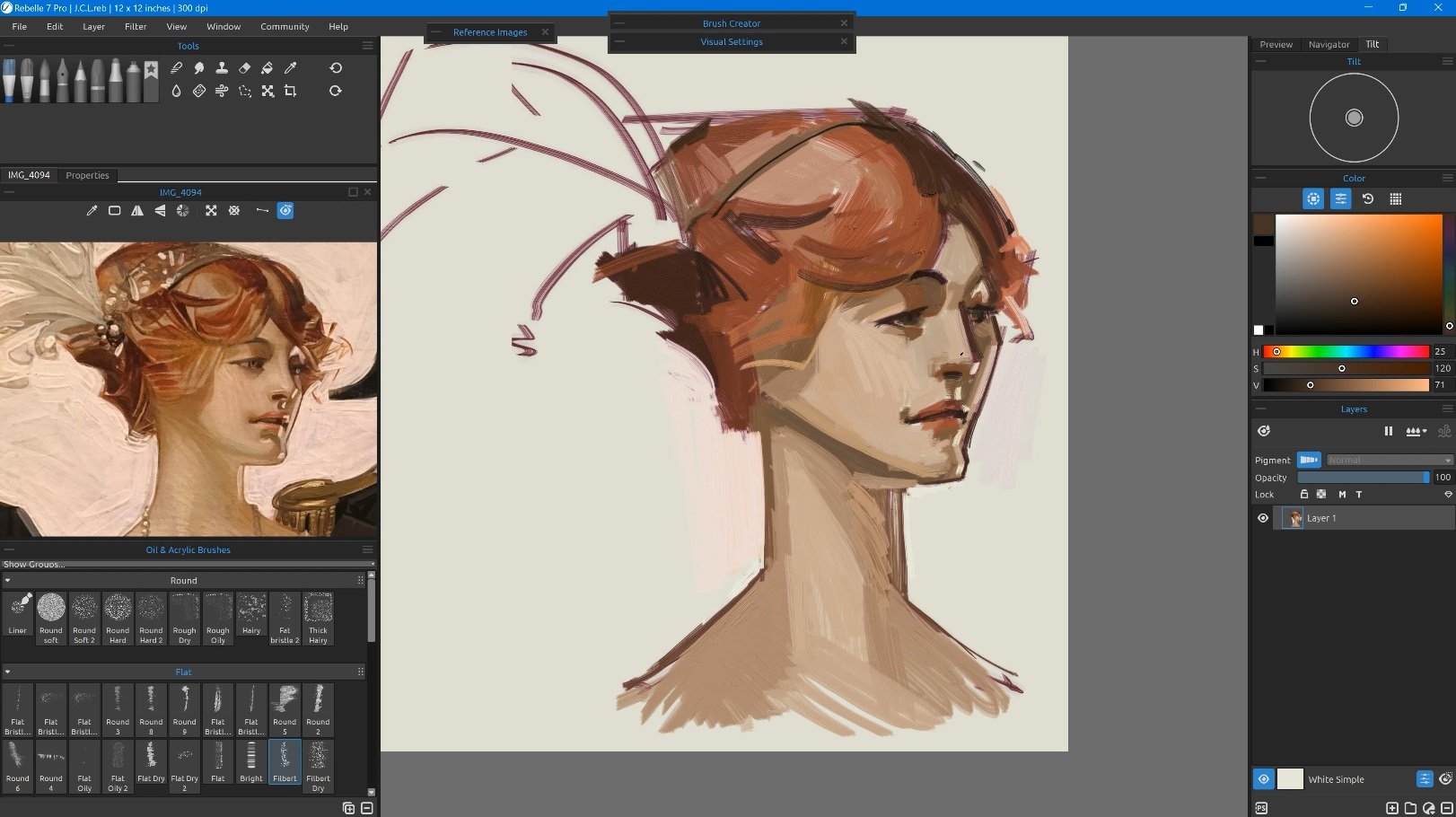 In the next phase, we can approach the refinement of the artwork. If you are doing this painting or you chose a different reference, paint smooth gradients to build up the value structure from dark to light and then leave it as it is. Paint it as if you're just painting a normal semi-stylized portrait right where there's a little bit more attention on the linear elements and the design sensibility of the facial features. Make sure the design has a lot of angles and a lot of interaction of those triangles and angles and that you get some dynamic lines. The synthesis of all of these elements coming together is a very attractive design, so you can see why there's some gravity around Leyendecker’s work even after a hundred years. One thing you will surely enjoy when you're painting in this style is allowing your design sensibilities to come to life.
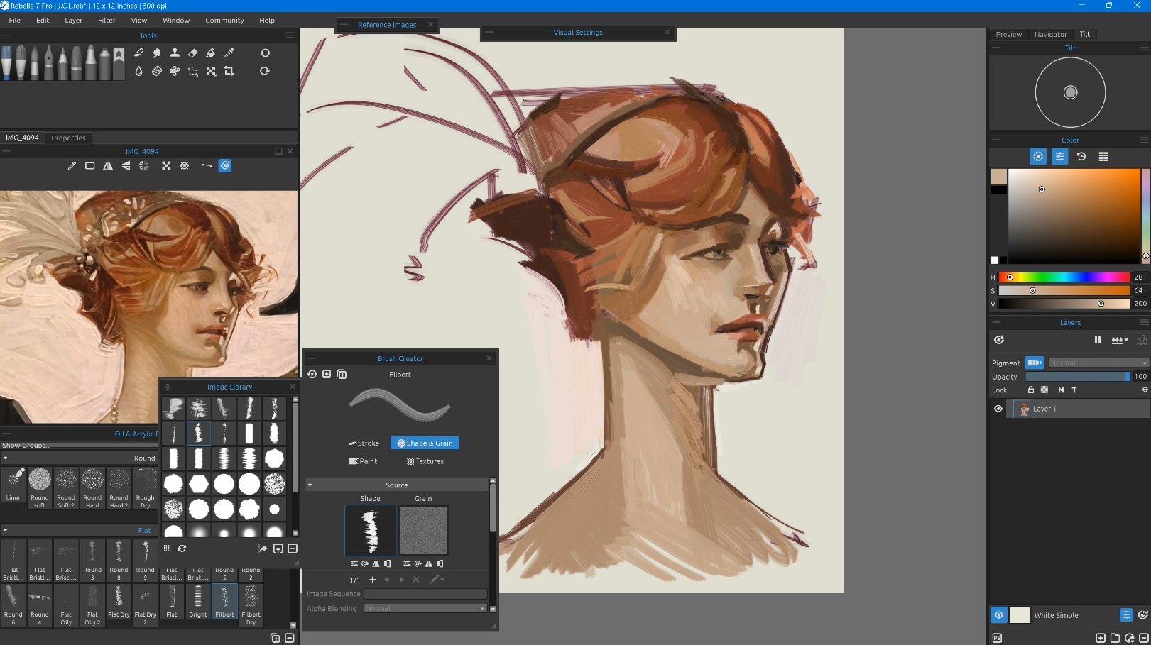 More important than doing an accurate Master Study is to get the gist of it and be ready to do your design work in this style later. When looking back, surely, you will see the mistakes and things you would do differently, but jumping into a project like this is going to be a bit of a journey, so allow yourself to have just some play time in the beginning when you are not worried about outcomes.
Watch this video on YouTube: youtu.be/GPhJeiZJrbw
There is this interesting position between curvy linear elements and strong angular linear elements and when you assess the interaction of those (it's a matter of your sensibility), there is a huge body of work you can look at to get cues and tips on how the master artist does it. It almost feels like a schema that Leyendecker has created, a method for how you can handle these objects or features. Knowing that just embrace what you see and have fun with it.
A Simple Object in Leyendecker’s Style
To apply what we learned from the master study, we are going to paint a simple little object, in this case, a pear. You can continue in replicating Leyendecker’s work or you can move quickly to paint something original in this style.
So just like with the master study, our first step is to frame the line work with the typical angular marks. Then apply some darker values and work up towards lighter values to establish the value scale early on. If we have white paper or light paper, getting those darks in early not only gives us the bones and structure of the piece but also gives us a point of contrast for that whole value scale.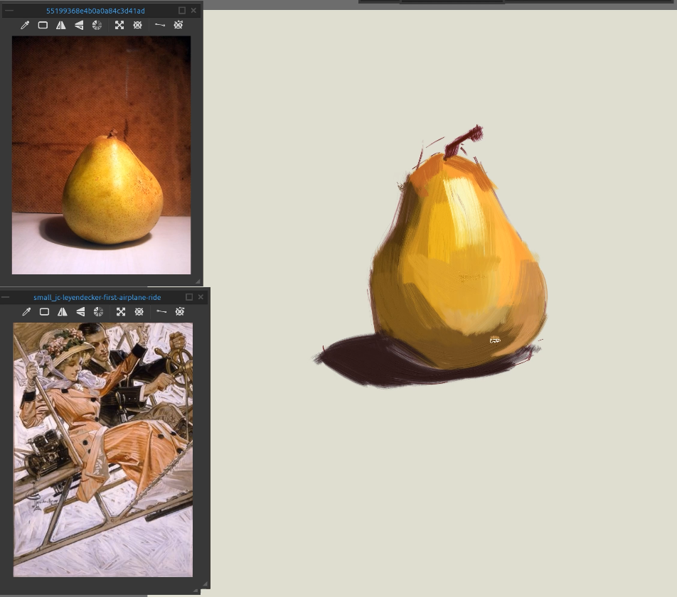 The next step is to use blending tools. Choose a brush that has a nice bristle to it and knock down and smooth out any hard edges. This works great in Rebelle because you can turn any brush into a blending brush. It's the equivalent to taking a brush with no paint on it and just kind of dry brushing over your wet paint in traditional painting. This is just a really quick and elegant process. One of the things we can admire about Leyendecker is that he does have a strong background in the fundamentals so he can break down complex subjects quite quickly and render them out in a beautiful way. We can see that he has drawn figures very realistically but then he does a sort of post-rendering treatment. In modern-day times, it's sort of like the equivalent of some kind of filter you might put on the photo. Leyendecker’s filter would be one that accentuates the outer contour through a highlighting linear element and a shadowy linear element. These marks are designed to be very dynamic and energetic and give the piece a visual punch so typical for his work. We need to use exaggerated angular contouring and then we need to make sure that those contouring elements are using both a black and a white outline further.
Watch this video on YouTube: youtube.com/watch?v=tKRVACislyA
To finish off the pear in Leyendecker’s style, we have a couple of things left to do. One is to put tone on the background and then do the white paint over as he does. Remember this is a commercial artist who's looking to be publicity-oriented or someone whose work is intended to help market or sell products or brands or identities. It’s definitely not fine art. This step has a little bit to do with painting but a lot to do with stylization and the way we're going to get at this is to use the Warp tool. You can kind of turn the artwork into something that's very pliable and stretchy. If you look at the figures that we used as our inspiration, they're realistic, they look like real people but there's a stylization where everything is designed around a schema. We're stretching the pear and warping it to make it look more attractive and elegant.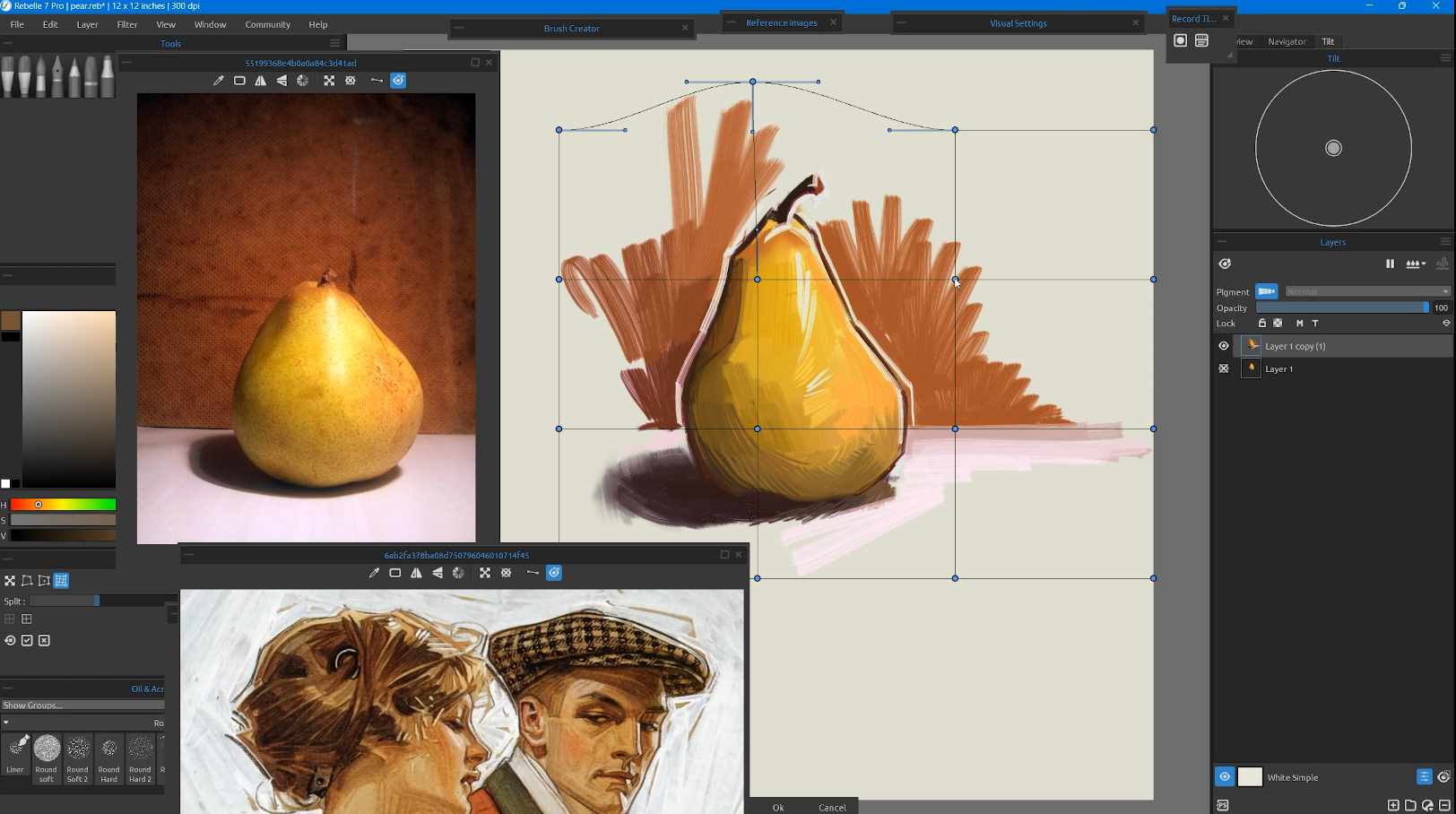 If we can create a simple mundane object in Leyendecker’s style in Rebelle using default brushes and a few tools, I am pretty confident we can recreate any of his work or apply his unique marks to our designs.
Take It a Step Further
The video Rebelle Master Series on Leyendecker contains four parts. While the content of the first two parts was briefly described above, we encourage you to visit our YouTube channel to see more of a practical application of Leyendecker’s style. In the third part, Daniel Ibanez takes a reference image of his wife while recreating the angular and dynamic brush strokes to get a sense of Leyendecker’s mentality and mindset.
Watch this video on YouTube: youtu.be/BNrWEcLDE0c
The last part is like a cherry on top of this master series. We get to take the techniques we learned and adapt them to our purposes. To your own designs, illustrations, and sensibilities.
Watch this video on YouTube: youtu.be/Qesq5Aoj9ug
Our hope is that this master study persuades you that you can paint like a real master in Rebelle. We hope you will be encouraged to research Leyendecker further and find your favorite images and aspects of his work.
Happy Painting,
Escape Motions Team
-----
Daniel Ibanez is a fine artist and illustrator who works out of beautiful Colorado. He grew up plein air painting mountain landscapes and western imagery. He has a love of painting the human figure, portraits, and landscapes. Daniel has worked on films, comics, video games, and tabletop games. While his range of subjects is diverse, all of his work is rooted in his traditional art background. He has been an oil painter since he was 13 years old. His work covers a wide spectrum of subjects, from sci-fi illustrations to alla prima landscapes. He has a digital portrait painting class with Domestika and a growing YouTube channel for tutorials and demonstrations. Find him on Instagram and say hello!
Reference images source: National Museum of American Illustration
What do you think?
0 Responses
0
Upvote
0
Funny
0
Love
0
Surprised
0
Angry
0
Sad
Sign in to comment!
Be the first to comment.