
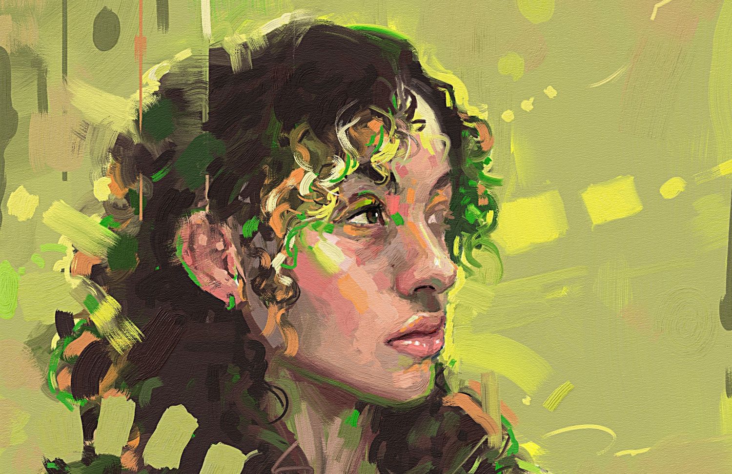

In the new tutorial series with Ludovico Clovis, Rebelle Featured Artist, we are exploring traditional painting habits and their application to the digital painting process. Let's treat Rebelle as a physical painting setup from the get-go. The goal of this first exercise is to train yourself to rely on observation, value grouping, and stroke intent rather than tool switching.
If you have ever tried painting with traditional media, you already know how unforgiving the process can be. One mistake can ruin hours of work, and fixing it often requires repainting large sections. Digital painting may offer more flexibility, but it does not automatically guarantee better results. Even with unlimited undo options, artists frequently end up with images that feel confusing, flat, or visually unbalanced.
The difference between a successful painting and a frustrating one usually comes down to one thing: planning. Professional artists rarely jump straight into detailed rendering or color experimentation. Instead, they construct their paintings step by step, starting with the fundamental visual structure that controls how the viewer experiences the image.
Watch this tutorial on YouTube: youtu.be/C9FqmsEwqzM
Preparation Process for Painting
One helpful rule during the learning stage is to limit yourself to a single brush. Many beginners spend too much mental energy switching between brushes, adjusting settings, or experimenting with digital tools. While brushes can influence style and texture, they are not the foundation of a strong painting. By using one brush, you reduce distractions and force yourself to focus on what actually matters: shapes, values, edges, and composition. This approach also mimics traditional painting, where artists typically rely on a small set of brushes and focus more on observation and structure.
Where Should Your Composition Lead?
The first concept that must be understood before any painting begins is the center of interest. This is the element in the image that you want viewers to notice first. Every strong painting guides the viewer’s attention intentionally, and the center of interest is the destination toward which the entire composition leads. Without a clear focal point, a painting feels scattered because every element competes equally for attention.
Many art tutorials recommend starting with a black-and-white value study, but simply painting in grayscale does not automatically teach you how to control attention. The real purpose of working with values is to understand how artists manipulate light and dark contrasts to guide the viewer’s eye.
Values refer to how light or dark a shape appears. They are one of the most influential elements in visual art because human vision naturally detects contrast before anything else. This is why black text on white paper is easy to read, and why shapes with similar values can become difficult to distinguish from a distance. Our brains rely heavily on value contrast to recognize objects and navigate visual information. Because of this, values play two major roles in painting. First, they make objects visible. Second, they control where attention goes. When all elements in a composition have equal contrast and brightness, everything becomes equally important, which weakens the visual hierarchy. When one element contains a stronger contrast than the rest of the image, it immediately attracts the viewer’s attention and becomes the focal point.
"Values play two major roles in painting. First, they make objects visible. Second, they control where attention goes."
Importance of Values
When planning a painting, it helps to decide early whether the image will be high-key or low-key. A high-key painting contains mostly light values with darker accents, creating a bright and airy atmosphere. A low-key painting, on the other hand, is dominated by darker tones with small areas of light. Both approaches can work beautifully, but choosing one early helps establish the overall mood and structure of the image.
Another important practice is limiting the number of values used during the planning stage. Many beginners attempt to include too many subtle tonal differences immediately, which complicates the composition and encourages premature detailing. Instead, professional artists often simplify value structure into three or four main value groups. These groups might consist of darks, mid-darks, mid-lights, and lights. By organizing the painting this way, the artist can focus on the major shapes and relationships without getting distracted by smaller transitions.
It is also helpful to think of values as groups rather than isolated tones. Instead of treating every shape independently, artists cluster similar values together into larger masses. These value groups create a clear visual structure and prevent the image from becoming fragmented. Once the major value shapes are established, smaller variations can be introduced later without disrupting the composition.
"Simplify value structure into three or four main value groups. These groups might consist of darks, mid-darks, mid-lights, and lights."
Values vs. Colors
After the value structure is working, color can be added on top. One of the most important principles to remember is that color should support the values rather than replace them. A painting with strong value relationships can still look convincing even if the colors are simple. However, beautiful colors cannot fix a painting that lacks clear value contrast.
Color contributes additional layers of contrast through temperature, saturation, and hue. Temperature refers to the perceived warmth or coolness of colors, such as warm reds and oranges versus cool blues and greens. Saturation describes how intense or muted a color appears. Highly saturated colors feel vibrant and energetic, while desaturated colors appear softer and more neutral. Hue simply refers to the color itself, such as red, blue, or purple.
These three properties allow artists to create subtle variations in attention. For example, a focal point might combine stronger saturation, sharper temperature contrast, and slightly higher value contrast than the surrounding areas. Meanwhile, less important parts of the painting can remain more neutral and subdued.
When choosing colors, it is helpful to think in terms of dominant colors and accent colors. The dominant color shapes the overall atmosphere of the painting, while accent colors introduce contrast and visual interest. Many artists also use color harmonies to guide their palette choices. These harmonies are based on relationships on the color wheel, such as complementary colors, analogous colors, or triadic schemes.  A useful trick when analyzing a palette is to temporarily increase the saturation of the colors. Highly saturated colors are easier to identify on the color wheel, which helps reveal the underlying harmony. Once the relationships become clear, the colors can be desaturated again to achieve a more natural or painterly result. Many beginners make the mistake of leaving colors fully saturated, which can make a painting look artificial. Introducing muted tones creates contrast and allows the more vibrant colors to stand out.
"Color contributes additional layers of contrast through temperature, saturation, and hue. These three properties allow artists to create subtle variations in attention."
Final Stage: Painting Process
When the values and colors are planned, the final stage is the painting process itself. At this point, the focus shifts toward brushwork, edges, and refinement. Because the major decisions have already been made during the planning stage, the painting process becomes far more enjoyable and experimental. Instead of worrying about whether the composition works, explore textures, expressive brush strokes, and subtle variations.
Edges play an important role in directing attention during this stage. Sharp edges tend to attract the viewer’s eye, while soft edges fade into the background. By sharpening edges near the focal point and softening them elsewhere, artists can subtly guide the viewer through the composition. Details work similarly. Areas with dense detail draw attention, while simplified areas allow the eye to rest.
One advantage of planning a painting thoroughly is that it provides a reliable structure that supports creative freedom. Once the composition, values, and colors are established, the artist can experiment without fear of ruining the image. Unexpected brush strokes, texture variations, or lighting adjustments can enhance the painting rather than destabilize it.
In the end, successful paintings rarely happen by accident. They are built through a sequence of deliberate steps that guide the viewer’s experience from the first glance to the final details. By starting with values, supporting them with thoughtful color choices, and finishing with expressive brushwork, artists can create images that feel both intentional and visually engaging. The most important takeaway is that most of the difficult decisions in a painting should be made before the final brushstrokes begin.
We’ll dive deeper into this topic with Ludovico in the next part. Stay tuned!
Happy Painting,
Escape Motions Team
-----
Ludovico Clovis is a digital and traditional figure painter. His style is influenced by the visible brushwork and color usage of the impressionist painters, mixed with different abstract techniques. When he isn’t working digitally, he is using oils, acrylics, watercolor, and charcoal.
See his portfolio: www.escapemotions.com/featured-artists/ludovico-clovis
What do you think?
0 Responses
0
Upvote
0
Funny
0
Love
0
Surprised
0
Angry
0
Sad
Sign in to comment!