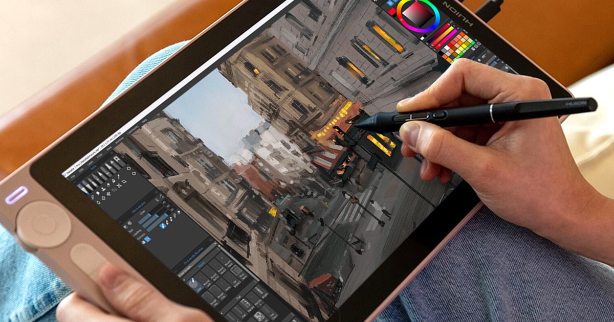



Impasto painting has a way of grabbing your attention. Thick strokes catch the light, colors blend into beautiful streaks, and every mark feels physical and deliberate. Yet achieving that effect digitally isn't as simple as increasing paint thickness and hoping for the best. In this tutorial, Ludovico Clovis provides four tips on how to work with thick impasto in Rebelle.
One of the biggest misconceptions about impasto painting is that any thick-paint brush will produce convincing results. In reality, the result is often disappointing. Paint becomes lumpy instead of expressive. Brushwork feels muddy instead of confident. Every stroke has texture, yet somehow nothing stands out. The problem isn't a lack of paint thickness. It's a lack of structure.
Creating compelling impasto paintings requires understanding how texture, brushwork, and paint depth work together. Once those principles are in place, the thick paint becomes more than just a visual effect, it becomes another design tool that helps communicate form, focus, and emotion.
Watch on YouTube: youtu.be/NTwdjlTna-Q
Tip 1: The Right Tool Creates the Right Effect
When most people imagine impasto painting, they're not thinking about traditional brushwork. They're thinking about palette knives dragging paint across a surface, creating thick ridges, broken edges, and unexpected color variations. That's why brush selection matters so much.
While bristle brushes can create incredibly thick-paint effects, they don't always produce the distinctive knife-like quality associated with classic impasto work. Palette knife tools introduce sharper edges, more natural paint buildup, and the streaking effects that make thick paint feel alive. Download the palette knife created by Ludovico Clovis for this tutorial here.
Another important characteristic is color mixing. One of the reasons traditional impasto paintings feel so rich is that colors aren't perfectly blended. Paint picks up traces of neighboring colors, creating subtle streaks and variations throughout a single stroke. Without that effect, thick paint can feel artificial and flat. The goal isn't simply to make paint thicker. The goal is to make thick paint behave naturally.
Tip 2: Bold Brush Strokes
Artists constantly hear the advice to use "bold brushstrokes," but the phrase is rarely explained. Most people assume boldness means painting larger strokes. Others think it means using more paint. Neither definition is entirely accurate.
A brushstroke becomes bold because it contrasts with what's around it. If every brushstroke in a painting is large, then large strokes stop feeling bold. If every stroke is thick, then thickness loses its impact. If every mark is colorful and dramatic, nothing stands out anymore. Boldness exists because of contrast. A single small stroke surrounded by larger ones can become the most noticeable mark in the painting. A single cool color inside a field of warm colors immediately attracts attention. Even a soft, subtle brushstroke can feel bold if it differs enough from everything around it. This principle explains why some paintings feel dynamic while others feel repetitive. The strongest brushwork isn't necessarily the most aggressive. It's the brushwork that introduces variety.
Tip 3: Paint Thickness as a Compositional Tool
Most artists think of composition in terms of value, color, and shape. Impasto introduces another layer of control: physical paint thickness. Thickness can guide attention just as effectively as color or contrast.
Imagine a portrait where the thickest paint is concentrated around the eyes, highlights, and focal areas. Those regions immediately become more visually important. They feel closer, more tactile, and more deliberate. Now imagine spreading that same heavy paint evenly across the entire painting. The effect disappears. Nothing stands out because everything is competing for attention. This is a common mistake when artists first discover thick paint tools. The excitement of the effect encourages them to use it everywhere. Instead of creating emphasis, the thickness becomes visual noise.
A more effective approach is to reserve the strongest impasto effects for areas that matter most. When thickness is used selectively, it becomes another method of directing the viewer's eye.
Tip 4: Impasto Creates Form and Depth
Impasto can also strengthen the illusion of form. One of the most powerful ways to do this is by allowing brushstrokes to follow the structure of the subject. The direction of a stroke can describe the curve of a cheek, the roundness of a nose, or the flow of hair. Rather than fighting against the form, the brushwork reinforces it. This approach adds clarity without requiring additional rendering.
What's particularly interesting is that there isn't always one correct direction. A face, for example, contains multiple planes and multiple axes. One area may benefit from horizontal strokes while another benefits from vertical or diagonal movement. The important thing is that the stroke direction supports the structure you're trying to describe. In traditional painting, thick paint physically protrudes from the canvas. Digital impasto simulations recreate that effect by allowing paint to cast shadows and catch light differently depending on its height. This means thickness can become part of your rendering strategy.
Highlights often benefit from heavier paint because they naturally represent surfaces that feel closer to the viewer. Building up paint in these areas enhances that sensation. Shadows, on the other hand, can often remain thinner.
This contrast between thick lights and thinner darks creates a subtle but convincing sense of volume. The subject doesn't simply appear painted, it appears constructed from layers of material. The effect can be remarkably powerful when used with restraint.
Final Thoughts
What makes an impasto painting successful isn't the amount of paint on the canvas. It's the way that paint is used.
Thickness becomes meaningful when it creates contrast. Brushwork becomes powerful when it remains fresh and varied. Texture becomes effective when it supports form rather than overwhelming it. The best impasto paintings use paint intentionally. They understand where to build thickness, where to simplify, where to sharpen edges, and where to let strokes remain loose and expressive. When those decisions work together, impasto stops being a special effect and starts becoming a language that communicates structure, depth, focus, and personality all at the same time.
Happy Painting,
Escape Motions Team
-----
Ludovico Clovis is a digital and traditional figure painter. His style is influenced by the visible brushwork and color usage of the impressionist painters, mixed with different abstract techniques. When he isn’t working digitally, he is using oils, acrylics, watercolor, and charcoal.
See his portfolio: www.escapemotions.com/featured-artists/ludovico-clovis

What do you think?
0 Responses
0
Upvote
0
Funny
0
Love
0
Surprised
0
Angry
0
Sad
Sign in to comment!