

Took a look around at your surroundings, we’re sure you could spot color or two. Actually, it might be harder to find a lack of colors in most places. Colors are so ingrained in our culture, that we subconsciously choose colors in situations like when we get dressed in the morning or buy a new bedspread for our bed.
Even after our purchase, we may bring it home and wonder why we don’t like that color with the room paint or we aren’t quite feeling right about that bright shirt with our skin complexion. Since colors are all around us, it can be difficult to step away and realize how color can be consciously used when you’re going through a rebrand or an important project.
That’s why Bold Web Design made the Color Palette tool that takes a look at the color palettes for the Fortune 500. It was made for inspiration and education when designers are stuck on color choices in their next project.
When talking about color, it’s natural to attach them to emotions. In fact, in marketing colors are used all the time to evoke a certain feeling. Think about when painting a new room in a house, you choose the color carefully. Light greens are associated with calming, so you may paint your master bedroom that color. Other colors like purple or red are extremely daring - you tend to not see these as much, except for maybe a feature wall.
Yet, you may see purple in a daycare as it sparks playfulness. Think: Barnie is purple! Black and white is a classic color combination that can be seen as sleek or powerful, especially if it’s opposed to the use of color.
For example, companies tend to have a colorful color palette, but brands like Apple stray away from this, showing their power in the industry. Speaking of brands, let’s take a look at a few color palettes below.
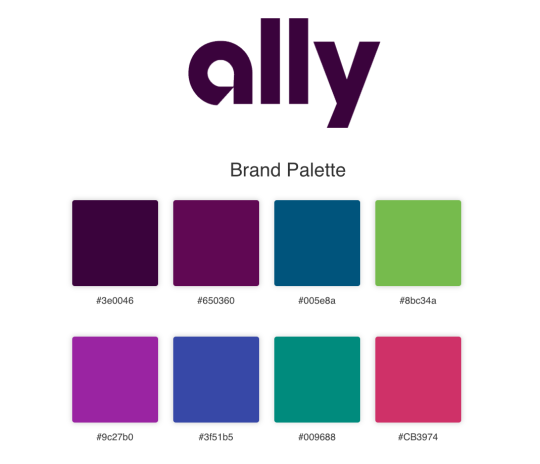
Ally has a pretty creative color palette for being a financial services company, as their main color is purple. Let’s dive deeper.
Purple can be associated with luxury, a term that many would like to hear when dealing with their finances. On the color wheel, purple, blue and orange are all next to each other. These colors subtly complement each other without making a harsh contrast.
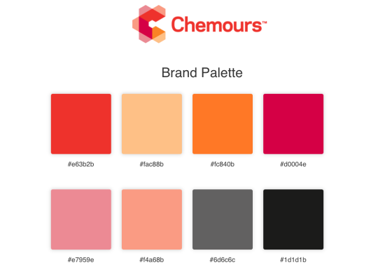
You may need your sunglasses for this one. Chemours chose an extremely bright color palette composed of oranges, peaches, pinks, and reds. Similar to Ally, this brand is choosing colors that are very similar to each other.
Oranges project warmth and optimism - a tactic the company could be using to associate positive feelings with their company. This overall color palette brings an air of optimism to their company perception.
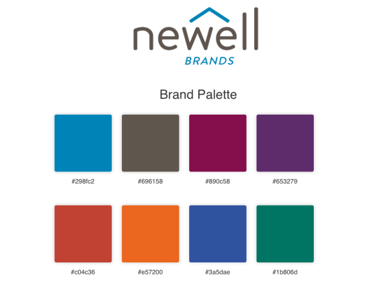
When you have a large consumer pool like Newell, you need to appeal to a lot of different people. Newell’s color palette does just that. This is a great mix of many different colors and spans all over the color wheel.
With a few complementary colors, these colors create much more of a statement against each other. These colors also seem to have a cool tone, which could be compared to the sophistication they have within the consumer industry and their ability to stay on top of trends.
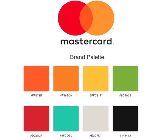
When thinking of your credit card, the last thing you’re paying attention to is the company colors. Yet, Mastercard seems to have a different approach.
While they do have green in their color palette which is commonly associated with health and wealth, they also have a bright orlay of oranges that represent warmth and optimism. While that may not be what most think of when diving into their finances, it’s a good reassures. This considered, Mastercard chose to only stay on one half of the color wheel.
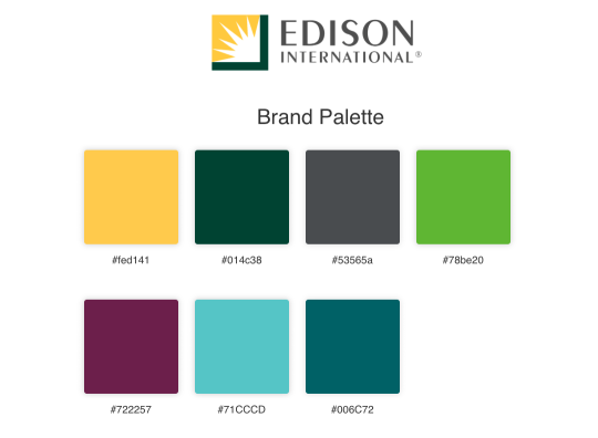
Utilities are the last thing you’d think of when looking at the color wheel. In fact, you may not think of any colors but the basic neutrals like grey and black. Edison International took a different approach though. They seemed to replicate nature in their color palette.
Dark green with the contrast of yellow could easily represent the sun and grass. Purple is definitely the pop of color, a complementary color from yellow on the color wheel.
Conclusion
When it comes to colors, we all may have a bit of a blind spot. We grow up with colors all around us, and although we learn colors in school, generally it’s just to remember the names and maybe the color wheel basics.
Yet, try changing the colors you generally wear for a day. Wear a yellow top if you normally wear black and see if it brightens your mood a bit. Paint your room and see if it changes how other colors look next to your walls. The options with colors are endless. Use them to their full potential.
———
This blog is a guest post written by Debbie Morgan.
About the author: Debbie Morgan is a writer that loves adding a witty analogy to any concept. With experience in the design and marketing industry, she’s seen her fair share of designing do’s and don’ts but loves to bring color to her explanations of these helpful concepts.