

Color is an integral part of how we perceive the world around us. It often carries information about the things we encounter. The color of the objects reveals much more about them than we realize - that's what makes the color a powerful tool. The movie creators work with colors consistently, and their individual use in the film affects our experience, even though we may not be aware of it.
Color can be used to signal action, influence mood, and even influence physiological reactions. It can affect us emotionally, psychologically, and even physically, usually without us becoming aware. The best filmmakers understand this since the times when black-and-white cinematography ceased to dominate the approach to filmmaking.
Until the 1970s, the theory persisted that black-and-white film was more honest and aesthetically pleasing than color film. On the other hand, it offered significantly less visual information. In the color film, it is precisely thanks to colors that we are more involved in the story, the dialogues and the psychology of the characters. It is fascinating how color in a movie can build harmony or tension within a scene, bring attention to a key theme, set the tone of the movie, draw attention to detail or show us character traits. Have you noticed? Warm shades of red are used in romantic scenes, cold shades of blue in horror movies, bright green in sci-fi and deep reds in comedies.
The movie creators work with colors consistently, and their individual use in the film affects our experience, even though we may not be aware of it. The experts agree: it is better if we do not realize the influence of colors at all, and it should remain on a subconscious level.
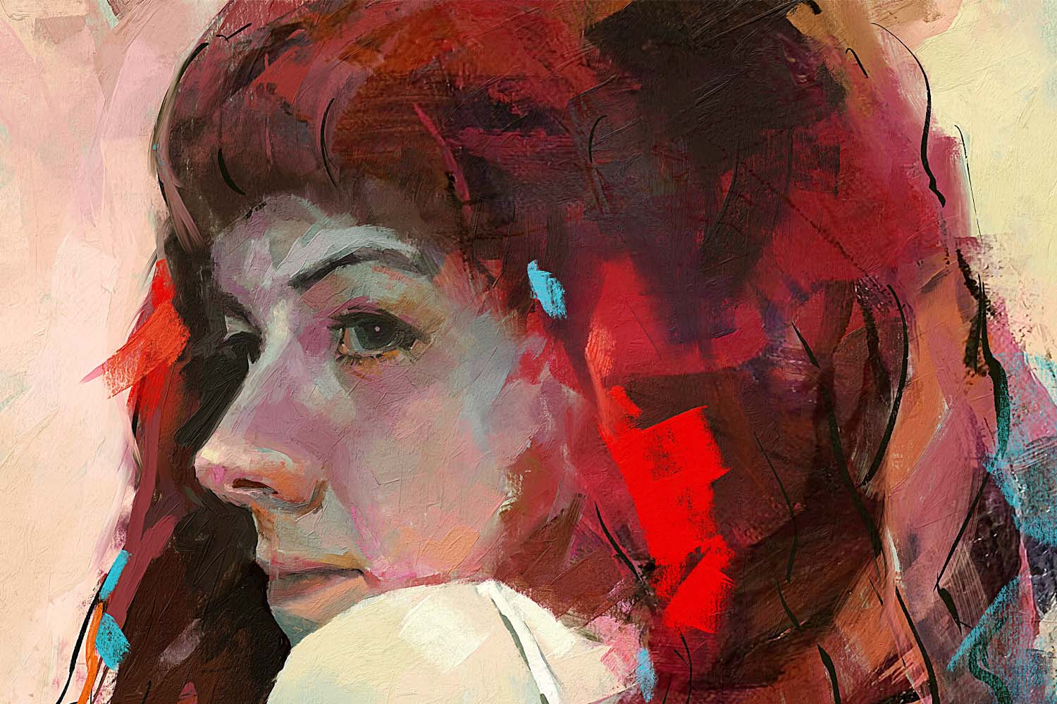
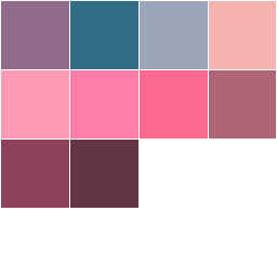
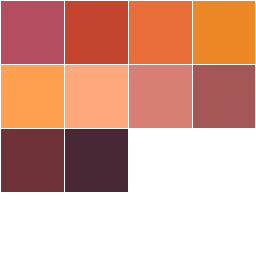
Thanks to the Instagram account @colorpalette.cinema we are bringing you 10 color palettes you can use in Rebelle to bring a similar mood to your artworks using colors. The process is simple, just drag & drop the palette's image from this blog to Rebelle's Color Set panel, and you are ready to start!
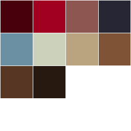
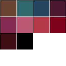
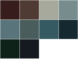
1. Grand Budapest Hotel (directed by Wes Anderson)
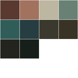
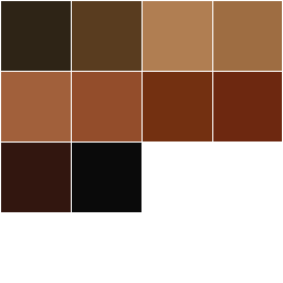
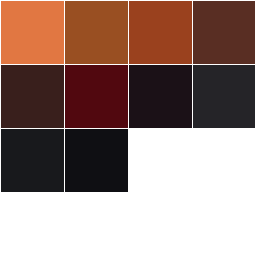
2. The Shining (directed by Stanley Kubrick)
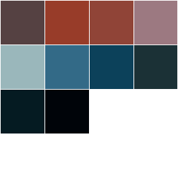
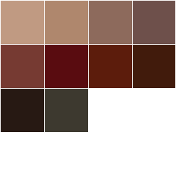
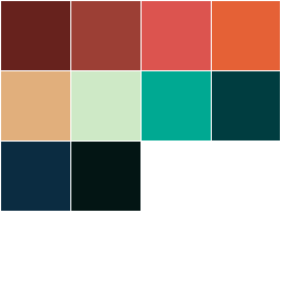
3. Dunkirk (directed by Christopher Nolan)
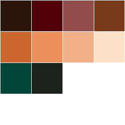
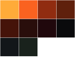
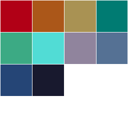
4. The Fifth Element (directed by Luc Besson)
5. Casino (directed by Martin Scorsese)
6. Scarface (directed by Brian De Palma)
7. Prisoners (directed by Denis Villeneuve)
8. Little Women (directed by Greta Gerwig)
9. Joker” (directed by Todd Phillips)
10. Once Upon a Time in Hollywood (directed by Quentin Tarantino)
What movies did you notice used color to influence the mood of the viewer? Is there a movie you like based on the colors it used throughout its scenes? Drop us a comment or even better, recreate a color palette from your favorite movie and post here:
https://www.escapemotions.com/community/forum/color-sets
https://www.escapemotions.com/community/forum/color-sets
Here's how to create your movie color palette:
The first step is to pick a specific scene from a movie and screenshot the image. You then have two options:
OPTION 1:
1. Open the image in Rebelle via File > Open;
2. Click the [ + ] sign in the Color set panel which creates a new, empty color set;
3. Rename the color set;
4. Pick colors from the image manually using the Pick color tool. After you pick each color, drag & drop it to the list of colors in the newly created Color set.
OPTION 2:
1. Open the Color set panel menu;
2. Choose "Create Color Set from Image File" and select how many colors should be picked from the image (4, 9, 16, or 25);
3. Select the image;
4. A new color set will be created in the Color set panel automatically.
Hope you enjoy this blog! We're excited to see your own color palettes and movie taste :)
Your Escape Motions Team
What do you think?
0 Responses
0
Upvote
0
Funny
0
Love
0
Surprised
0
Angry
0
Sad
Sign in to comment!
This is really cool!
We really need a way to reorder colors within a color set, so we can organize the colors how we want. Not just "last used" and "by hue". Sometimes you want to order colors based on objects you plan to paint, etc. A simple CTRL+click should allow you to rearrange the colors, with the option of turning that off through the menu to lock the set to prevent accidental changes.