

Dive into fantasy character oil painting with Rebelle Featured Artist and illustrator, Wes Gardner. In this four-part workshop, he will walk you through the whole painting process, from initial thought to the final touch. Read part one, full of tips on how to create the concept and a perfect layout for your artwork.

As a working illustrator, I’m always on the lookout for ways to improve my craft. Every few months, I like to try a personal “leveling up” piece that I can update my portfolio with. I currently work in the tabletop roleplaying (TTRPG) and card game industries and love the storytelling and narratives the images can convey. With Rebelle, I can successfully transfer my “traditional art” ideas to the digital realm, which allows for greater flexibility when working with Art Directors or publishing houses. Changes no longer take hours, but minutes!
The Concept
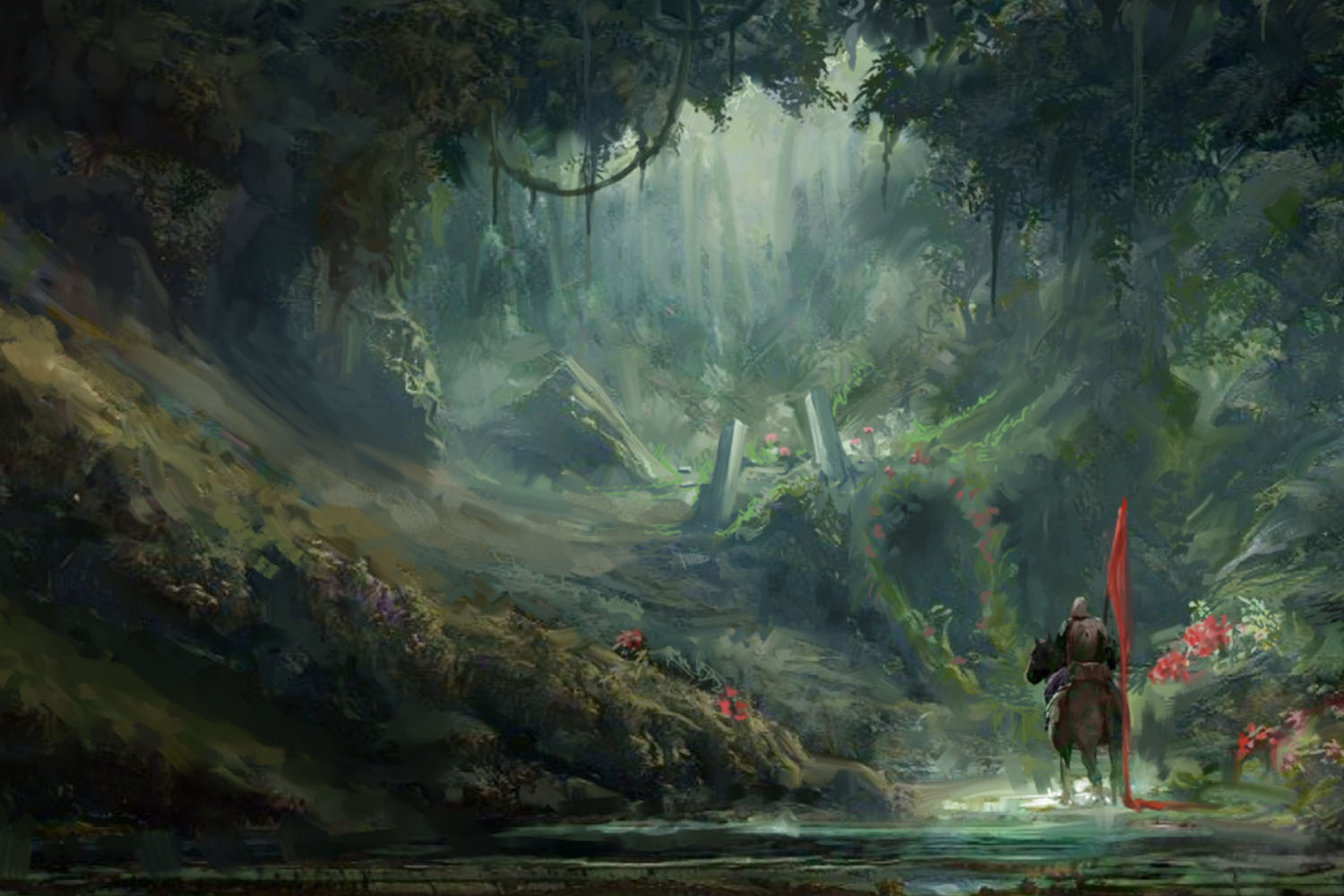
I’ve been meaning to do a new portfolio piece, one that is fantasy art-focused. I love the standard “Ranger” class in my fantasy games and stories (think of Aragorn from Lord of the Rings, or Drizzt Do’Urden from the various R.A. Salvatore classics), and have always had a soft spot for snowy, dreamy landscapes. I want to use this piece to invoke the feel and style of some of my art heroes, a handful of those being Todd Lockwood, Tyler Jacobson, Cynthia Sheppard, and Karla Ortiz. They make incredibly beautiful paintings, almost baroque in nature while transporting the viewer to another reality. For my take on this, I’m thinking of making my painting be of a Ranger taking a walk through a snowy forest, maybe seeing some out-of-place flowers that have somehow overcome the harsh conditions. The focus will be on believability, mood, and lighting.
Setting Goals
I have a few design goals I’d like to hit with this piece, as I’m trying to take the next steps in my card game illustration career:
- Use a standard 4:3 ratio - This ratio is close to what commercial card illustrations are made with
- Have an easy-to-read composition - We want to make sure our artwork can be read at both full-size for playmats or marketing art, as well as “card size”, only being a few inches wide and tall when printed on a playing card!
- Limited palette - this will be helpful not only in making sure the colors we choose work well together, but to make decision-making easier when we’re deep in the painting looking for finishing tones, shadows, and highlights.
- Control my contrasts - have our Ranger be the focal point with the highest contrast, but have the overall composition feel soft and peaceful as if the Ranger’s flower-gazing is his respite from a patrol or a day of stressful hunting and tracking
- Softer, painterly brushwork - for more cohesive edges, and also to reinforce the peaceful nature of the piece. I also have a tendency to make edges too sharp, which starts to make my digital paintings feel artificial and flat. Softer edges and blends will make for a more engrossing final painting.
I find it helpful to make this “checklist of goals” before starting on a piece, as I can always refer back to it if I find myself at a roadblock during the creation process. As long as I can check items off of my goals list, everything else is just a nice bonus!
Creating Canvas
Enough pre-planning, let’s get to painting! So as we established in our goals, we want to keep our image’s ratio 4:3, so slightly wider than it is tall. Since this is also going to be a portfolio piece, I want to make the canvas a decent size to allow for a variety of brush sizes, densities, and techniques. I’ll create the canvas at 4000 pixels wide, and 3000 pixels tall at 150 dpi to allow for a little more pixel density than the web-standard 72 dpi. Note: If your computer is a little older, or you just want a faster painting experience, you can go ahead and cut the pixel count in half (so 2000 pixels wide by 1500 pixels tall) at 72 dpi.
In the New Artwork window, you’ll see an option to change your Canvas. Go ahead and pick your preferred canvas type. Since I want the feel of “classical oil painting”, I’ll choose the CA 01 Canvas.
Now we’re ready to rock!
Prepping Layers and Adjusting Global Settings
The first thing I do with any artwork is to name my initial layers. This helps me keep track of what I’m doing, even before I get fully started! I’ll be mimicking the same style I have for doing traditional oil paint here, so my initial layer setup should be:
- A background (the canvas, untouched by paint)
- An underpainting layer (sandwiched between the background layer and my Sketch layer)
- Sketch layer (to lay down my initial roadmap of shapes before I begin my underpainting)
From here, I want to do a slight tweak to my global Visual Settings (F12). I love the Impasto and Gloss effects that Rebelle provides, as it allows me to get exactly the type of feel that I want. Initially, though, I actually turn both the Impasto and Gloss effects down to 0. While I paint, I don’t want to get too preoccupied with the depth of the paint, I’m just concerned with how the image itself is working and how the paint is blending.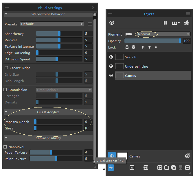
Seeing the impasto and gloss this early is neat, but I’m afraid I would like how a brush stroke looked too much and be afraid to change it! It’s always good to allow yourself some freedom, so the Impasto and Gloss sliders are something we can activate later in the process to see what we have.
Now that we have our piece set up, it’s time to officially start! Let’s begin with our sketch.
Sketching and Landmarking
I’m DEFINITELY a painter, as sketching is not my strong point! With that in mind, my initial sketching and landmarking phase is still vitally important, as this allows me to make sure my composition and shape placement are solid before I start applying paint.
I’m going to make sure my Sketch layer is selected, and I’m going to change the blending mode to Multiply. This will allow me to see the sketch even when we work underneath it, as the Multiply blending mode acts as a sort of “darkening algorithm”, ensuring that my line art is always darker than what is underneath it (unless you paint under it with pure black, of course!).
Rebelle has a fantastic assortment of pencils, charcoals, and pastels. I want to have a fairly dark, thick pencil mark to allow for “happy accidents” while we sketch, which will let me start “seeing” the piece come together.
I select the Pencils category in the Tools window and pick the 4B option under the Pencil Brush subcategory. I also make sure that the blending mode for the brush itself is on “Paint” mode, as I want to have the most control over my marks possible at this stage.
With our tools set, and our Sketch layer set to Multiply, let’s get to drawing!
During this phase, I’m not very interested in making a lot of small decisions, I’m interested in getting the main pose of our ranger, and how his figure relates to the items around him. The image should read well, and already have the “blueprints” of a story, but things like anatomy, the structure of his outfit, the details of the trees, and other nuances aren’t being decided yet.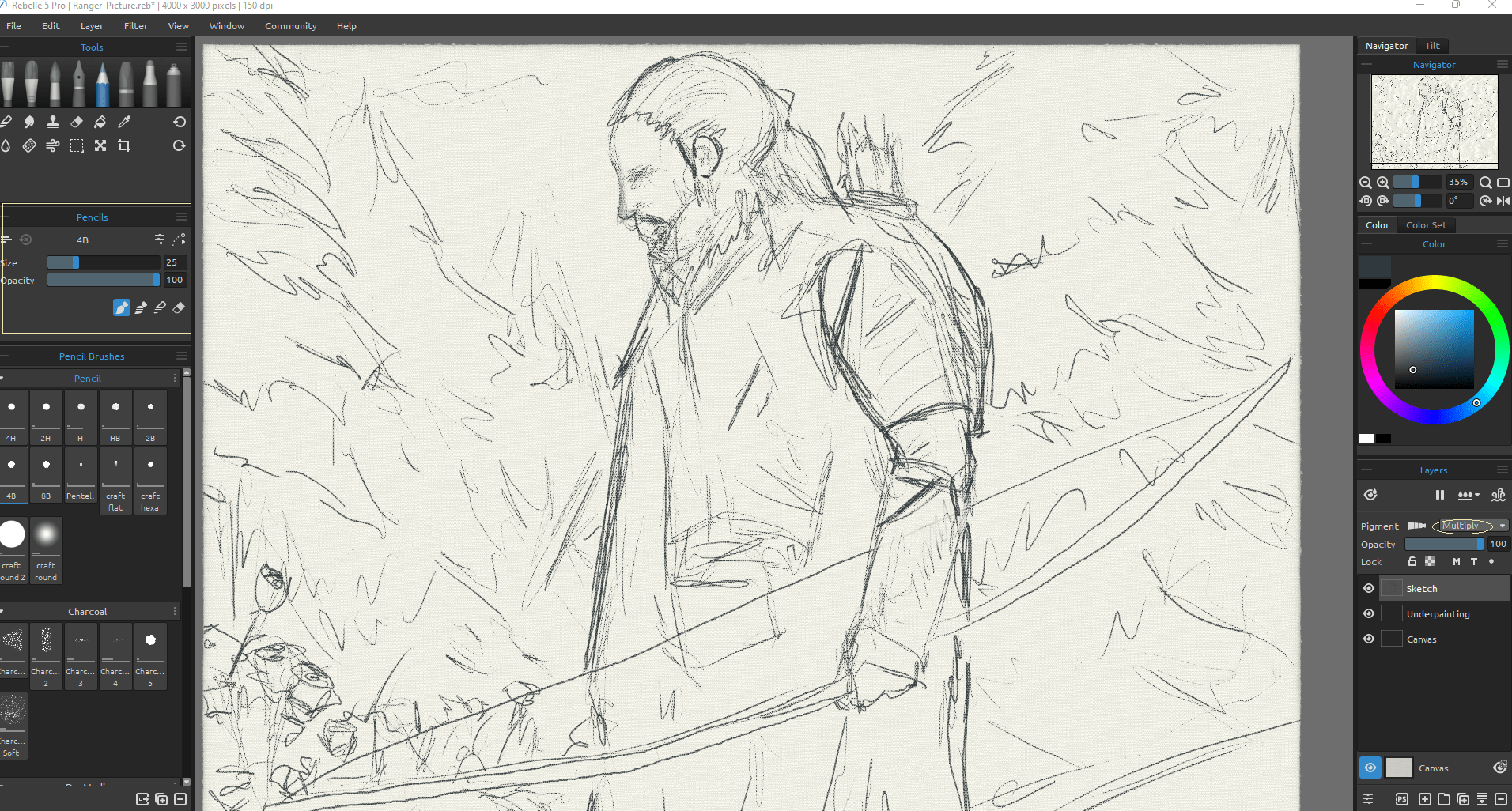 I told you anatomy wasn’t important yet, ha! Don’t worry, we’ll add details and fix stuff in a bit, but my wife likes to say “you can’t edit words that aren’t on the page”, and I think the same thing rings true for creating images. Put stuff on the canvas, we’ll fix it later!
That being said, the more time you spend on nailing this initial drawing and sketch phase, the fewer problems you’ll have to solve down the line. I like the fact that the tree line works as a set of diagonal “guiding lines” leading to our Ranger, and his bow works as a nice framing device bringing the viewer’s eyes back into the canvas if they start to wander to the lower right.
For creating impactful images, always do your best to draw attention to your focal point, even if that means creating shapes that make lines that point directly where you want the viewer to look. It may seem too obvious and an “easy art hack” while you’re creating your image, but it absolutely works!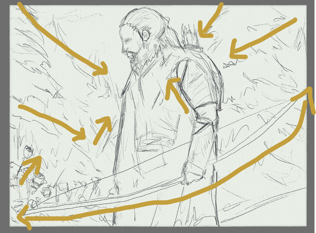 While I’m happy with the outer things such as the treeline, the flowers, and the bow, I think I probably should add a bit of shape and shadow sketching to the Ranger. Defining the shapes of his facial structure, and outfit, and landmarking some folds in the cloth he’s wearing will help during our underpainting step coming up soon. Since I want some finer details, I’ll change from my 4B pencil to the 2B.
With this smaller and less-intense pencil, I’ll go in and plot out some more specific details on my Ranger.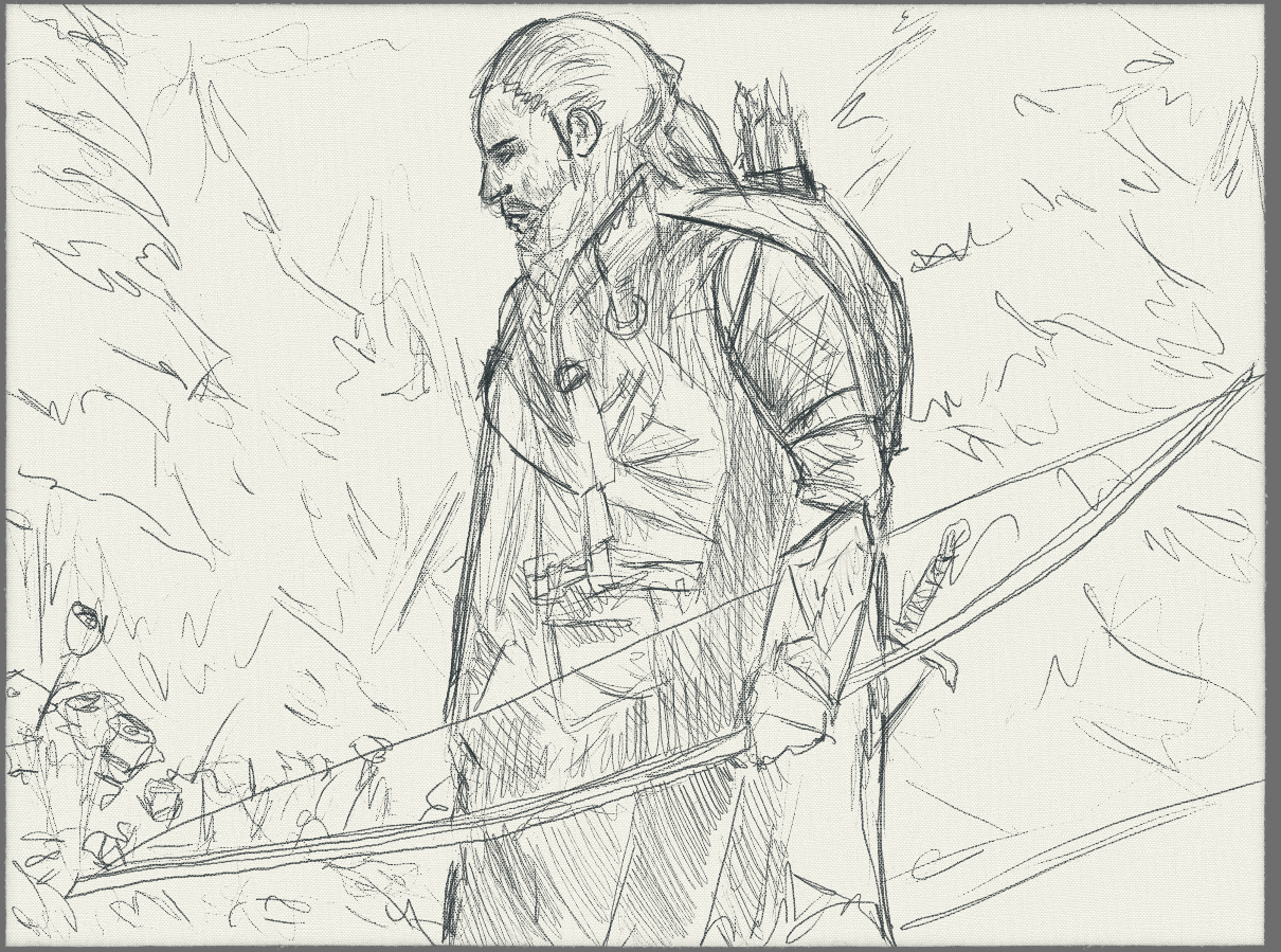 I took the opportunity to refine some shapes (namely the nose, eyes, eyebrows, and the structure of the arm holding the bow) that will aid me momentarily. I also did some scratchy cross-hatching lines to map out where my shadow values will go. I’m thinking this scene will be fairly bright (as it’s daytime in the snow), with the main source of light coming from the upper-right of the scene, in front of our ranger (so basically, between us as the viewer, and the painting itself).
Now that we’ve blocked in some basic shapes and the first bits of “lighting” information, it’s time for our underpainting pass! We will focus on that and more in the second part of this workshop.
Stay tuned!
Escape Motions
text and images provided by Wes Gardner
-----
Wes Gardner is a professional illustrator and freelance artist currently working in the tabletop, card game, and roleplaying game industries with credits that include Warhammer 40k Roleplay: Wrath & Glory, Varia, ADIDAS, Warner Bros., and more. When not working for clients, Wes spends his time mentoring art students, creating tutorials, and posting videos discussing art tips and tricks on his YouTube channel.
Rebelle Featured Artist profile: escapemotions.com/featured-artists/wesley-gardner
Website: wesleygardner.com
YouTube channel: youtube.com/c/WesleyGardner86
Instagram: instagram.com/artofwesgardner
What do you think?
0 Responses
0
Upvote
0
Funny
0
Love
0
Surprised
0
Angry
0
Sad
Sign in to comment!
Be the first to comment.