

Dive into fantasy character oil painting with Rebelle Featured Artist and illustrator, Wes Gardner. In this four-part workshop, he will walk you through the whole painting process, from initial thought to the final touch. Read part two, full of tips on how to add colors to your underpainting.
As a working illustrator, I’m always on the lookout for ways to improve my craft. Every few months, I like to try a personal “leveling up” piece that I can update my portfolio with. I currently work in the tabletop roleplaying (TTRPG) and card game industries and love the storytelling and narratives the images can convey. With Rebelle, I can successfully transfer my “traditional art” ideas to the digital realm, which allows for greater flexibility when working with Art Directors or publishing houses. Changes no longer take hours, but minutes!
Read previous part of this workshop series:
Part I. - Preparing Canvas and Initial Sketch
Underpainting
Since I want this to feel like a traditional painting, I’m going to approach my steps as if I were painting with oils on canvas. Instead of going directly into adding local colors, I want to tone my canvas so it can get rid of the harsh white background, as well as start giving the piece some mood.
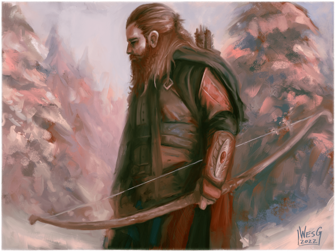
I usually like to use a complementary color to my “main” color for an underpainting pass. This piece is showcasing an outdoor scene in the snow, which will end up being a very “cool” palette, favoring the blues, greens, and cyans. A great way to make sure these hues pop off the canvas would be to lay down a “warm” underpainting, such as an orange, or reddish-brown. With traditional paint, this is a perfect excuse to use Burnt Sienna, one of my favorite underpainting colors, so let’s use that!
I’ll go to my Oils and Acrylics panel, and choose a brush that would give me the most surface coverage in the fastest time. While it’s true you can just choose a color and use your Paint Bucket (Fill) tool to put a full color in with a click of a button, painting in our underpainting (and in turn, the darker and lighter versions of our chosen color for shadows and highlights, respectively) will give us more familiarity with our subject, and give us a better sense of how the painting is working even at this very early stage.
I choose the Flat Oily brush with the Size at 100, Loading at 100, and Oiliness at 90, with the “Paint and Mix” sub-setting selected.
Now it’s time to paint our underpainting! Select your Underpainting layer in your Layers panel. Go ahead and pick a color that fits your “warm” definition (mine will mimic Burnt Sienna or a nice darker copper/burnt-orange color). I want to keep my color’s value (the brightness level) around 50%, as this will act as our initial mid-tone pass. I’m really liking the feel of the brush, so with our “mid-tones” set, I want to add in some darker darks to start mapping in my shadows. I’ll just adjust my Color Selector to be lower on the brightness, and add some saturation by moving to the right.
Using this darker dark color, and following my crosshatched “shadow lines” from my sketch layer, I’ll lay in my darker values. I also make sure to switch my brush’s mode to ‘Paint and Blend” (the third icon in the brush icon properties list), allowing my pressure from my tablet to dictate how much of the darker color is present per stroke.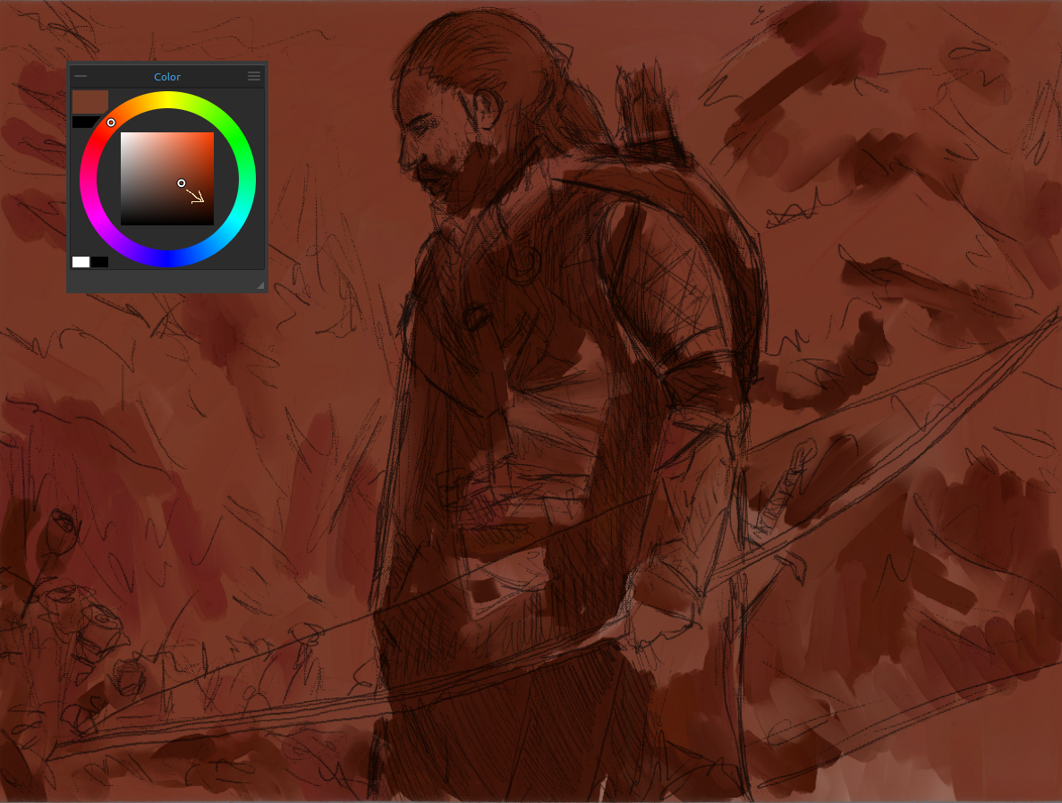 The Ranger has the highest concentration of darker darks, which allows him to appear closer to the viewer and stand out against the background. Where the magic REALLY begins to happen, though, is when we add in the lights. I move back to my original color by Alt-clicking on an area I hadn’t painted with darker-darks, then move up and to the left on the Color Selector.
Remember, shadows have darker values but (usually) higher saturation than our mid-tones, while our lights and highlights are lighter in value (brighter) with lower saturation (usually). We’ll talk about more advanced lighting techniques near the end of the painting.
With our new light color selected, let’s block in our lights! Remember, make sure the ‘Paint and Blend” brush mode is active, letting your pen pressure dictate how much paint you put on your canvas during each stroke.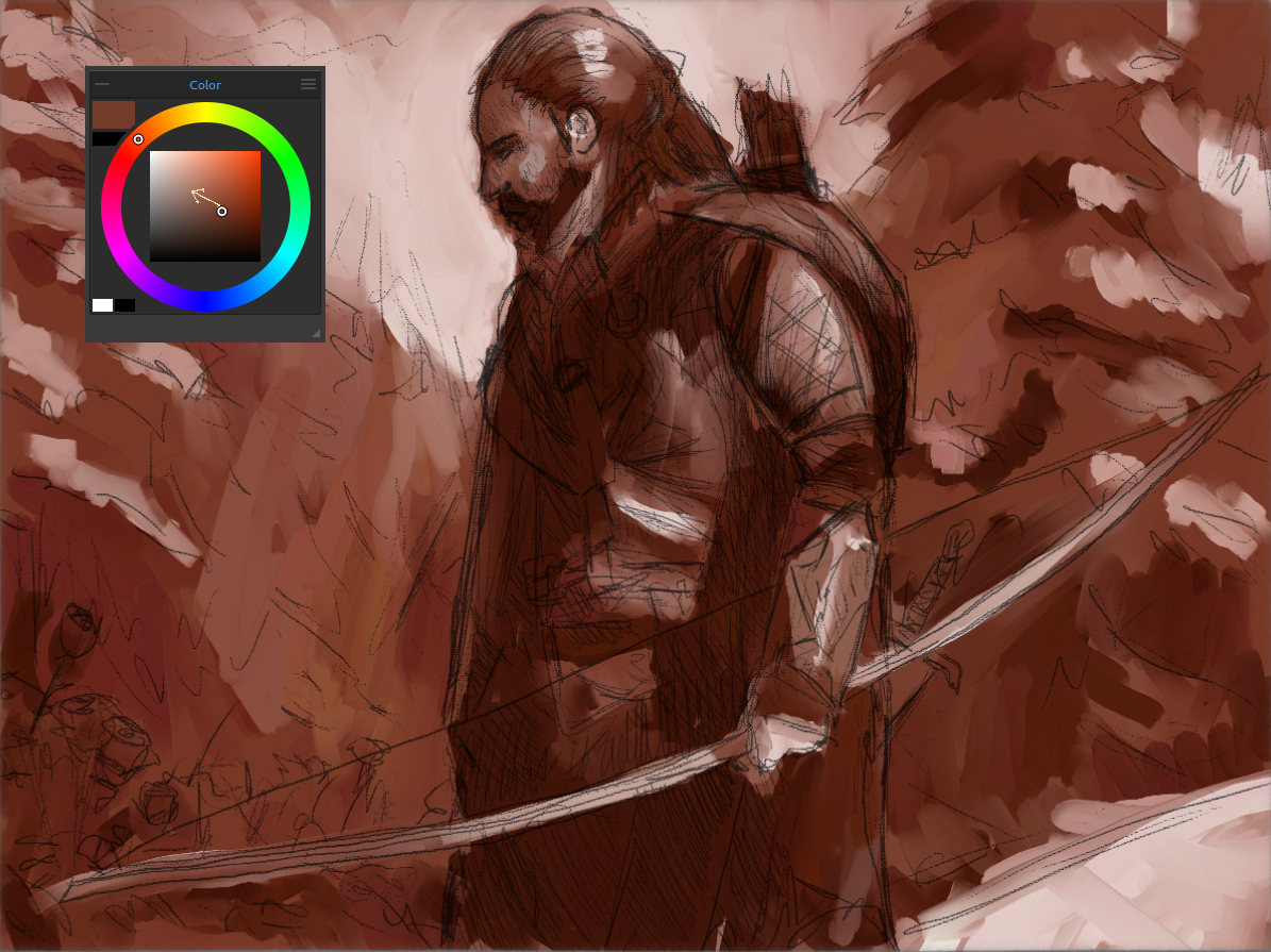 WOW! Who knew that just a simple monochromatic mid-tone, darken, and light pass could give us so much information to use! The picture’s mood is already starting to take shape, and we’re utilizing Rebelle’s natural brush engine to give us some traditional feeling work so far.
Now, to REALLY kick this up a notch, let’s start blocking in our local colors!
Adding In Color
There are multiple ways you can approach this step. A way that I used to use to splash in my colors was to create a new layer on top of my Layers panel, choose the “Color” blending mode option, then paint in my chosen colors. This would overwrite the hues I had established in my underpainting, but wouldn’t alter the values (lights and darks). While this way is definitely useful, since I want to truly mimic a traditional workflow, I’m going to essentially “glaze” some colors on top of our underpainting. I want to use the color information of my underpainting to influence our decisions, so I’ll basically mix my colors in with what we already have.
I’m going to Duplicate my Underpainting layer, and name this “Basic Color Pass”.
In my Oils and Acrylics brush panel layer, under the “Flat” subcategory, I’m going to choose “Flat Dry Thin”. This will act as a nice “glazing” brush, allowing the warmer underpainting info to directly influence the colors being mixed.
I want to start on the background, so let’s block in our cool blue sky and snow-covered trees. This will help us set the mood for the rest of the piece, as well as come to terms with how our underpainting’s pigment information will influence our color choices, without dealing with the “heavy hitting” focal point of our image (the Ranger).
I’m going to select a nice pastel blue, and start bringing some painterly strokes to the sky. I’ll keep in mind my values by Alt-clicking my underpainting information, then just rotating my color wheel to the blues instead of the oranges. This should keep our values relatively close to what we’ve already chosen, but change the temperature dramatically.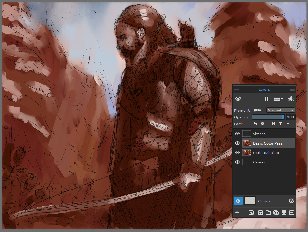 Neat! Let’s keep this idea going by introducing these lighter blues into the trees, as we want them to be “pushed into the background”. The easiest way to push something into the background in a painting is to have it closely match the overall sky color. This technique is referred to as “Atmospheric Perspective” and is a LIFE-SAVER in concept art and illustration work for separating forms and adding depth to a piece.
 Now we’re talking! Just that little bit of blue lightness brought into our warmer trees is starting to bring a lot of visual cohesion to our piece. We’re also able to use the darker warms as our trees’ “shadows”, allowing the forms to start taking shape as well. Remember, the more “pushed back” we want something, we’ll get closer and closer to matching the color and value of our sky. Notice how I want to make sure there are some smudgy, light areas immediately next to the darker areas of our Ranger. This allows the biggest separation of forms, solidifying the fact that the Ranger is indeed our main focus.
 Now, let’s take the same general idea we had with our blues, and mix in some reds and greens (primarily for the roses and hints of green in the trees). Remember, to keep your values in check, you can always color-pick the area you want to paint into using the Alt-click method and just change the hue on the color wheel to the hue you want.
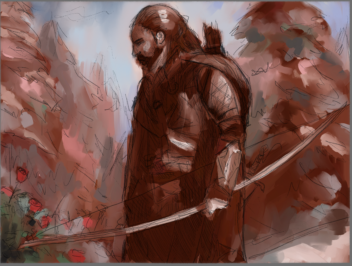 Good deal! A fun thing you can do at this point is hiding your Sketch layer. The image will look blotchy, but the separation, colors, and values should start to read well already!
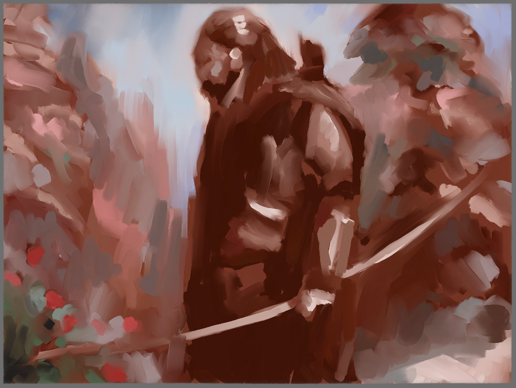 There’s a saying that the first 20% of your painting should solve 80% of the problems, and the final 20% of your painting should take 80% of your time. I’m thinking we’re nearing the end of our first 20%, all that we need to do before moving on is blocking in some colors for our Ranger.
I’ll re-enable the Sketch layer (don’t worry, we’ll get rid of it entirely here in a bit) and block in colors using the sketch as a guide. I chose the colors for my Ranger by color-picking colors I’ve already added to the piece. This allows me to pick from a variety of colors (as we had blues, greys, greens, browns, and reds to choose from) while maintaining visual cohesion. It’s important to make your color choices early and stick to them (which is why another favorite palette of mine is the Zorn Palette, which consists of Ivory Black, Titanium White, Yellow Ochre, and Cadmium Red Deep). In fact, this piece seems to have the same feel as a Zorn Palette painting! A limited palette ends up being a huge benefit for not only deciding on colors to use but to simplify the process so you can focus on the act of painting.
Remember that rule about how the last 20% of our piece will take 80% of our time? I think we’re there! In the next part of this workshop, I will explain how to refine your work and add finishing touches that will be crucial to the final result.
Stay tuned!
Escape Motions
text and images provided by Wes Gardner
-----
Wes Gardner is a professional illustrator and freelance artist currently working in the tabletop, card game, and roleplaying game industries with credits that include Warhammer 40k Roleplay: Wrath & Glory, Varia, ADIDAS, Warner Bros., and more. When not working for clients, Wes spends his time mentoring art students, creating tutorials, and posting videos discussing art tips and tricks on his YouTube channel.
Rebelle Featured Artist profile: escapemotions.com/featured-artists/wesley-gardner
Website: wesleygardner.com
YouTube channel: youtube.com/c/WesleyGardner86
Instagram: instagram.com/artofwesgardner
What do you think?
0 Responses
0
Upvote
0
Funny
0
Love
0
Surprised
0
Angry
0
Sad
Sign in to comment!
Be the first to comment.