
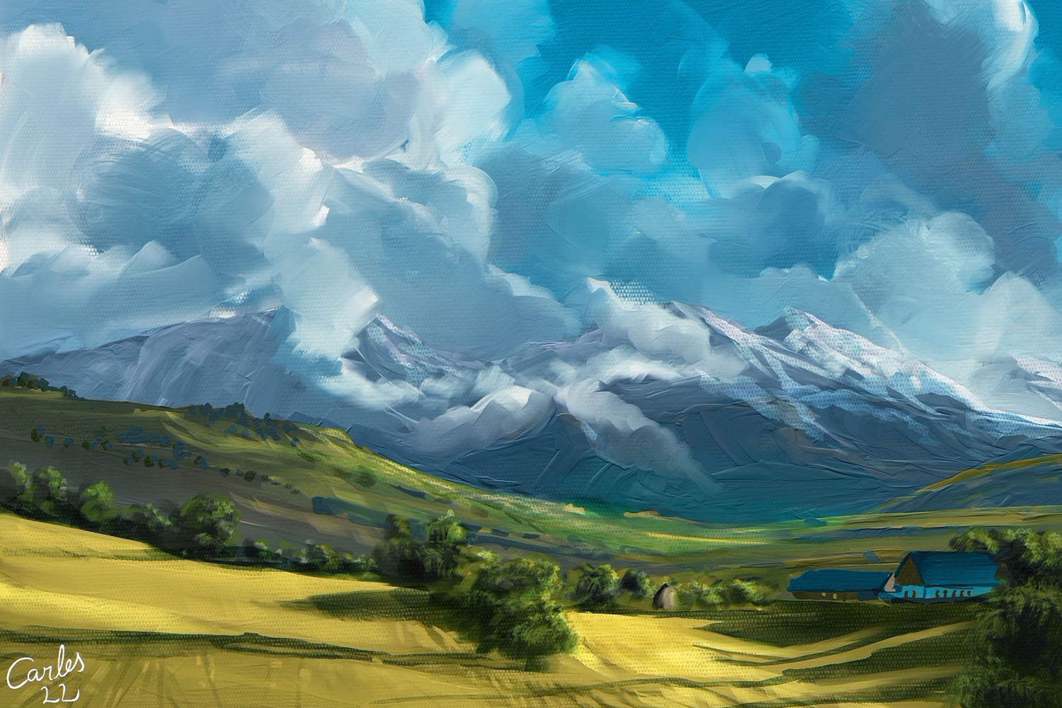

Carles Carbonell Bernado, specializing in landscape painting, comes with a unique approach to painting landscapes in Rebelle 5. He uses oils & watercolors in a way that makes Rebelle’s natural media simulation less intimidating. This approach is suitable for anyone who wants to discover mixed media and software with paint simulation more deeply, or for traditional oil painters wanting to get used to Rebelle.
1. Preparing the scene
We will use a reference for the painting. For this workshop, I chose a photo of a Tuscany scenery by Grafit Studio. Let's study the image by the rules I mentioned in my previous workshop and see if it meets our requirements:
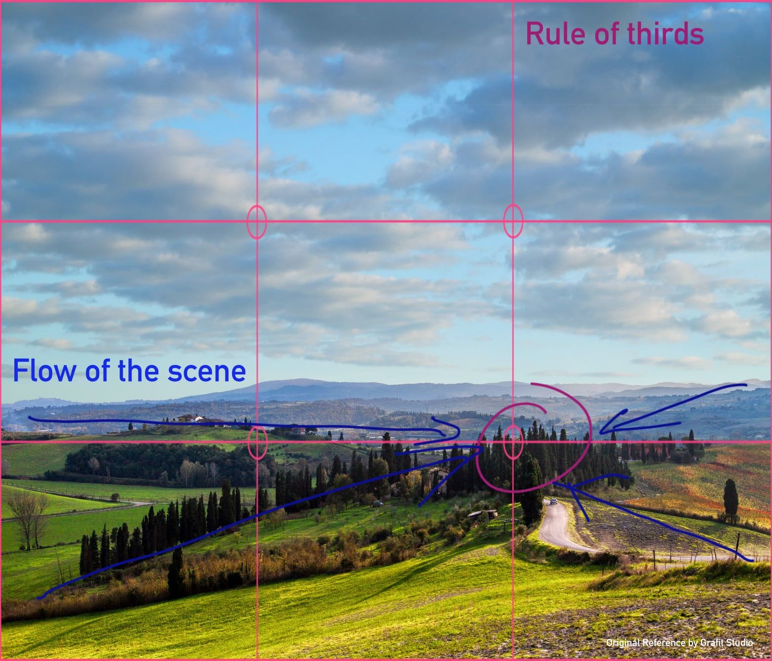
- Depth. As an aerial scenery and no mountains in the near range, it has depth by itself. So, I will not change anything.
- Object distribution. The objects are almost perfectly distributed, with one exception: the original image was half sky/half ground. So I added more sky. Now it almost fits the Rule of Thirds.
- Flow of the Scene. Almost all lines point to the same zone, so our sight goes to that tree zone where the road disappears. I will not change anything here either.
- Contrast between objects. There are many small hills and trees distributed between fields. This is perfect! Maybe I will add fewer details, we don’t want so much contrast in our scene.
- Color harmony. The original image was overexposed; it’s a nice effect in photography, but not for painting. I added an auto-contrast to the image just to see all details, not to paint in that tone. I decided to use yellowish and warm tones and I will do that when I paint. I changed the sky, the original was way over-exposed (almost white); the sky I used is only for color reference and general scene feel, I will paint my own clouds.
If you would like to learn more about rules of landscape painting, read this blog post.
Now we create a New Artwork in Rebelle. Which aspect ratio, canvas size and texture should we choose?
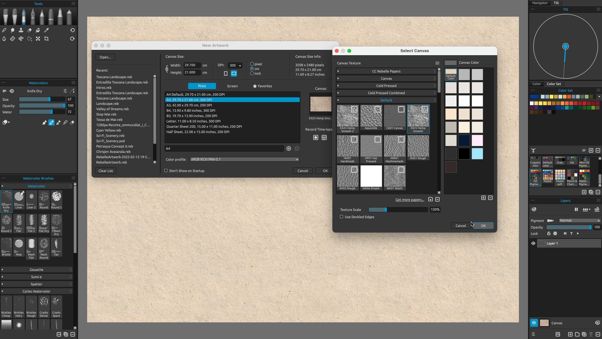
For aspect ratio, it depends on which media your artwork will be reproduced with. If you wish to print your artwork, you need to look at the frame size; the usual aspect ratios are 2:3 or 3:4, but you can ask for custom sizes as well. If you wish to use your artwork as wallpaper on your computer, it must be 16:9. If you wish to use your artwork for social media without being cut, it must be square (1:1) or 2:3 at maximum. Many people like to use their own aspect ratio despite the media; in this case, a lot of artists like to use very wide aspect ratios, as panoramic as possible.
The size in pixels also depends on the media it will be reproduced with. The most important media to consider is Printed Artwork. The printed media must be the size of Inches x 300 pixels; so, a DINA3 artwork must be 3508 x 4961 pixels or anything proportionally higher. I don’t recommend anything higher than that, because Rebelle 5 Pro allows you to amplify any image with very precise detail. In our case, we will use a DINA4 document at 300 dpi, which will be big enough in almost all cases (even if I finally decide to upscale it for printing at DINA3 size).
For the paper, Rebelle 5 allows us to use a lot of different surfaces which will interact with our brush strokes. They can be divided into three major categories, the same as in real media: Canvases, Regular Watercolor papers, and Rough Papers. Canvases and Regular Watercolor papers are very pattern repetitive ones. For landscape painting the most useful are the Rough ones (note: some Watercolor papers are also Rough) because they can produce more randomness. For our painting, we will use the very nice Hemp Paper, a default full-color paper with a very rough texture. The grain size will be at 100% size. The Visual settings will be the default ones; we will change them later if needed. The final size will be DINA4 at 300 dpi.
2. Sketching
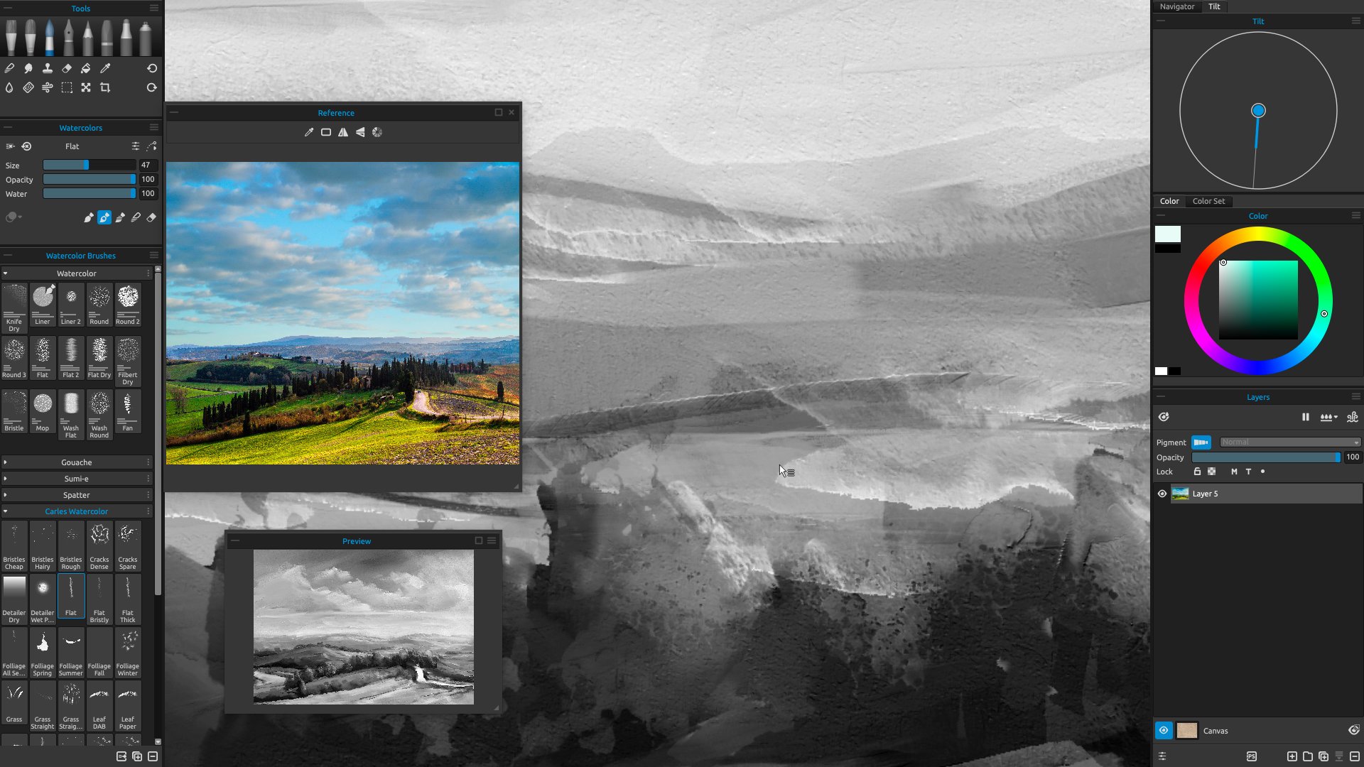
Before we start doing anything, we test the grain size. The best tool to do that is Watercolor because it’s the most sensible for canvas grain. I changed the grain size to 130%. You can use any value to your taste, but I recommend higher values because it helps to add details. Then load your reference image in the Reference Panel (Window>Reference Images>Import a new Reference Image).
I recommend using the Preview Panel, in a small size. This helps to see your artwork as a whole as if you look at your artwork at a distance (something a lot of traditional artists do). The Preview panel has the “Grayscale” option. When you press “G” on your keyboard, you will see your image in grayscale, this is helpful to check the values and contrast of the scene. A good-looking grayscale image means the artwork has the correct values. You should use the “G” very often, especially in the first stages of painting; a good start is everything when you paint.
I also recommend activating the Pigments option (Layers panel in Rebelle 5 Pro). Why? Real Pigments are made from natural resources. They mix naturally and especially when painting nature you can achieve very close colors to reality. I would say, it’s almost mandatory to use when you paint landscapes. If you paint mostly landscapes, and you do it on a regular basis, I strongly recommend buying or upgrading to Rebelle 5 Pro and using Pigments mixing to its fullest.
In this workshop, I will go directly into the painting process. I guess the reference is very simple and doesn’t need an initial sketch at all; and really I don’t care if the objects are placed exactly at the same place that is in the reference, a small variation is acceptable. If you would feel more comfortable, do a sketch first. But do not make it very detailed, it will be replaced very soon with the painting process; do your sketch just to place the objects in the scene. If I did a more detailed artwork or a bigger one, surely I would start with a pencil sketch.
3. Painting the first layer with Oils
In this case, I don’t do any underpainting. Many traditional artists do underpinnings for different reasons: to add color richness to the artwork, because they don’t like to start with a black canvas, to add a neutral tone (you can do the same by changing the color of the canvas), to add temperature… or simply because the artist likes to do it.
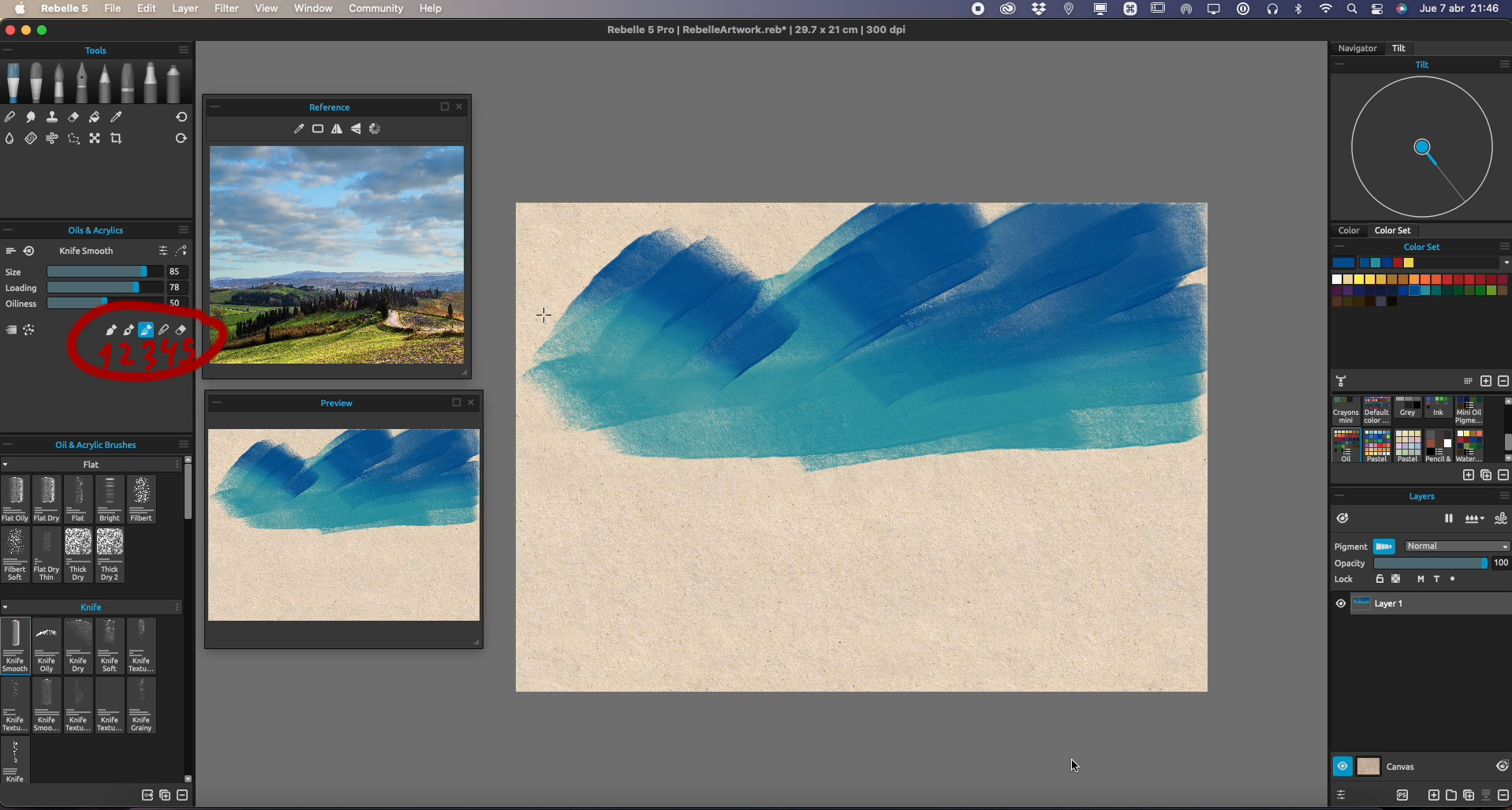
This mixed media method consists of painting first with oils. Then add details and contrast with watercolors. So, let’s choose any oil/acrylic brush, and let’s start. I like to paint using flat brushes and palette knives, but use any of your choice.
I always start with the sky. The sky’s a good starting point to check the value and contrast in any landscape. In the first stages of painting with oil/acrylic, don’t use brushes with a lot of thickness. As in real media, the Impasto adds to the paper texture and it will affect the afterward brushstrokes. So better choose thin brushes, especially for the sky.
Now it’s time to get used to Painting Modes. It’s a very unique feature in Rebelle and a very important one for your workflow. It allows you to use any brush with different painting behaviors without swapping between brushes. The modes are: 1- Paint, 2 - Paint and Mix, 3 - Paint and Blend, 4 - Blend, and 5 - Erase. The shortcuts are the same numbers (1 to 5), so it’s very important you get used to them; it will make your workflow much faster and more comfortable because you don’t need to change constantly to other tools.
Start painting with mode no. 1 or 2. Blend with 3 or 4. Blending not only helps to do smooth gradients (it’s better to do any gradient in the first stages), but it also helps smooth the thickness. So in this first stage, it’s a good idea to use blending very often. The sky gradient doesn’t need to be a perfect one unless you want it, of course. I guess the visible strokes in the sky add personality; if the sky is perceived as a gradient, is enough, even if it isn’t a perfect gradient.
In real life, the sky gradient is barely noticeable or nonexistent at all. But when painting, it’s better to add a stronger gradient even if it doesn’t exist in real life. It adds depth to the whole scene.
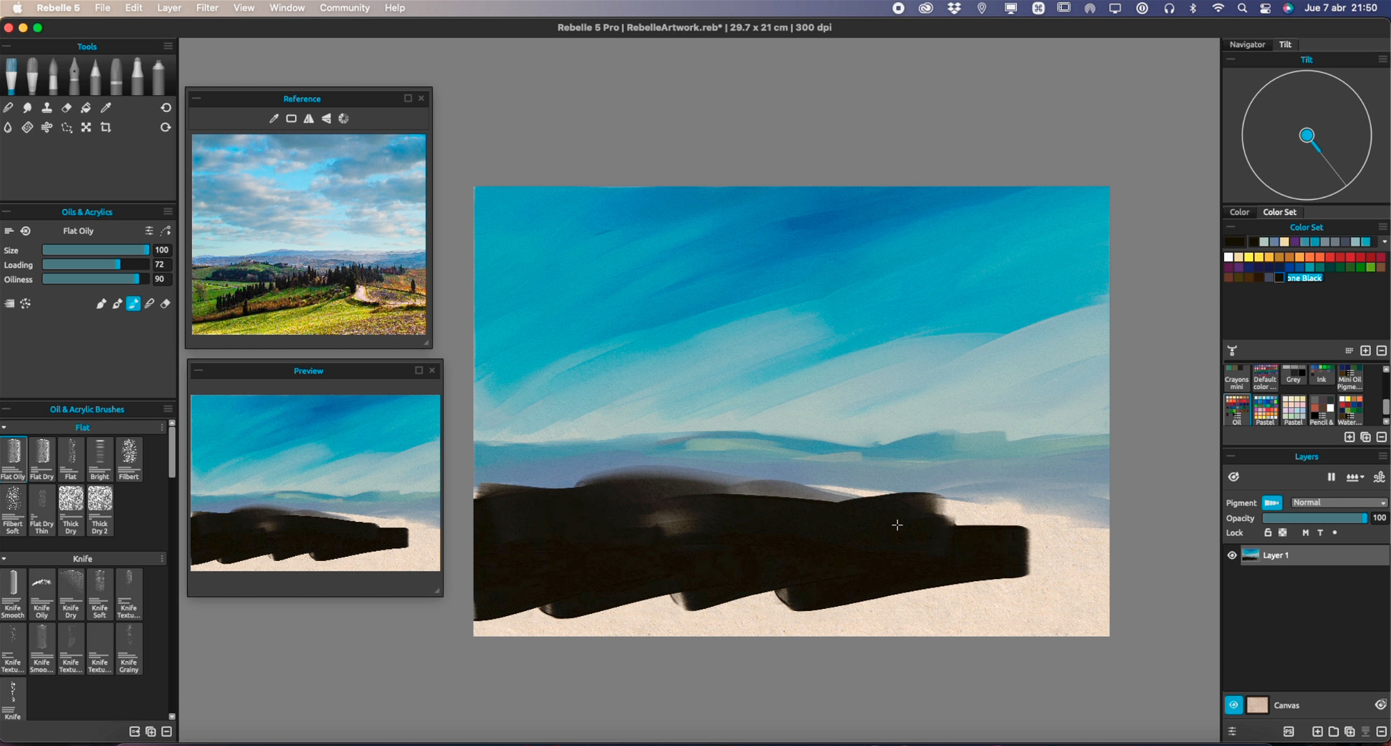
For the colors in the sky, don’t use only one blue. Use different ones. At this stage, it doesn’t matter which blues you are using, or if they are too cold or too warm. You can always change that later. Also, when you add clouds or any object in the sky, the color perception may change a lot.
I like to use the Oil Pigments color palette included in Rebelle 5 a lot. It’s a very good palette that mimics traditional media oil colors. And a very good selection to start with as well. As you paint and mix over and over, you will obtain lots of different colors in the scene; then it’s a good idea to start color-picking colors in the already painted scene. You can use the Mixing Palette if you wish.
Now we continue with the far mountains. At this point, I strongly recommend painting only using ONE layer. Why? It adds a lot of richness and color mixing in the whole scene, and at this stage, you only need to add a general background to add the first values of the scene, not a perfect painting. Later, when you add details, you will have time to define the edges better or paint in different layers if you feel more comfortable.
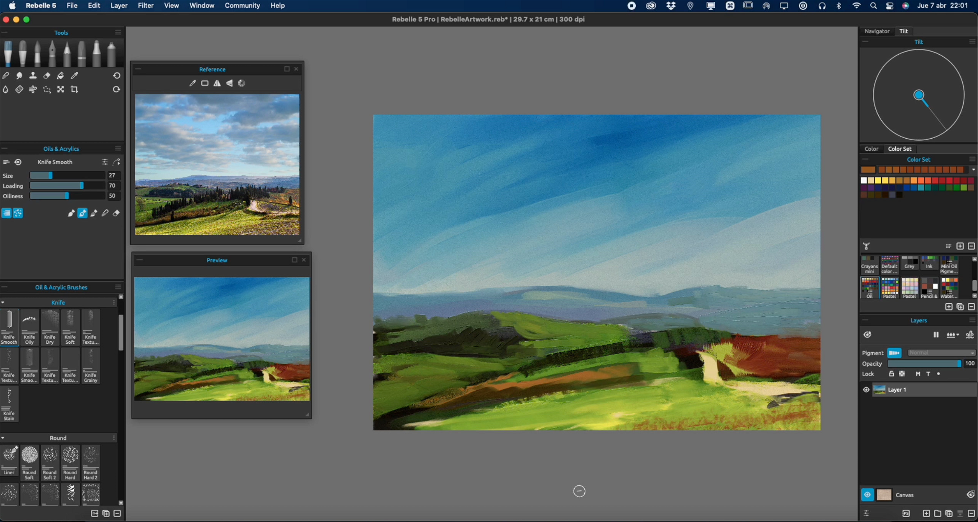
Background mountains need to have lighter values than nearest objects. As you add nearest objects, they should have darker values. In the real world, the background mountains have a blue tone as far as they are. This is due to the atmosphere, the distant objects reflect more of the predominant color (in this case the blue of the sky, or the grey if it’s a cloudy scene). So let’s paint the distant mountains with a pale blue tone.
Keep adding more distant mountains. Now you can see if the sky needs to be tweaked. Paint over if you need to do it, in my case I needed to make the horizon brighter.
For the foreground fields, it’s better to start with dark values, then add the colors over them. Otherwise, it’s harder to paint darker tones if you start painting the lighter colors. Try to avoid using pure black or pure white when you paint; this way it’s easier to retouch the darker or lighter zones if needed.
Start painting the fields and any other foreground elements. Make loose strokes, at this stage don’t try to be too precise. Just add colors to create the general shapes and composition. You can use very saturated colors if you wish; later on, you can make the colors look less saturated. Remember to do all the painting in ONE layer. This helps to create better color transitions and to avoid too many sharped edges. You may add some zones of trees or any other elements (the roads, the houses if there are any), but very roughly.
As you progress, you can see if the painting is going well. Focus just on the colors. Now you can start to make tweaks. To tweak the Contrast and brightness of the painting, select the Menu option Filter > Brightness/Contrast. If you need to saturate/desaturate, select the Menu option Filter > Hue/Saturation.
Remember to use the greyscale mode to see the values of your painting (press the G key on your keyboard).
At this point, you can start to add more details, but keep in mind this stage is only to build the scene not to be detailed. You can also start to adjust some parts of the scene; maybe make the sky gradation softer (use any brush in the Mix mode).
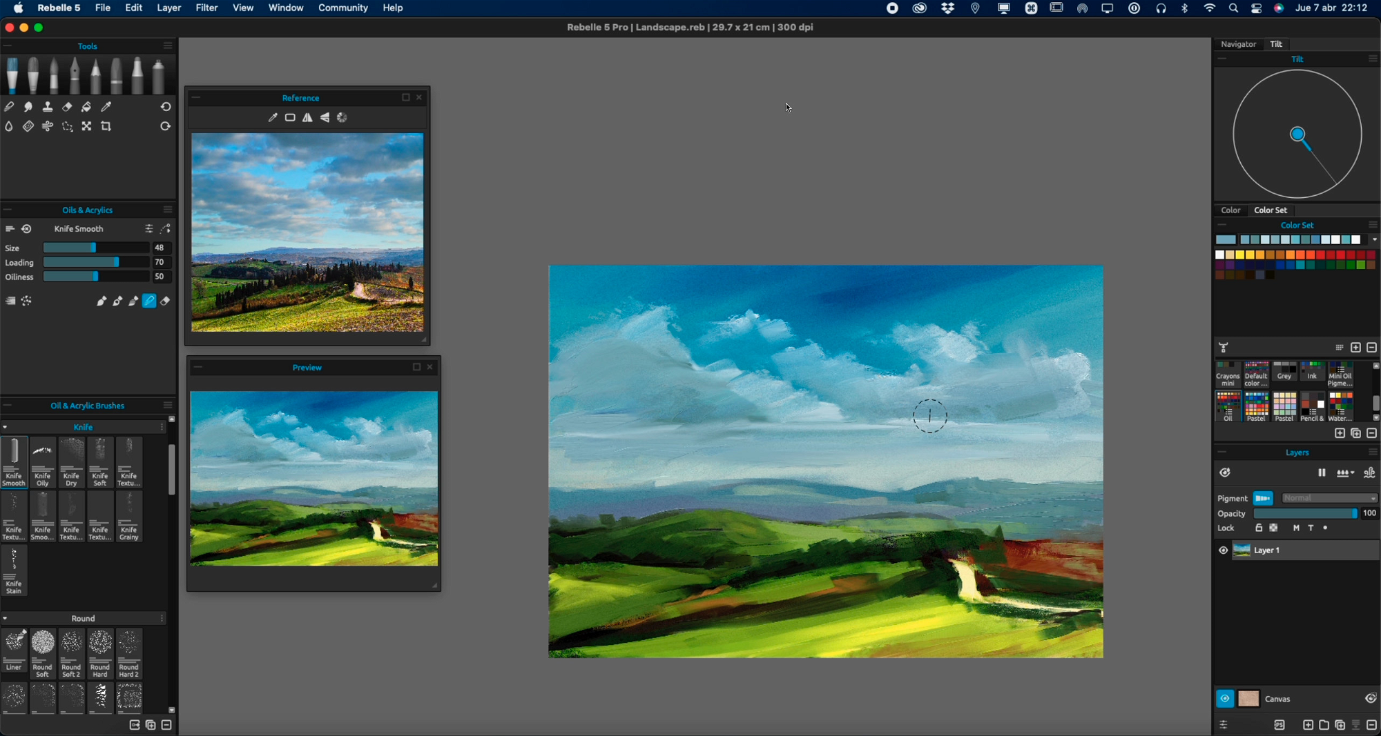
Start adding the clouds. There are many ways to paint them. The easiest one works the same for any digital painting software: paint the brighter zones with brighter color (try to not use pure white), paint some desaturated and darker blue on the bottom, then mix that (trying to preserve the edges on the top). The Mix tool also helps to light some zones if they are too dark.
I recommend making your own clouds. Try to not use any references at all. Make your own shapes and improvise. Don’t overdo the clouds, and don’t add too many clouds. You can use any textured brush or any brush which reacts to paper, to add some small clouds; but don’t abuse that.
In the next part of this workshop, I will pick up watercolors to add texture and details to the painting. I will apply it to the same layer as oils and let it mix. If you want to improve in mixing Rebelle's media or are just curious about my approach, do not miss the second part of this workshop.
Happy Painting!
Escape Motions
text and images provided by Carles Carbonell Bernado
-----
Carles Carbonell Bernado studied Art at Art Secondary School of Vic (Catalonia, Spain). As a teenager, he won several prizes, some of them being Young Comic Artist from Catalonia government and World Icon Design for Modern Operative Systems. He worked as a Graphic Designer almost his entire life. Recently, he retook the painting activity, specializing in expressive landscapes and experimentation.
Visit his YouTube channel for landscape time-lapses and tutorials: youtube.com/Ibbbixx
Artist's Portfolio:
- Escape Motions Community: www.escapemotions.com/community/Carles/
- Instagram: instagram.com/carles.carbonell.bernado
- Twitter: twitter.com/Carlitusroda
Reference Image: Grafit Studio
What do you think?
0 Responses
0
Upvote
0
Funny
0
Love
0
Surprised
0
Angry
0
Sad
Sign in to comment!
Be the first to comment.