

Carles Carbonell Bernado, specializing in landscape painting, comes with a second part of unique approach to painting landscapes in Rebelle 5. After laying down the initial layer with oils, now he is picking up watercolors to mix media. See what his painting process is like.

Missed the first part of the painting workshop? Find it here.
4. Painting over with Watercolors
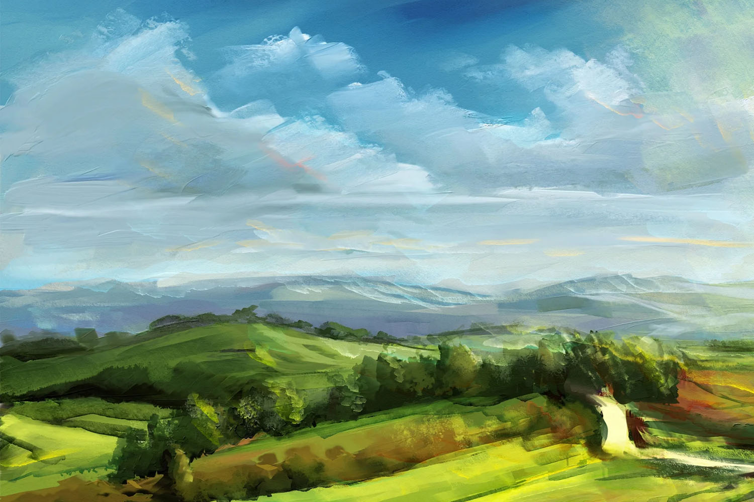
The scene starts to look nice. Now it’s time to add texture and details with watercolor! When you already have an oil layer, there are two ways to paint over with watercolor:
1. Applying the watercolor on the same oil layer. This way, if the watercolor has enough water, it will affect the oil layer; specifically, it may soften the zones you apply the watercolor at. The watercolor brush strokes will be affected by the thickness of the oil layer; in addition, it will add extra thickness.
2. Applying the watercolor on a new layer. This approach won’t change anything on the oil layer. This is like glazing with the medium in real media. The watercolor brush strokes will be effected only by the paper texture.
Use any of these two ways. But, I recommend painting on a new layer, because it adds more flexibility and texture. In any case, I recommend using any brush with 100% Water and Opacity as high as possible (without being at 100%). In watercolor the most important settings are Water and Opacity, use any brush you wish and change those settings. As with oils, my preferred brushes are the flat ones. The Rake of Bristly brushes may help to paint the grass zones, or simply add a little texture. The round brushes are ideal for details.
I actually decided to lay watercolor on the same layer as oil, to achieve media mixing. As you can see, it softens some zones and blends the colors, adding some nice gradients and colors. You can start to add details, like trees. Take into consideration that watercolor remains wet. So, if you like the results at any moment and you wish to avoid the alteration of the shapes, DRY the layer (press Shift+D on your keyboard).

I don’t recommend the use of the Canvas Tilt at 100%. Add just a little bit of tilt, in any direction but preferably to the bottom. In landscape painting I like to add small zones with reds and oranges, it adds more richness to any landscape painting. For the tree foliage use any textured brush, remember you paint the feel of leaves, not actual leaves.
I noticed the watercolor starts to soften the oil layer too much. So I decided to start painting watercolor on new layers.
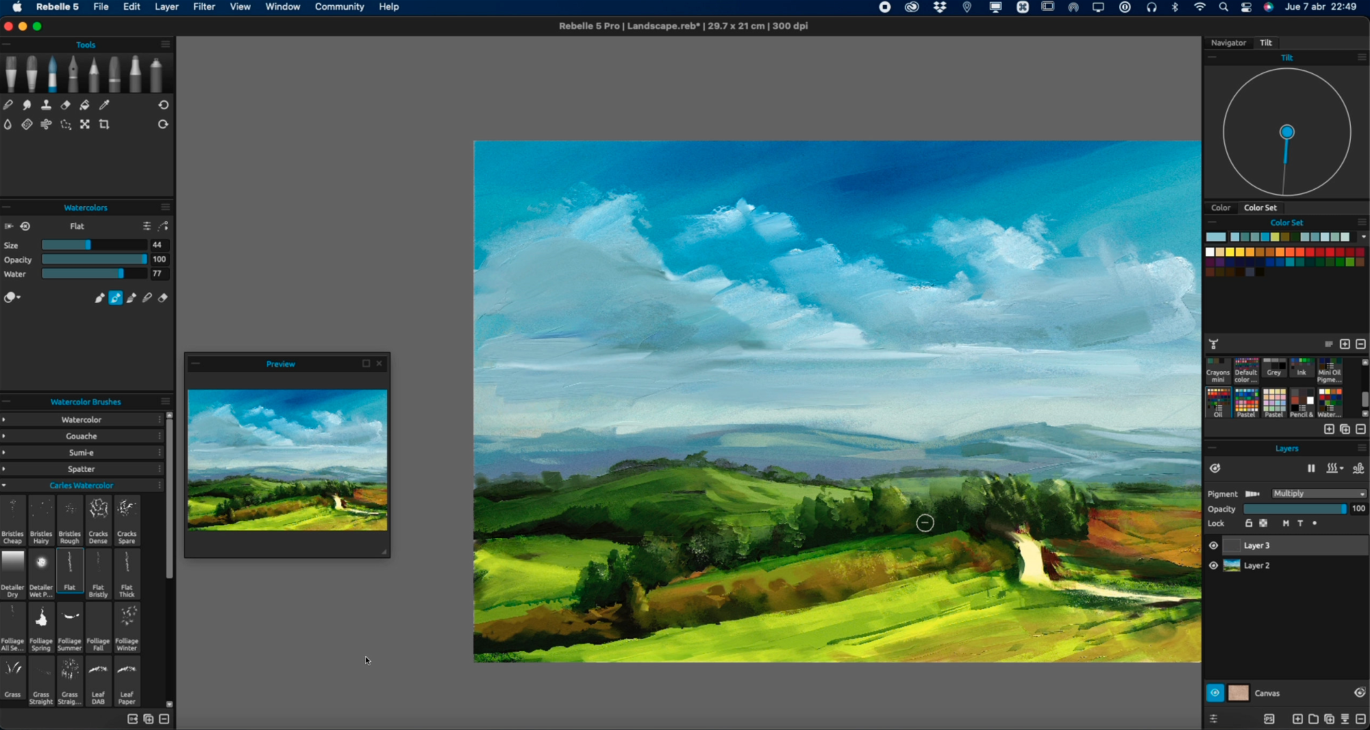
Now, on a new layer, you can be more precise. Create a new layer in Normal layer blending mode. It’s time to add textures thanks to the behavior of watercolors with paper. It’s also time to start painting any detail you wish. The process is very straightforward:
- Change the water amount. More water = more softening and also Canvas Tilt gravity affects more the watercolor. Less water = more precise but less randomness.
- Change the opacity if needed. Unless it’s at 100%, the watercolor is usually transparent. I recommend 80%, it allows you to paint in your desired color but it also retains a little bit of under color.
- Paint. You can wet the layer before painting, in case you need to soften anything; press Shift+V to wet the already painted zones.
- Dry the layer, to avoid softening any edge.
You can merge the layers when you are satisfied. Or keep them unmerged if you wish. In case you merge the layers, remember to keep Pigments activated; if you merge a Pigmented layer with a non-Pigmented one, the merged layer will have the Pigment option turned off.
5. Glazing with Watercolors
Now it’s time to add more life to our painting, playing with Layer Blending modes. I start creating a new layer and using the Multiply layer blending mode on it. This layer will serve to add shadows or darken any zone. I don’t recommend using black or any unsaturated color. I recommend any blue or green. Watercolors have some transparency, but I don’t recommend using too dark colors in Multiply layers. If it looks too dark, you can change the layer opacity, but it may be better to change the brush opacity. Eraser may help to lower the darkness of any zone or delete it.
Create a new layer. This time we will use the Overlay layer blending mode. Overlay mode adds contrast to the below colors, but uses the chosen color instead of changing only the value. It’s like a two-in-one blending mode. You achieve more contrast in addition to some degree of color shift. I like to use it to add more life to my paintings, using yellow or red variations.
We add lighter zones to the distant mountains, simply using the same color of the mountains. We do the same with clouds; it will add more color richness with different shades of blue, using this method.

Then, I start to use RED or ORANGE, just for adding more color variation. I also like to use red in the sky, just for fun.
Keep painting on the Overlay Layer, but don’t overdo it. Just a little looks awesome, if you use it too much it will look too fake.
Then create a new layer using the Lighten layer blending mode. It will serve to add a lighting set to the scene. In this case, the light comes from the top-left area, so paint this zone. I decided to use yellow because this is how I prefer the lighting setting in this scene. Mix the colors to look softer.
Keep painting until you like it. Just remember to not overdo it. If you paint within a realistic style, your “painting is never finished” (Leonardo Da Vinci). But in this case, we don’t want to be realistic, we want to be loose. So stop before you add too many details. With practice, you will create more detailed and realistic artworks; this time we did a fast and loose one.
6. Final Retouch
At this time, I consider this artwork finished. But it’s a good practice to make some final retouches. Remember to always sign your artwork! You can do the first stages of retouching inside Rebelle, the most useful options are:
- The menu option Filters > Color Balance is useful to change the tones of your artwork.
- The menu option Filters > Hue/Saturation is helpful to make your artwork more or less saturated. You can also use it to change the tone, but it’s more useful than the previous filter.

Then you can Export it to PNG or JPG (don’t use compression in JPG). In Rebelle 5 Pro you can use the NanoPixel technology. It adds almost infinite detail to any artwork. Export with NanoPixel if you wish to add more resolution to your artwork!
External software with more advanced tools (like ML-driven technologies) may be useful. But I consider Rebelle 5 to be enough to do color corrections. In case you need extra changes, I recommend Photoshop. Rebelle 5 Pro offers the plug-in for Photoshop, so they integrate very well.
And the artwork is done. I hope you enjoyed this workshop and it encourages you to create many paintings, mix media, and explore Rebelle tools!
Happy Painting!
Escape Motions
text and images provided by Carles Carbonell Bernado
-----
Carles Carbonell Bernado studied Art at Art Secondary School of Vic (Catalonia, Spain). As a teenager he won several prizes, some of them being Young Comic Artist from Catalonia government and World Icon Design for Modern Operative Systems. He worked as a Graphic Designer almost his entire life. Recently, he retook the painting activity, specializing in expressive landscapes and experimentation.
Visit his YouTube channel for landscape time-lapses and tutorials: youtube.com/Ibbbixx
Artist's Portfolio:
- Escape Motions Community: www.escapemotions.com/community/Carles/
- Instagram: instagram.com/carles.carbonell.bernado
- Twitter: twitter.com/Carlitusroda
Reference Image: Grafit Studio
What do you think?
0 Responses
0
Upvote
0
Funny
0
Love
0
Surprised
0
Angry
0
Sad
Sign in to comment!
Be the first to comment.