

Color Management can be a complex and tricky subject to understand, let alone master. But understanding some basics and using a few quick tricks can help you get better results, particularly if you want to create your images intending to print out the final result. In this article, Pete Smith (Basement Picasso) shows how color management and color proofing features of Rebelle 5 Pro can be used to the best effect to help get great-looking prints.
What is Color Management
Color management is a big enough topic that you can write a whole book on it. I should know, I have read more than one! Even the cover images often hint at the complexity of devices, colors, profiles, mapping, and more, all working together to render accurate color.
“What color is Black?”
This seems like such a simple question. Black is just the absence of all other colors, isn’t it? Black is simply black. But a quick search of any art supply shop and you will soon find a whole host of blacks, including things like Mars black, Process black, Ivory black, Lamp black, and so on. Why so many?
If you paint them out and let them dry you will find they look different, some are blacker, some are warmer, and some are cooler particularly when mixed with other colors. The reason is that none of them is pure black. They all reflect a small amount of light.
Is there a perfect black?
If you write “Black 3.0” to a search engine you will find a product claiming to be near-perfect black acrylic paint. It reflects almost no light and is therefore very close to pure black. This “quest” for perfect black appears in many areas – TV screens being a good example. You have probably seen the promise of high-end OLED TVs with near-perfect blacks, which are indeed stunning to look at. They also tend to have glossy screens, because a glossy surface scatters very little ambient light, so black is very black. A matte screen surface, by comparison, reflects a lot of ambient light, so the darkest black it can produce will only appear as a dark grey.
No such thing as “a print”
This difference between matte and gloss carries into art in both traditional works as well as with prints. Oil paints, when wet and glossy, tend to have deep dark blacks, lots of contrast, and rich saturated colors. When they dry and go matte (sometimes referred to as the color sinking) they seem flat and lifeless by comparison and there is now a trend on social media for “Varnishing” videos where people pour gloss varnish onto the final image to reveal the original depth and contrast of the image.
When you create an image digitally and print it out you will typically have a choice of printing on matte or gloss paper. On certain printers, such as the Epson 3880 that I use, it has two separate black inks, one especially for matte papers and another one for gloss paper, to optimize the print quality. MK stands for Matte Key (Matte Black) and PK is Photo Key (i.e. Photo Black). Before you print an image the printer shows you which one is selected:
So why don’t we all just use Gloss Black?
In the two example prints below, the matte print on top has a dark grey instead of black, and you can see the red/orange is slightly less intense than the gloss picture underneath. The gloss print has better contrast, and images seem more dynamic and more saturated. So why don’t we just always use gloss? One word, Reflections! Gloss surfaces are amazing right up until they catch a bright reflection and then the image can all but disappear.
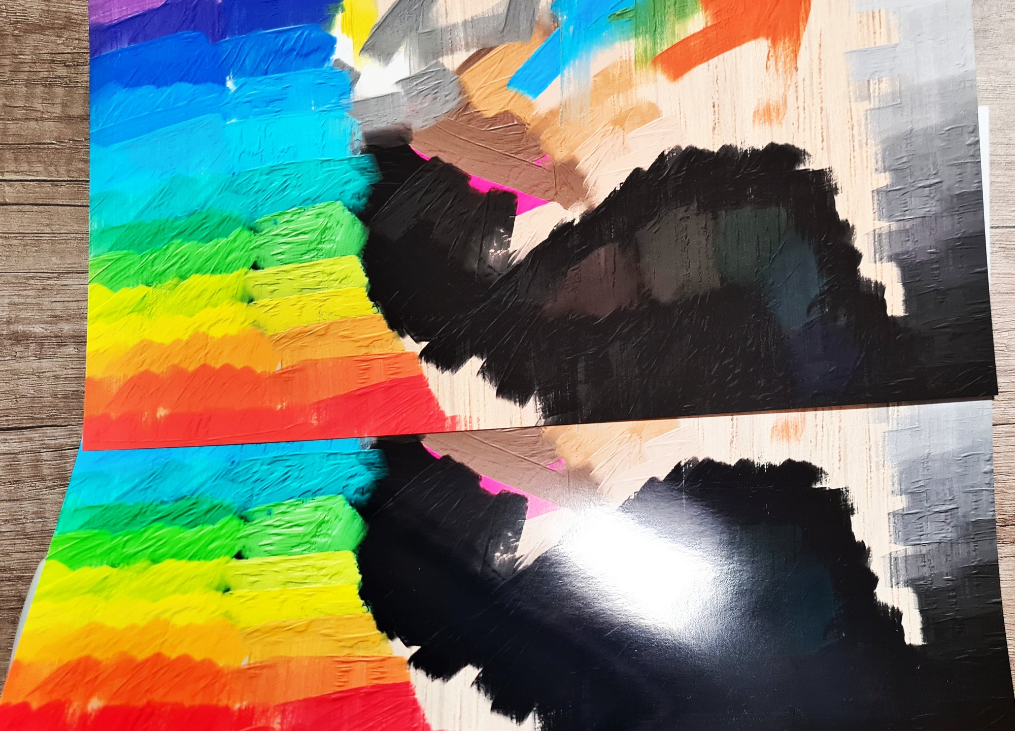
 Matte images can look more natural, particularly under bright light, and some people just prefer them. For traditional artwork, it is a personal choice whether to finish them with a gloss or matte varnish. Personally, I find that highly textured traditional artwork doesn’t take gloss varnish very well as the texture can cause a lot of shiny spots.
How can Color Management help?
If we paint an image and put some pure black on it, we know that it will look different depending on how we eventually print it (on gloss or matte paper). Rebelle has some color management features that can really help with that.
The way that I use color management is to first enable color management by assigning a profile when the file is created. By default, in the File>New menu, the color management is disabled. Select a profile. You can select the profile of the paper you will use to print, however, I tend to set the profile to suit the monitor and then use soft-proofing towards the end. This provides more flexibility as I can later choose if the image better suits a gloss or matte print. If you have calibrated your monitor, or you have a profile for it, you can select it, otherwise, I would tend to just use a generic profile like Adobe RBG (1998). You can also set this up as a default for any new artworks in Preferences>Color Management.
Once that is assigned you will be able to use color management. The key part that I am interested in is the soft-proofing and gamut warning. In the preferences, I set up soft-proofing as shown: The most important part is the soft proofing profile – which I set to the specific printer paper I have in mind. (These profiles were installed with the printer driver, but profiles for other papers can usually be downloaded). Perceptual tries to render based on what the eye will tend to see, and I want black as close as possible to the printed output. Gamut warning will show colors (or blacks) in your image that are outside of what a print (on that particular paper) can achieve. I created a test image with lots of black, dark colors, and highly saturated colors, plus a neutral grey scale and warm and cool light colors.
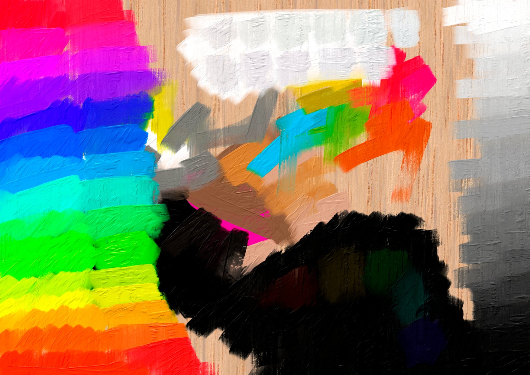 In the View menu, there are now two key options available to us. Specifically, the “Proof Colors” and the “Gamut Warning”. You can use the shortcut keys shown. I am using Loupedeck instead of keyboard shortcuts.
These allow me to paint the image using a full-color palette initially – but I can then check to see if there are any Gamut warnings (meaning that I have used colors that can’t be printed accurately) or to visually “proof” what the image will look like when printed.
With both, Soft Proofing and Gamut Warning disabled you will get the best image the screen can display: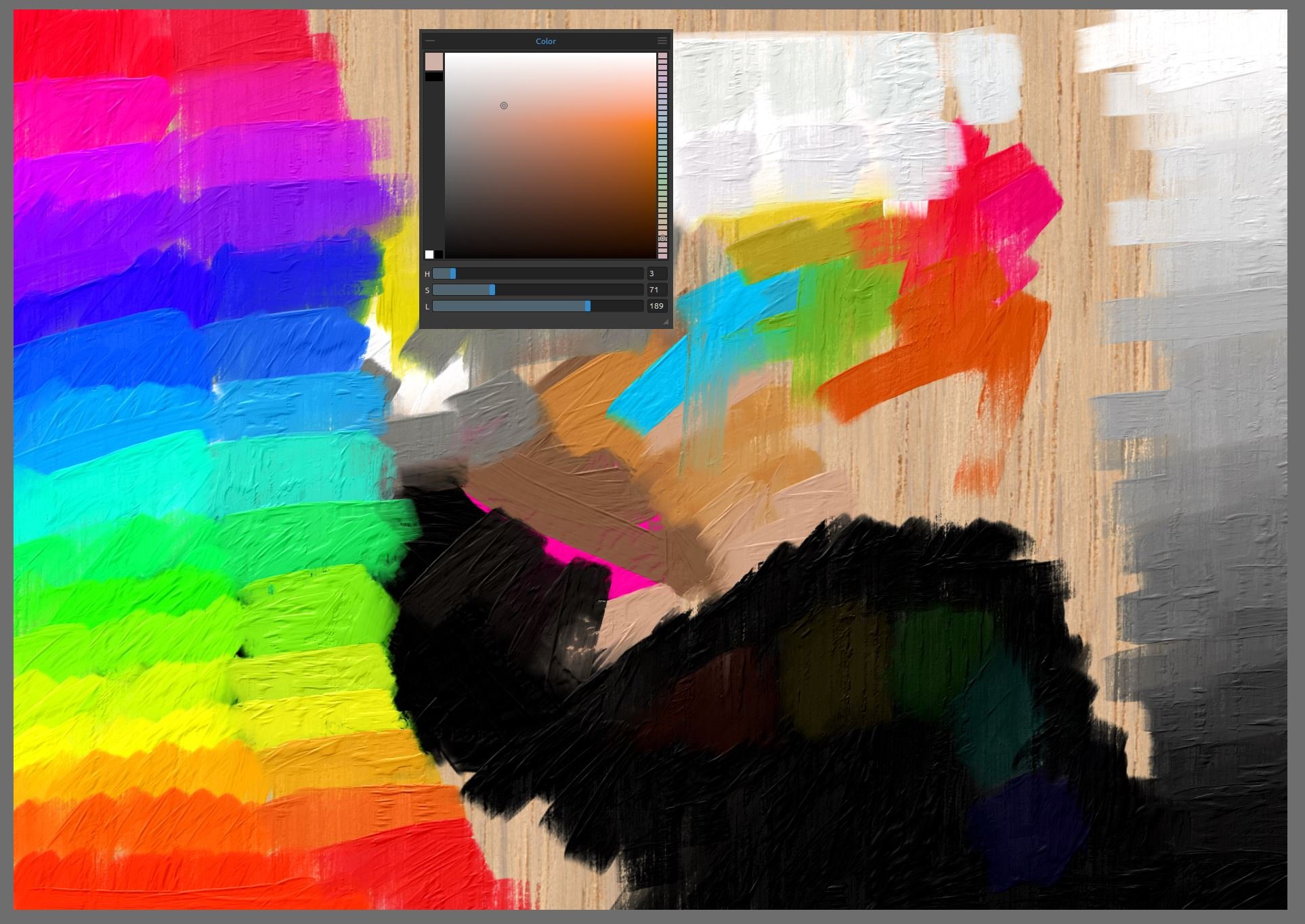 But some of these are outside what your intended print can display, so you can use gamut to see that. Enabling Gamut warning (in red, in this case, but you can change that in Preferences) highlights all values that the intended print target cannot accurately render. This was a test image, so many of the colors and blacks are deliberately outside the range, for illustration purposes:
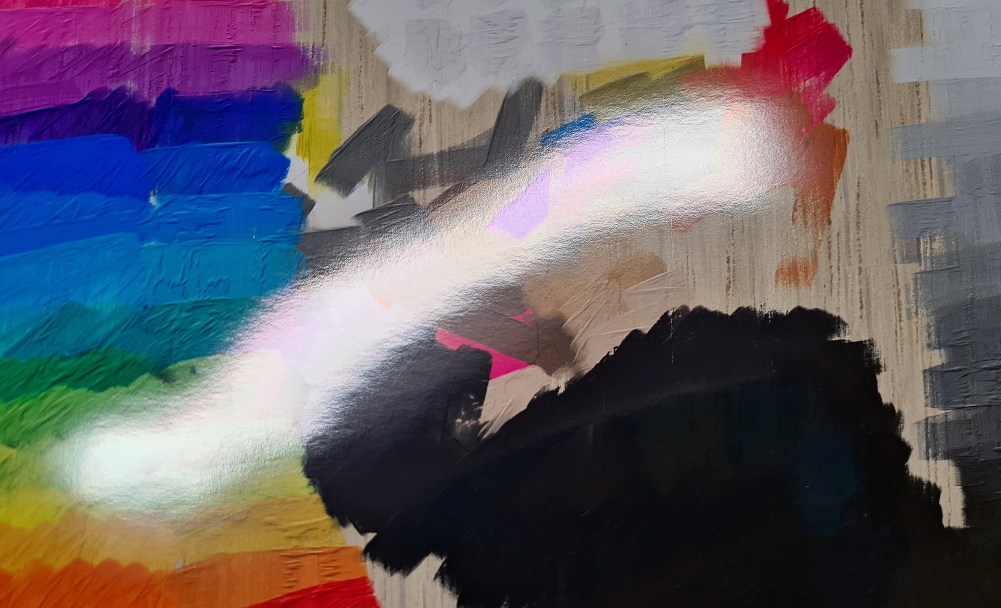
 Alternatively, we can use Soft proofing to get a better indication of what this image will look like when printed. Notice that the color picker itself also changes to show how the color will appear, so the color-picker no longer has the darkest blacks or most saturated colors available.
 If we compare this to the actual print (the matte version at the top) we can see that it has done a better job of rendering what the final print will look like.
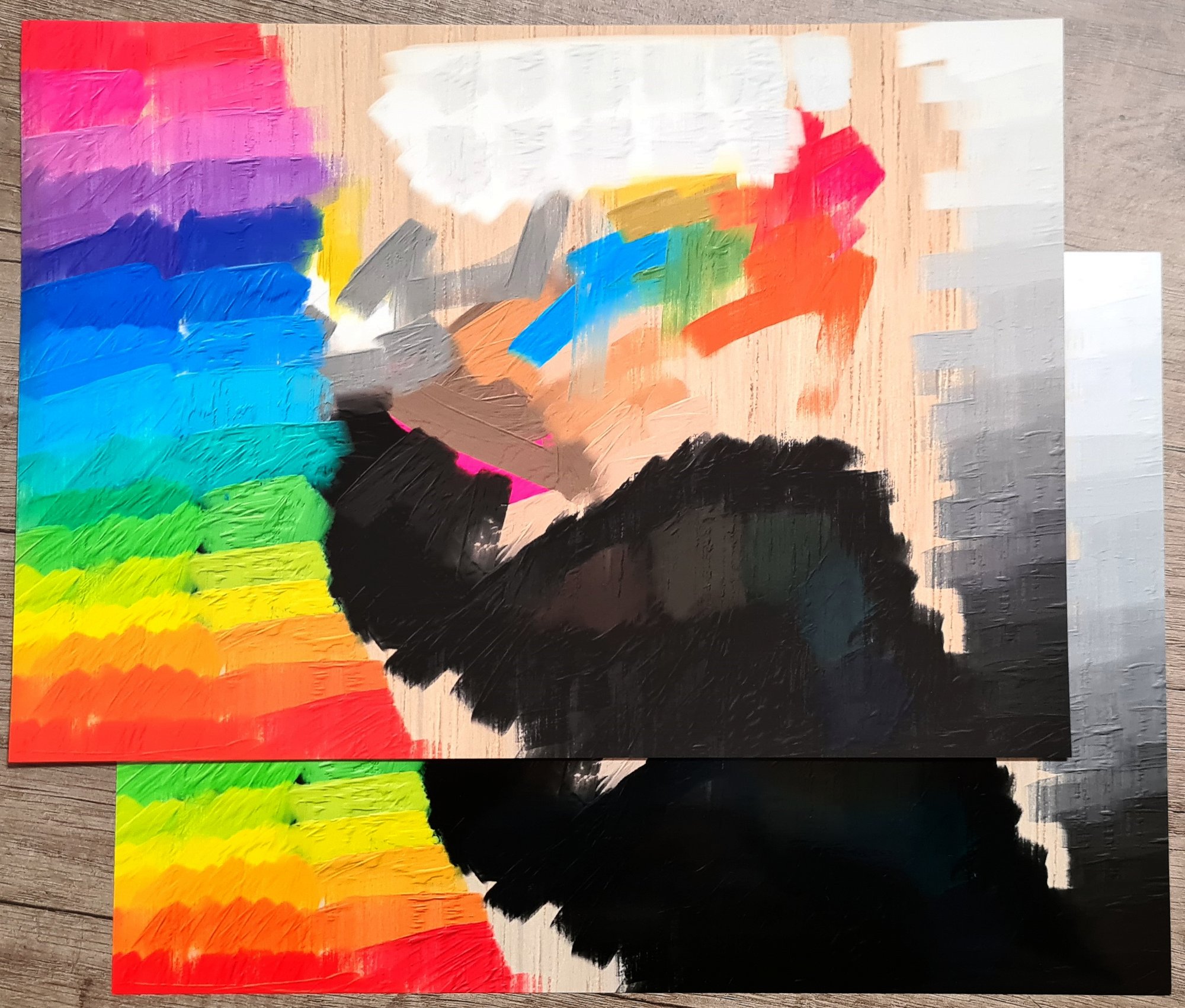
Practical Color Calibration
As we said at the beginning, color calibration and management can be complex (and expensive if you buy dedicated color calibration hardware). A trick that I use is to create a test image like the one shown & then print it on both gloss and matte paper. I then hold the printed image on top of the screen that I draw on. I then manually adjust the screen settings to get the best match for the gloss print. I then enable the color proofing and look to see if I want to adjust anything for the matte print. This isn’t perfect, but it is a quick and practical way to get your device close to your printed outputs.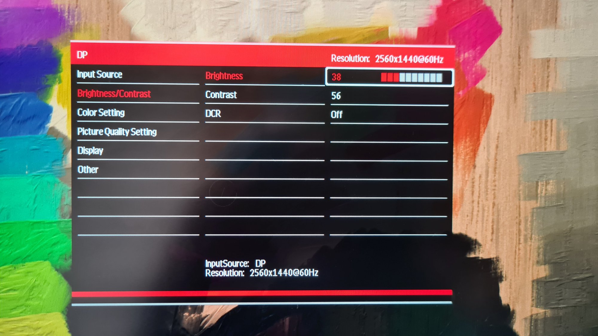 You can see in the image below that my device (Huion Kamvas Pro 24 QHD) struggles with rendering cyan very well, and the grey scale is a little warm, but it is close enough in practice. Also, be aware that the color of your print is completely dependent on the light in your room, and will look very different in bright daylight versus artificial lights, so you should do this for the setup you generally use where possible.
 Being able to toggle the “proofing mode” on and off towards the end of an image is very helpful.
One last trick
The final trick is doing one or more test print(s). If the objective is the physical print rather than the digital image, then you can do a test print and then decide if it is what you want. If not, you can use the adjustments in the Filter menu such as Brightness/Contrast, Hue/Saturation, Color Balance, etc. which will help you get the printout that you want.
Hopefully, this gives you a few ideas to help begin to explore what can be a very complex topic, and a few helpful practical suggestions to manage color and get better prints.
Happy Experimenting!
Escape Motions
text and images provided by Pete Smith
Read another blog from Pete Smith: Prepare for Perfect Prints with NanoPixel Technology
-----
Pete Smith started his journey in art in the ’90s as a self-taught Comic Colorist, working in traditional acrylics, inks, and airbrushes. An increasing interest in Fine Art led to many years of study and development of interest in traditional materials, oil painting, and life drawing. For the last 10 years, Pete has been blending his interests in art and technology to combine traditional techniques with new digital technology on a quest to find the ultimate digital toolset to provide a traditional drawing and painting experience.
Rebelle Featured Artist profile: www.escapemotions.com/featured-artists/peter-smith
Website: www.basement-picasso.com
YouTube channel: www.youtube.com/user/basementPete
Instagram: www.instagram.com/basement_picasso
What do you think?
0 Responses
0
Upvote
0
Funny
0
Love
0
Surprised
0
Angry
0
Sad
Sign in to comment!
Loved reading this, Pete! Colour accuracy in commercial printing ensures that the printed materials represent the intended shades and tones to maximum precision. The saturation, brightness, highlights and contrast are necessary parameters to ensure brand recognition and loyalty without confusion. Get a free quote from a professional for your next print job.