

Dive into fantasy character oil painting with Rebelle Featured Artist and illustrator, Wes Gardner. In this four-part workshop, he will walk you through the whole painting process, from initial thought to the final touch. Read the third part, providing useful tips on how to focus on details and make sure the composition is as it should be.
As a working illustrator, I’m always on the lookout for ways to improve my craft. Every few months, I like to try a personal “leveling up” piece that I can update my portfolio with. I currently work in the tabletop roleplaying (TTRPG) and card game industries and love the storytelling and narratives the images can convey. With Rebelle, I can successfully transfer my “traditional art” ideas to the digital realm, which allows for greater flexibility when working with Art Directors or publishing houses. Changes no longer take hours, but minutes!
Read previous parts of this workshop series:
Part I. - Preparing Canvas and Initial Sketch
Part II. - Underpainting and Color Choices
Refinement Passes
Remember that rule about how the last 20% of our piece will take 80% of our time? I think we’re there! Here are a few main goals for my refinement passes:
- Make sure the sharpest edges, highest contrasts, and tightest rendering all happen in the “hot spots” of our focal point, namely the Ranger’s face, his arm, and part of his cloak (the parts facing the light source), and the bow.
- As I want to push items to the background, I’ll have them match the light-blue color of my sky more closely.
- As I want something to “come towards the viewer”, I will make sure it is darker in value and more detailed in rendering.
- Keep the majority of brushwork loose and “painterly” in the background and surrounding areas, while making sure my physical brush movements are following the guiding lines I established in my sketch phase.
- Most importantly…..Have fun!
To begin, I’m going to more tightly render the colors, values, and shapes of the trees in the background. I think making these more refined won’t take a long time, but be an easy “victory” to push my creative momentum forward, keeping me in a good mood for the inevitable “grueling rendering phase” we’ll go through near the end.
I’m making a new layer named “Color Refinement 1” to do my main color brushwork.
I will be going between my Flat Oily, Flat Dry Thin, and a few brushes (Round Soft and Rough Oily) from the Rounds subcategory. My main push right now is to refine some of the shapes, colors, and blending of our background trees. Here’s a quick status update: I’m using some smaller brushes (namely the Round Soft and Rough Oily) to block in different shapes in the background, making sure the shapes are blending well together and giving the impression of a snow-covered set of trees. We are still working fairly loose, but that also allows us further room for exploration as we refine our colors and shapes.
Now, to really start digging into some more specific details, we will move over to our Dabber subcategory under our Oil and Acrylics category. These brushes are OUTSTANDING at giving great, quick texture while retaining a painterly feel. They’re not as loaded as our standard oils or acrylics, but that will actually work to our benefit as we want to give the illusion of “spots of snow” sprinkled around our trees.
Because of the variance of texture and transparency, this gives a very convincing feeling of a “deep tree”. Nature is very sporadic and hard to pin down, so having loose, chaotic brushwork can help sell the “natural” feeling.
I continue using my Dabber brushes until I’m fairly happy with the trees in relation to the rest of the piece. Now that I have the basic shapes, values, and colors blocked in how I like, I feel like I need to go in and tweak our Ranger. Since I’ve lightened the background considerably (by getting rid of the darker darks and replacing them with neutral greys and pinks), I feel like the Ranger’s shadows are a bit too overbearing.
On the same layer, I’ll use a Flat brush to lighten up our Ranger a bit. I’ll be choosing some colors from our refined trees, namely the “darks” of greys and blues, to integrate into our current shadows. I’ll also make sure to put small splashes of other colors, namely the pink, purple, and reds that the Dab brushes provided with their random mix properties. I feel MUCH better about our Ranger’s values now, as he’s starting to feel like he’s actually present in the painting. Remember, color picking from colors already on your canvas is not only a quick way of getting color, it ensures that your piece feels more pre-planned and cohesive!
I think now we’re at the point of being able to get rid of our Sketch layer, rolling up our sleeves, and spending the time to fully render our painting.
Pushing To Final Render
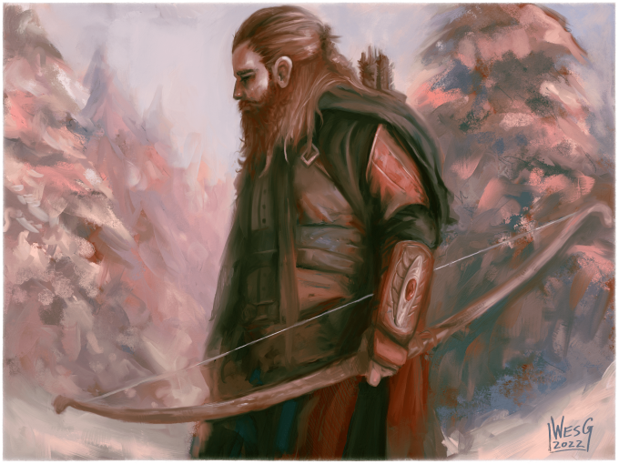
Here’s a quick look at what we have now that we’ve hidden the Sketch layer: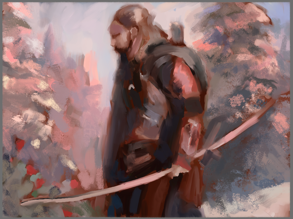 Not bad! The Ranger definitely feels correct in the painting, with the nice splashes of blues and greys in the shadows really allowing him to be covered in the ambiance and bounced light around him.
Here are some things to take into account when pushing to the final render:
- Work big to small. Don’t get so bogged down in the details right away that you exhaust yourself before you make big strides on your piece. There’s nothing worse than burnout during critical moments of your painting!
- Choose the “important parts” (aka focal points) and make those areas the most highly rendered. The human eye can only focus on one main thing at a time (for instance, keep your eyes locked on these words. Without moving your eyes, can you read words from two or three paragraphs ago? Probably not, at least not easily!). Focus is a fun thing to play around with in your paintings, and having strong focal points can make the difference between a good painting and a true showstopper.
- Don’t overthink things. Work on one aspect at a time (such as an “edge pass”, a “color pass”, a “render pass”, etc.) Trying to do too many things at once (rendering WHILE figuring out lighting WHILE adjusting where cast shadows go WHILE controlling our edges) is a one-way ticket to Burnout Town. Keep the steps simple, and keep them organized.
- Take your time. The patience you show during this final push will be well rewarded. Remember, 80% of your time will be spent doing the last 20% of your piece!
With that, let’s get to it! I’m going to start on the Ranger’s face, as I think that once we really nail that down, we’re free to be a little looser with everything else.
Focusing on the Face
If your painting has a face in it, it’s automatically going to be a central focus. Humans are programmed to look at other humans to relay information such as situational analysis, emotional empathy, and communication. It’s paramount to spend a lot of time on the face, as it’s primarily going to be the first thing people notice about your character!
Taking a quick look at the face as it is right now… I’m liking the sketch lines and how they’re playing and integrating with the underpainting, so I’m going to do my best to keep the “energy” of the face as it is right now. I want to make sure the emotion reads as a mix of relief, sorrow, and intrigue, as our Ranger is tired, but inspired by the beauty around him.
I start by making a new merged layer of everything (including the sketch lines) and naming this new layer “Render Push 1”. I want to have all of my information on a single layer, so Rebelle’s awesome wet brushes can integrate with everything we’ve made so far.
I’m keeping my brush strokes loose and fluid, using the Flat Oily and Flat Dry brushes on Paint and Blend mode. I also find that using “sketching” strokes works well at this stage because it keeps energy of a sketch, with the awesome nuance and blends of oil brushes.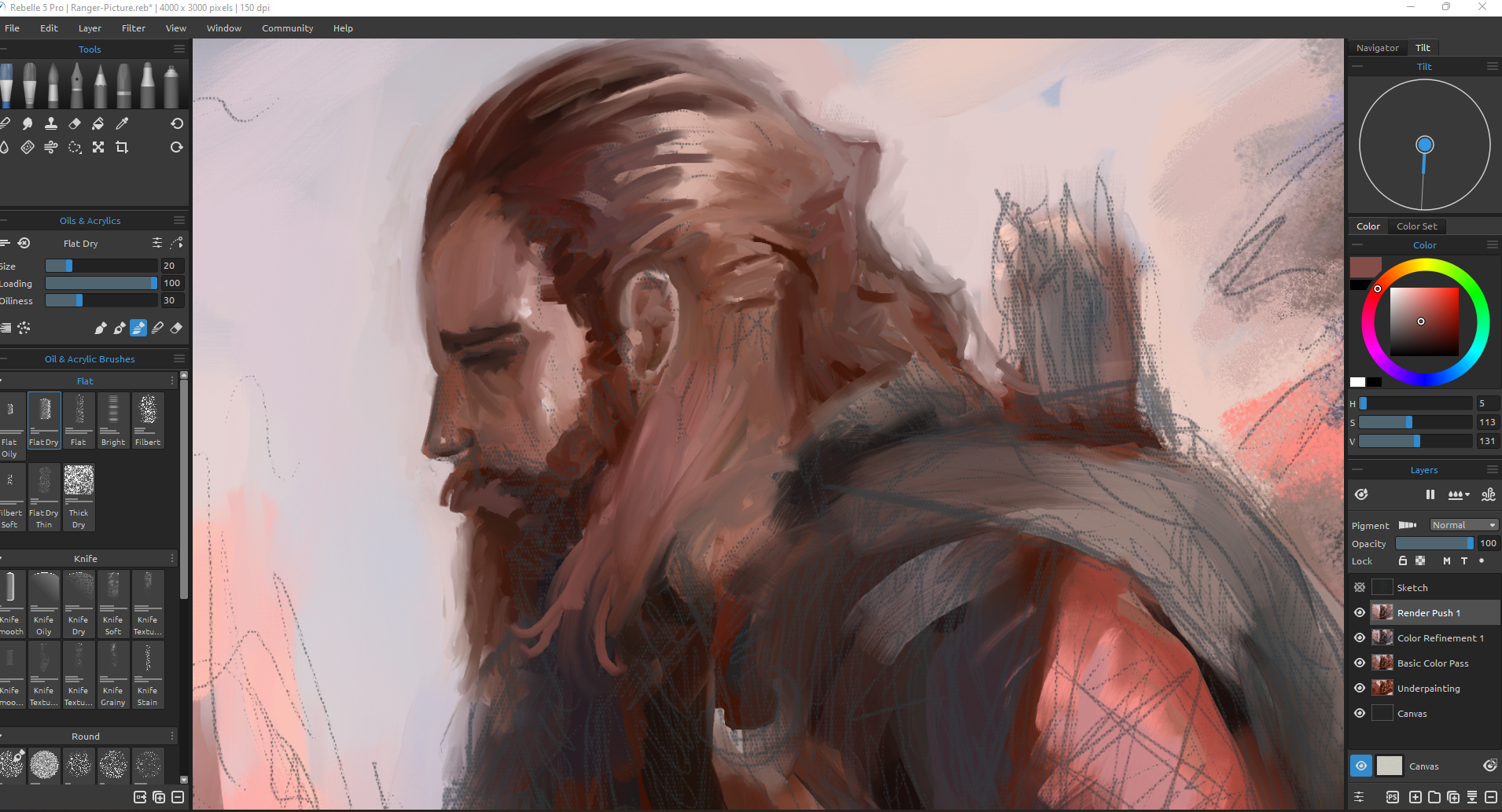 My biggest advice for working on faces is to take your time, understand the planes of the face, and use references whenever you can. If you google “Asaro Head”, you’ll find some great 3D breakdowns of the face, showcasing the relationships and angles of the face and how each component correlates to the component next to it.
I’m feeling okay about where the face is at now in relation to the rest of the piece, but I want to move on to other portions of the Ranger to avoid “tunnel vision”.
This gives me a break from the face rendering, allows me to solve different problems in another area of the painting, and also has the important benefit of letting the rest of the piece get to a better quality finish. Once the rest of the piece is more highly rendered, coming back to the face will allow me to make any changes that I can’t quite see right now, and correct things to make our face read as a major focal point in relation to the surrounding aspects of the painting.
Moving Around the Composition
From here I’m going to use my Flat Oily and Flat Dry brush to go and refine other areas of the painting. This will include the body, some armor, the arrows in the quiver, the bow, and even a touch-up of the trees.
There’s no real rhyme or reason to what I choose to paint and when, this is just a way to refine points of interest and keep other aspects painterly and loose to add visual flair. Remember, this is a painting, not a photograph, not every detail has to be perfectly rendered! This also allows me to move around to other areas if I get bored (which is bound to happen when doing a multiple-hour painting), maintaining consistency throughout.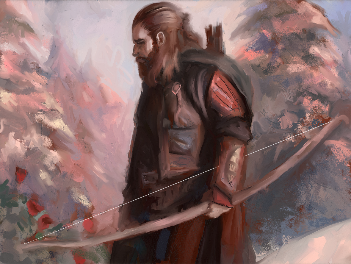 Looking good! The benefit of using our Flat Oily and Flat Dry brushes is they allow us to make our choices about edges, where using our Flat Oily creates nice, creamy, smooth flows between values and colors, the Flat Dry is super-useful for creating more harsh edges and textured areas.
The piece is already starting to feel more cohesive and together, and I think there’s the main reason why: The edges aren’t razor-sharp. Digital paintings often look TOO crisp, being unrealistic and designed to the point of looking “fake” or “computer generated”. The beauty of Rebelle is that the brush engine keeps nice nuances of randomness and “natural beauty” that traditional brushes also possess. You never quite know what stroke you’re going to get, and that’s the beauty of Rebelle!
In the last part of this workshop, I will focus on finalizing the artwork. How to refine it? How to keep a traditional look? Read the last part here.
Stay tuned!
Escape Motions
text and images provided by Wes Gardner
-----
Wes Gardner is a professional illustrator and freelance artist currently working in the tabletop, card game, and roleplaying game industries with credits that include Warhammer 40k Roleplay: Wrath & Glory, Varia, ADIDAS, Warner Bros., and more. When not working for clients, Wes spends his time mentoring art students, creating tutorials, and posting videos discussing art tips and tricks on his YouTube channel.
Rebelle Featured Artist profile: escapemotions.com/featured-artists/wesley-gardner
Website: wesleygardner.com
YouTube channel: youtube.com/c/WesleyGardner86
Instagram: instagram.com/artofwesgardner
What do you think?
0 Responses
0
Upvote
0
Funny
0
Love
0
Surprised
0
Angry
0
Sad
Sign in to comment!
Be the first to comment.