

Dive into fantasy character oil painting with Rebelle Featured Artist and illustrator, Wes Gardner. In this four-part workshop, he will walk you through the whole painting process, from initial thought to the final touch. Read the final part, providing tips on how to finalize your artwork.
As a working illustrator, I’m always on the lookout for ways to improve my craft. Every few months, I like to try a personal “leveling up” piece that I can update my portfolio with. I currently work in the tabletop roleplaying (TTRPG) and card game industries and love the storytelling and narratives the images can convey. With Rebelle, I can successfully transfer my “traditional art” ideas to the digital realm, which allows for greater flexibility when working with Art Directors or publishing houses. Changes no longer take hours, but minutes!
Read previous parts of this workshop series:
Part I. - Preparing Canvas and Initial Sketch
Part II. - Underpainting and Color Choices
Part III. - Composition and Details
The Final Push
From here, our main focus will be “refinement”. What does the term refinement mean in the context of painting something like this? How do you truly “push to final”? Here are some helpful hints:
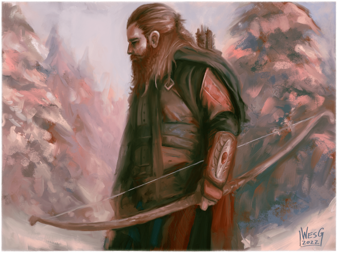
- On areas of focus (namely the face, the bow, some of the Ranger’s accessories, and some of the tree work), you’ll want to do your best to remove any harsh transitions of brush stroke direction or brush size. These areas will be “tightly rendered”, meaning smaller brushes, more nuanced control, and more deliberate brushwork. As you get further from the focal point (in this case, the face), the brushwork can get more sporadic and impressionistic.
- In areas of interest, you’ll also want the highest amount of contrast (meaning differences). You can do this by changing your brush size for more detailed work, working with brighter colors immediately next to darker colors, and controlling your edges to have hard edges, soft edges, and lost edges very close to each other.
- Design! At this point, you’ll notice there are a few portions of the piece that have not been “designed” yet, namely the Ranger’s leather jerkin, his wrist-guard, and most importantly, the bow. Since these are high-contrast areas, it’s worth taking the extra time to make sure they read as believable!
After a few hours of using the Flat Oily, Flat Dry, and Knife Oily brushes in the Oil and Acrylic category and the Round Hard and Round Soft 2 brushes in the Digital subcategory (located under the Pencil tool) focusing on our above three points, we have something like this: I’m feeling good about where it’s at! I think the small nuances on the bow, the wristguards, and the Ranger’s hair are working well, however now I need to focus on nailing down the roses, the rose bush foliage, and tweaking my values (as currently, I think the Ranger’s shadows are a little harsh for his surroundings).
Using my Flat Oily brush, I’m going to start painting some roses. To get started, I’m going to choose a darker red color and “sketch” my roses with paint, then follow up with a less saturated red and “sketch” out where the highlights would be. This will allow me to find the forms and structure while maintaining the proper colors, value, and “vibe” that we already have established. Remember, choosing colors from your painting while doing these final render steps will ALWAYS lead to better color harmonies and more cohesive artwork!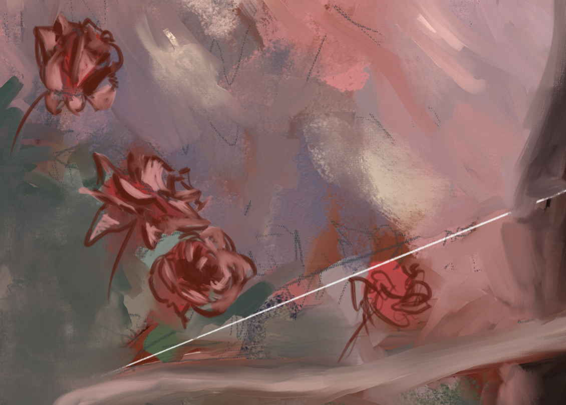 Now, I’m going to drop in my SUPER saturated reds in the “in-between” spaces to really allow the roses to catch this light. I zoom in and out of my composition a LOT during this phase, as I want to make sure the reds are rich, but not overbearing when compared to our true focal point (the Ranger).
I also want to add some darker, more saturated greens to the foliage area, with hits of lower-saturated, brighter greens for the highlights. Reference, reference, reference!
After a bit of finessing, I have something like this: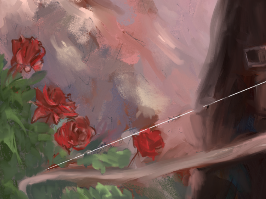 I want to keep these fairly loose, as the roses shouldn’t draw too much attention (as our Ranger is gazing at the roses, this will naturally direct the viewer’s eyes towards the roses in a natural, non-abrasive manner). If the roses become too saturated and take too much attention away from our focal point, they will become the focal point, and that’s no good! Roses are nice and all, but this is a Ranger painting, not the painting of a rose!
Correcting Some Stuff
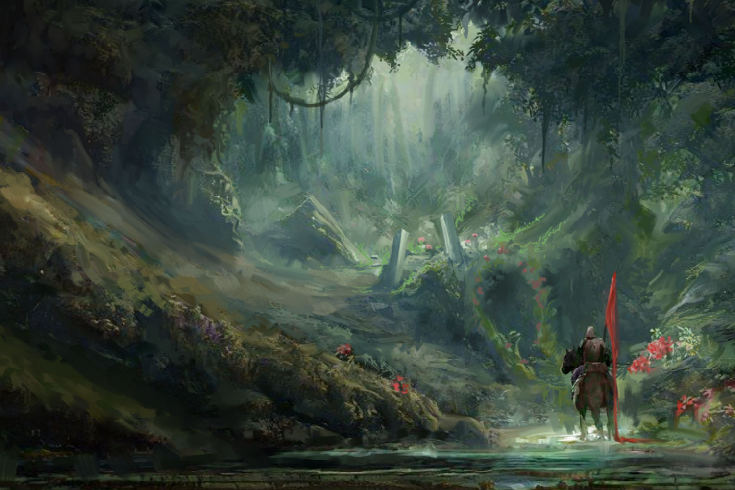
So let’s take a look at where we’re at: Overall, not bad! I definitely need to refine a bit though. The shadows are too dark, and not saturated enough to be believable as a “bright, snow-lit day”, as the reflection of the sky’s light in the snow should be bouncing up into the shadows of our Ranger. Also, the rose bush looks nice….but is it taking too much attention away from our main idea? I hate to say it, but…..yes. Yes, they are. I’m thinking…..
Yeah, the roses have to go.
I know what you’re thinking: “Wes, are you crazy? The roses were the main part of the storytelling of this piece! You spent time on it, why are you scrapping it!?”. As a painter and illustrator, one of the main mantras you should follow is that the image always comes first, and your ego always comes second. It doesn’t matter how much time, how many references, or what kind of rendering you’ve done on an aspect of your piece. You have to be honest with yourself: Does this aspect work for my image? If so, refine it and make it fit like a glove. If not? Scrap it.
By color picking the surrounding tree shadows and highlights and using some oily wet brushes in Paint and Blend mode, I’m going to get rid of the roses. Now, we have something like this: While it’s sad to see the roses go, I feel like this is MUCH stronger as an “atmospheric” piece. Everything feels more cohesive, and the Ranger is very much the focal point, with the base of the treelines acting as a “V” shape to direct the viewer’s eye towards him.
You may have noticed that we painted completely over the front part of the bow and bowstring, and that’s on purpose! Since I have yet to “finalize” the bow, it’ll be easy to paint what we need back on top. I think that Rebelle has the best wet-brush engine I’ve ever used, so creating the bottom-left portion of the painting to get rid of the roses was an absolute breeze. We’ve retained the “painterly” feel we were after, and the piece is more cohesive than it was before. Success!
Before we add our last little bit of details, let’s use Rebelle’s awesome color correction features to smooth out some of the harsher darks and add some vibrancy to our shadows.
Color Balancing For Impact
With our piece open, I’m going to go to Filter > Color Balance.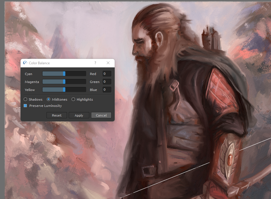 This is an incredible tool that allows us to tweak the hues and luminosity/lightness settings of our respective values. I’m going to select the Shadows radio button, and do a few adjustments to take away some of the darkest darks (as they’re too close to black for my liking at the moment).
After some tweaking, here’s what we have!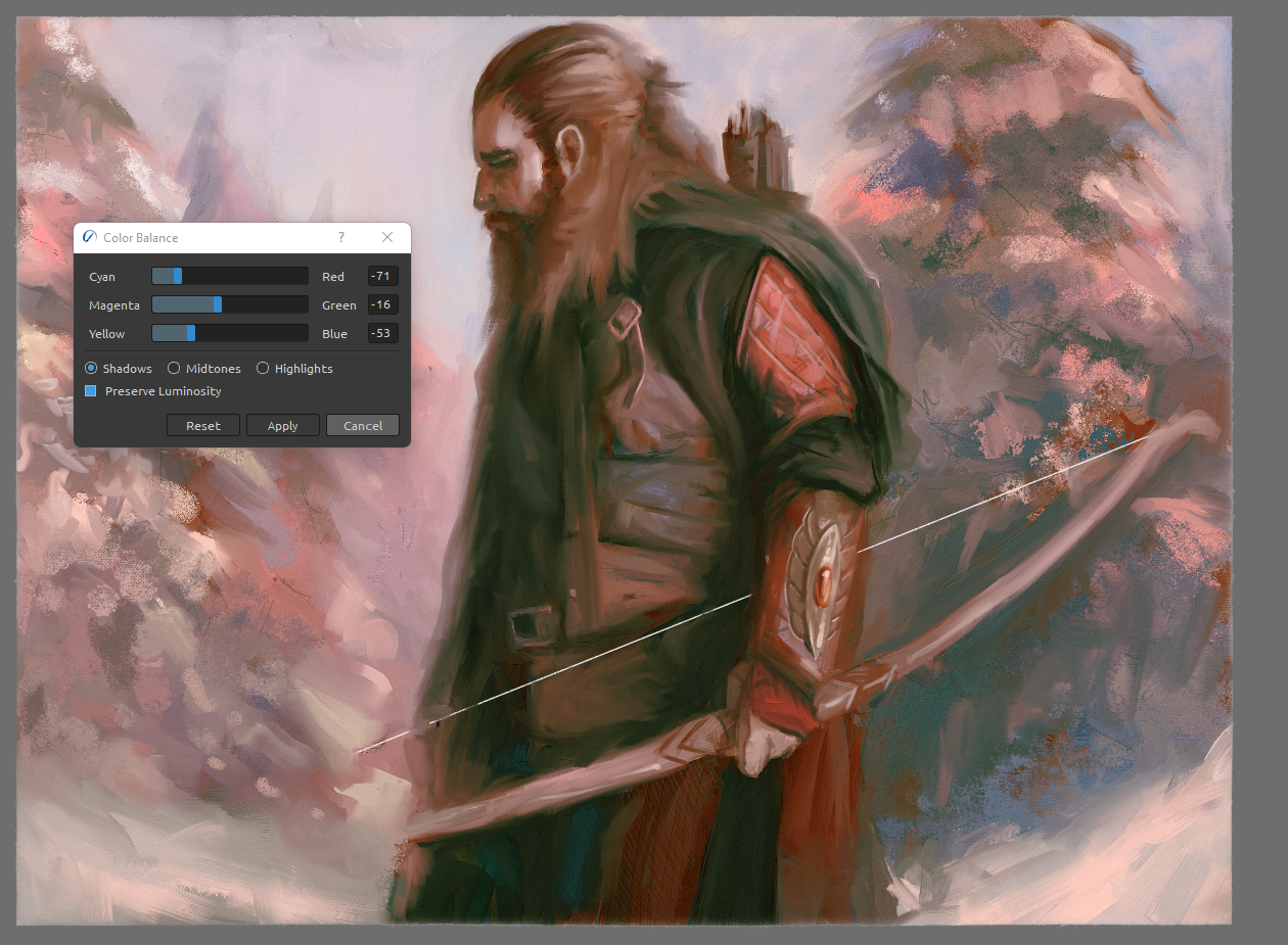 This feels MUCH better in my opinion and has a bit more color personality than the somewhat flatter previous iteration. And the best part is, this was ONLY tweaking the Shadows, not even touching the Midtones or Highlights! Slight tweaks using this Color Balance tool can drastically change the way your pieces feel, and give you total control over your work in an intuitive, interesting way.
At this point, I feel very comfortable and confident in the values and colors. Now, it’s just time to wrap things up, add some cool brushwork flair, tweak the Visual Settings for Impasto and stuff, and call it done!
Wrapping It Up
Now we’ve reached the finale! I only have a few things I want to do here:
- Complete the bow and bowstring, while giving the wood texture a little more nuance than it has right now.
- Do one final pass on the face and wrist guard to give some nice highlights and color variation.
- Adjust a few areas of the right-most tree to remove any weird tangents or areas that are incorrectly catching the viewer’s eye.
- Do a quick pass of a dry brush to “scumble” some visual interest over top of everything.
After a few more hours, tweaking some angles, polishing some brushwork around areas of interest like the beard, jerkin, and hair sheen, and doing one final “edge smudge” pass using the Knife Oily brush in Blending mode, we finally have our final image, something we can be proud of! If you’ve made it to the end of this tutorial series, thank you so much for your time and perseverance! I hope you picked up some helpful tips and tricks to take your paintings to the next level using Rebelle’s awesome workflow, and even picked up some basic pro tips on creating a piece of compelling fantasy art! While we covered a lot of tools, theories, and techniques, always remember the golden rule that is ALWAYS the most important:
If it looks good, it IS good!
Rebelle has a huge suite of incredible tools that can aid you in making your artistic goals a reality, all it takes is some planning, discipline, and time. Now go make cool art!
Happy Painting!
Escape Motions
text and images provided by Wes Gardner
-----
Wes Gardner is a professional illustrator and freelance artist currently working in the tabletop, card game, and roleplaying game industries with credits that include Warhammer 40k Roleplay: Wrath & Glory, Varia, ADIDAS, Warner Bros., and more. When not working for clients, Wes spends his time mentoring art students, creating tutorials, and posting videos discussing art tips and tricks on his YouTube channel.
Rebelle Featured Artist profile: escapemotions.com/featured-artists/wesley-gardner
Website: wesleygardner.com
YouTube channel: youtube.com/c/WesleyGardner86
Instagram: instagram.com/artofwesgardner
What do you think?
0 Responses
0
Upvote
0
Funny
0
Love
0
Surprised
0
Angry
0
Sad
Sign in to comment!
Be the first to comment.